What is Tableau?
Tableau is a commercial software tool for visual data analysis. It has roots in academia; its research department has contributed several notable papers to the InfoVis discipline in recent years. And those of you with an interest in Data Visualization may well have come across Robert Kosara, of Tableau Research, and his highly influential blog. What makes Tableau distinct from other data analysis tools is the very heavy emphasis on the visual perspective in data analysis.
Getting Tableau
Tableau is commercial software — so is not free to use and in fact is quite expensive. However, great for you: it is free to students and university staff. The University of Leeds also has an institutional licence — so it is fully installed on the machines in the labs. It also makes sense to have a version of Tableau Desktop running on your own machines. You can do this by following the links below.
Why Tableau?
Since the company was founded in 2003, Tableau has seen rapid growth and is widely used in industry (e.g. companies list). Whilst Tableau has its frustrations, underpinning its design and layout are key tenets of visualization design: of data types and their mapping through visual variables. In a similar way to ggplot2, then, Tableau forces its users to consider the visual grammar behind their graphics and data analysis. Finally, although not open and free to use, Tableau is sustained by a very large community of users, which is cultivated by Tableau through its Zen Masters programme. Should you wish to develop some expertise in Tableau, you may find their MakeOverMonday useful. Rob Radburn, a UK-based Zen Master, has posted some great examples with an implied geographic flavour.
Why not Tableau?
Tableau is a software tool rather than programming language. It therefore relies on point-and-click interactions, making reproduction of workflows problematic. As with all software tools, it can be slightly idiosyncratic — you need to understand/convert your thinking into a Tableau way of organising data. You may at first find particularly confusing the means through which data are aggregated and grouped in Tableau. Related to this, there is a layer of abstraction between the user and dataset. Tableau does not offer much support for data cleaning and since aggregation and summarisation tends to be performed by Tableau automatically, a user may not know quite what a plot is showing — you’ll discover this for yourselves. Despite these problems, Tableau is a very accessible software tool — some claim that it is "democratising" to the extent that it takes business intelligence away from IT departments and into the hands of decision-makers. Crucially, and probably uniquely, it is a genuine, off-the-shelf interactive visual data analysis tool.
How the Tableau display is organised
Data handling
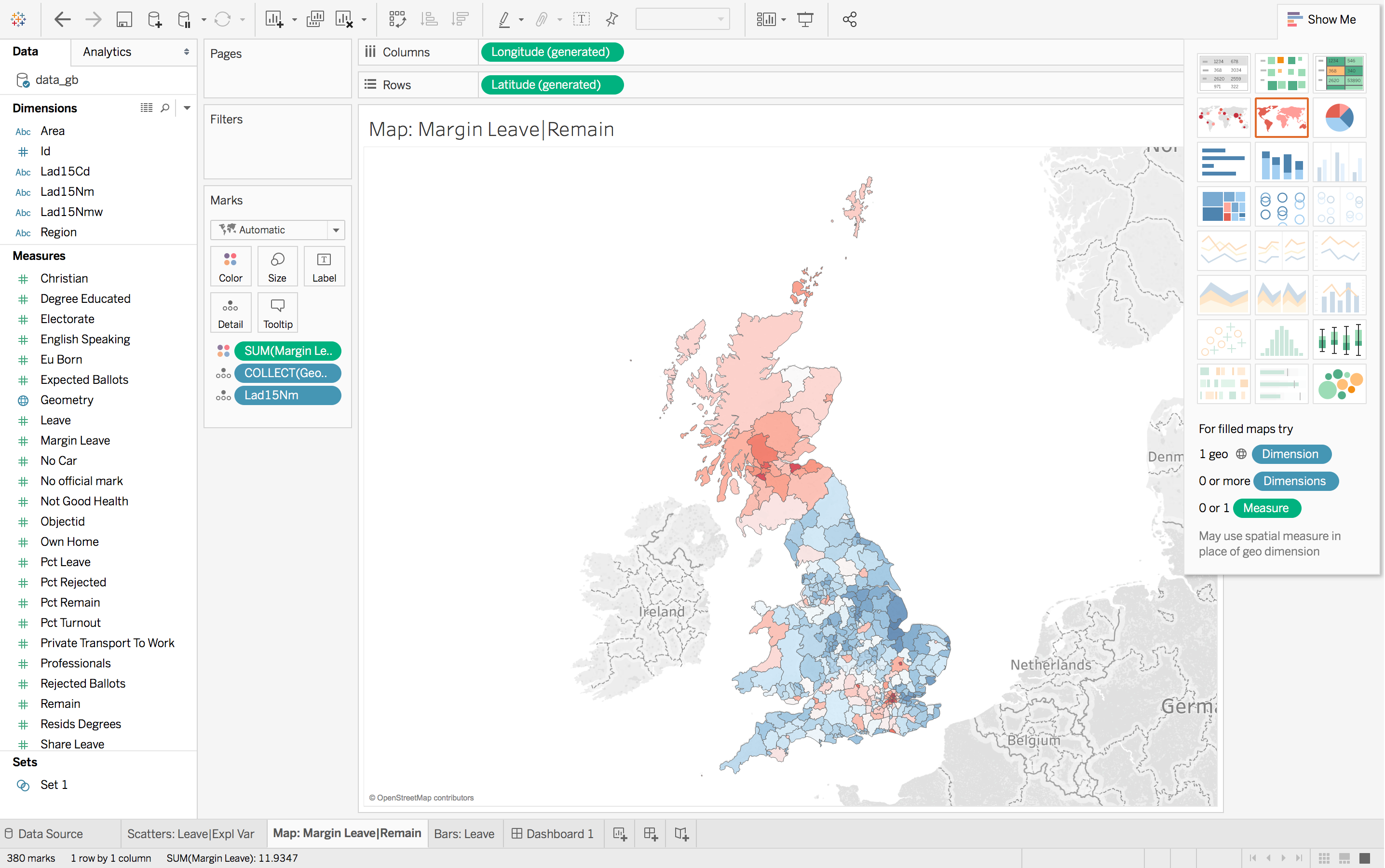
As with R’s data frame or tibble, Tableau works with tabular data — where rows are populated with observations and columns with variables that describe observations. Once loaded into Tableau, data are automatically organised into Dimensions and Measures (left margin of Figure 1). Dimensions are typically categorical variables used for grouping and pivoting data, which might be achieved via faceting to form small multiples or through colour hue, shape or other visual channels. Measures are quantitative (numerical) variables and mapped to size, colour and other visual channels. As of Tableau --version 10.2, spatial data types are supported. Interestingly, they are handled in the same way as in R using the SimpleFeatures package. Geometry information is converted and stored in a variable called Geometry, each element of which contains a list of type MULTIPOLYGON.
Windows
At the top of Figure 1 are the Columns and Rows shelves. These can be loosely thought of as the x-position and y-position for your charts in Tableau.
In the second margin of Figure 1 is the Marks window. This provides access to the numerous visual channels to which data can be mapped.
You will soon discover that Tableau aggregates data according to the configuration provided to Rows, Columns and Marks. You will often wish to disaggregate, and to do so you will need to drag an attribute to the Detail icon (under Marks).
Task 1: Listen and explore
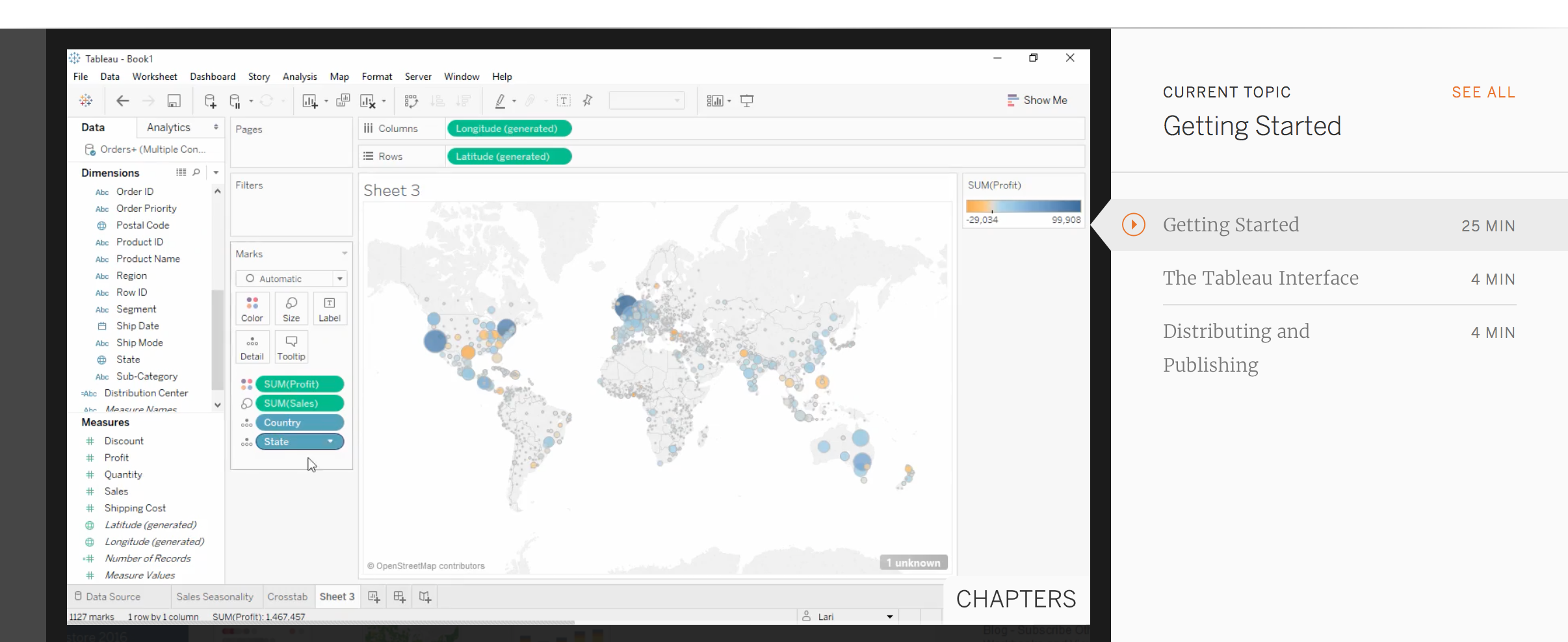
Perhaps the best means of introducing Tableau is through the introductory tutorial provided by Tableau themselves. The tutorial can bebe accessed from this link. Note that you will need to sign in to access the tutorial.
Task 2: Connect to data and familiarise
After completing the R sessions, you might have considered yourself free from writing any code. Whilst that is generally the case, in this session you will be returning to the Brexit dataset and using Tableau to query and explore the data and relationships generated in the previous session as part of the modelling activity.
# Convert back to WGS84 (EPSG:4326) for use by Tableau.
data_gb <- st_transform(data_gb, crs=4326)
st_write(data_gb, "data_gb.geojson")You should now have in your R directory a GeoJson file containing the Brexit results, Census variables and model outputs from the previous session. Next, load these data into Tableau by following the instructions below.
You should now see a screen that resembles a spreadsheet and should not be too different from the screen that you see when typing the command View(<dataframe-name>) in RStudio. Notice that Tableau has automatically attributed data types to the columns (variables) in this spreadsheet view and that this is also true for spatial data — the Geometry column has been annotated with a globe-type icon.
The Worksheet view should be familiar to you from the introductory video. You may wish to take a moment to check that you are happy with the way in which Tableau has automatically allocated variables to the Dimensions and Measures panes. To re-allocate a variable, right click and select Convert to <Dimension|Measure>.
Task 3: Reproduce (your Brexit vis)
Tableau is supposed to be an exploratory tool where you as a researcher rapidly explore different variable combinations and visual mappings in order to generate new views on a dataset and new insights. While R requires some precision and consistency in the syntax used to perform analysis, Tableau does not. Rather than a very prescriptive set of instructions to follow, the rest of the practical will require some creative thinking from you around generating graphics and the mapping of data to visual channels.
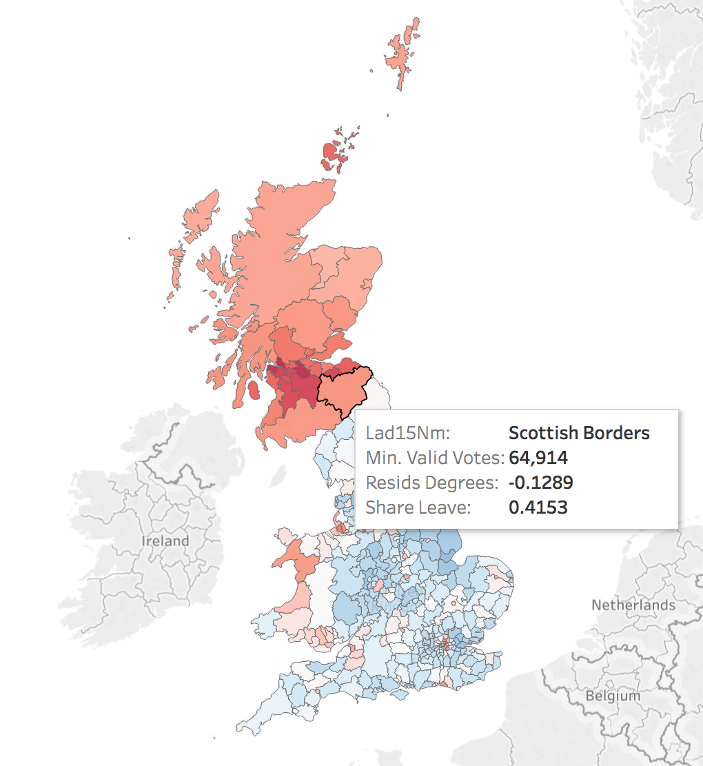
Map
|
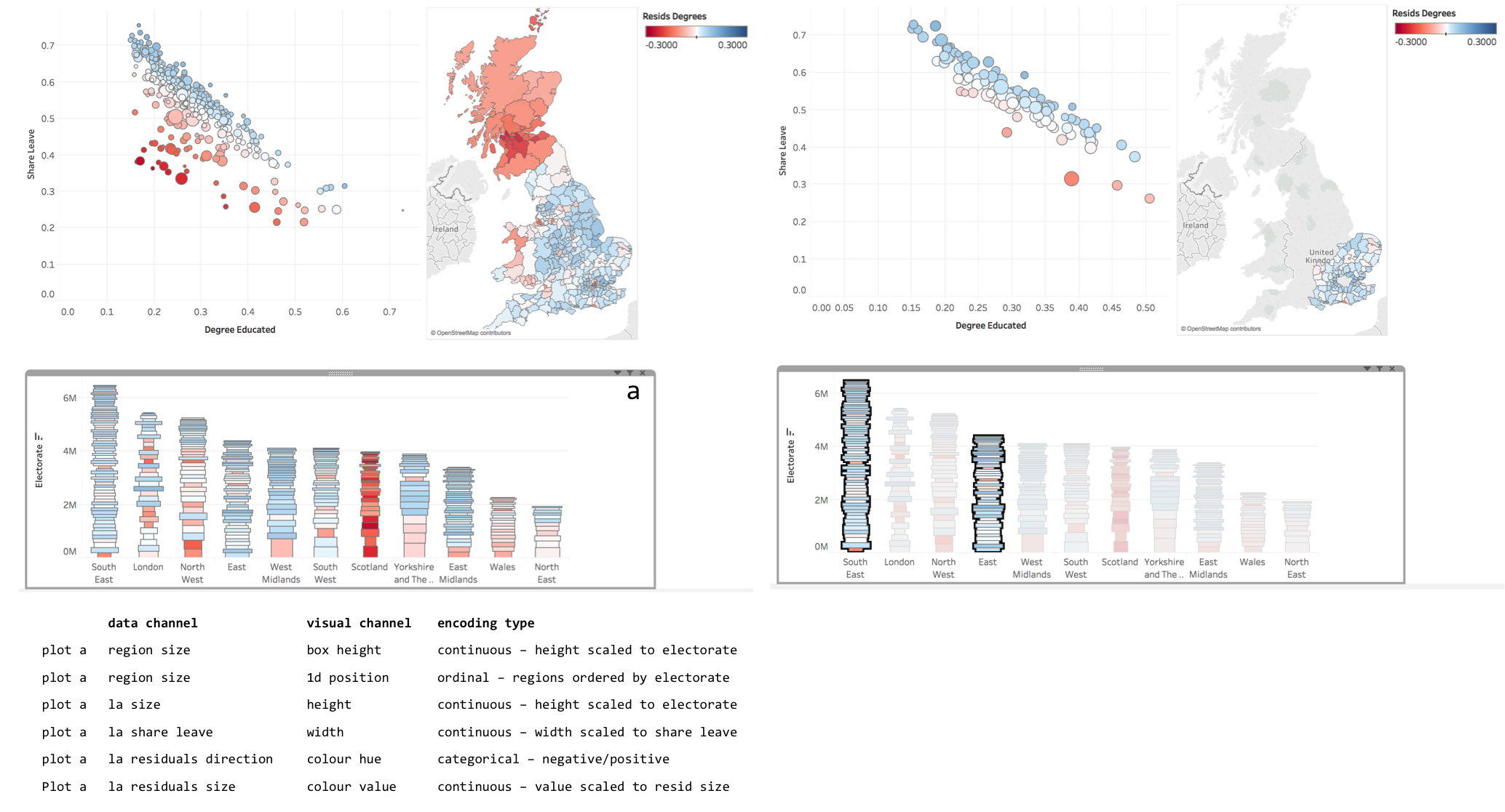
As discussed earlier, Tableau was developed on the back of academic research in the InfoVis discipline. As a result, it is underpinned by key tenets of data visualization design. You saw this when associating colour to the |
Scatter
Bar
Task 4: Interact
Assessed Task
This is a short, assessed task. It does not assume knowledge or skills above what you have learnt in the session. Ideally, the task should be completed within the workshop session — the aim is not to burden you with additional work.
The task is designed to assess your:
-
ability to produce outputs in Tableau
-
understanding of data types and their encoding through statistical graphics
You can quickly glance at the assessed task below. However, the document into which you’ll need to upload your answers can be found on Minerva, under this module (GEOG5022M), then Learning Resources. Click on this week’s folder (Week 8 - Tableau). You should see a word document called PD_Workshop_5_Tableau.docx. Download this document to a local directory — this is the document you will use to paste in your answers. Once you’ve completed the task, save the document using the filename PPD_R_<StudentID>. Upload the completed document to Turnitin — again, a link is provided under Week 8 - Tableau.
Assessed task 1. Upload
Assessed task 2. Interact
Assessed task 3. Annotate
Data Challenge (post assessed task)
Over the last decade, data journalism has emerged as an important discipline in and of itself. Several notable publications have developed some impressive data analysis and visualization competency:
-
Check out Alan Smith and Martin Stabe, of the FT and their visual vocabulary;
-
Or the incredible data vis at the New York Times.
The Guardian DataBlog has over the last 5-10 years been a great resource for data journalism pieces, but also it has made great efforts to provide access to the datasets that underpin stories. In this optional activity — to be completed if you have finished and uploaded your answers to the assessed task — you will use data provided by the Guardian DataBlog.
Further reading
-
Munzner, T. (2014) Visualization Analysis & Design, CRC Press. Chapters 2, 5. Available as an e-book via the University of Leeds Library.
Content by Roger Beecham | 2018 | Licensed under Creative Commons BY 4.0.