
Important links
Abstract
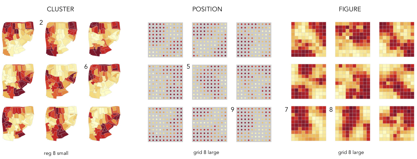
The line-up task hides a plot of real data amongst a line-up of decoys built around some plausible null hypothesis. It has been proposed as a mechanism for lending greater reliability and confidence to statistical inferences made from data graphics. The proposition is a seductive one, but whether or not line-ups guarantee consistent interpretation of statistical structure is an open question, especially when applied to representations of geo-spatial data. We build on empirical work around the extent to which statistical structure can be reliably judged in map line-ups, paying particular attention to the strategies employed when making line-up judgements. We conducted in-depth experiments with 19 graduate students equipped with a moderate background in geovisualization. The experiments consisted of a series of map line-up tasks with two map designs: choropleth maps and a centroid-dot alternative. We chose challenging tasks in the hope of exposing participants’ sensemaking activities. Through structured qualitative analysis of think-aloud protocols, we identify six sensemaking strategies and evaluate their effects in making judgements from map line-ups. We find five sensemaking strategies applicable to most visualization types, but one that seems particular to map line-up designs. We could not identify one single successful strategy, but users adopt a mix of different strategies, depending on the circumstances. We also found that choropleth maps were easier to use than centroid-dot maps.
Important figure
BibTeX citation
@inproceedings{doppler_strategies_2021,
  author    = {Johanna Haider Doppler and
               Margit Pohl and
                             Beecham, R. and
                             Jason Dykes},
  editor    = {David Lamas and
               Fernando Loizides and
               Lennart E. Nacke and
               Helen Petrie and
               Marco Winckler and
               Panayiotis Zaphiris},
  title     = {Strategies for Detecting Difference in Map Line-Up Tasks},
  booktitle = {{INTERACT} 2021 - 18th
               International Conference on Human-Computer Interaction, Bari, Italy, August 30th-2nd September, 2021, Proceedings},
  series    = {Lecture Notes in Computer Science},
  volume    = {12934},
  pages     = {},
  publisher = {Springer},
  year      = {2021}
}