Exploring spatial networks
Contents
Session Outcomes
By the end of this homework session you should be able to:
- Interpret non-standard data graphics by ‘looking-up’ specific values/trends.
- Infer patterns from non-standard data graphics.
Introduction
This homework requires you to apply the concepts and skills developed in the class session on exploring spatial networks. Do complete the task and be sure to save your work as it will be submitted as part of your portfolio for Assignment 1.
Visualization interpretation challenge
You may be pleased to know that this week’s homework does not require you to write a single line of code. Instead, it is designed to get you reading and interpreting data graphics. OD Maps are a good candidate here as they have been catalogued by Marteen Lambrechts as a Xenographic – Weird but (sometimes) useful. I’d add that within the list of other Xenographics, OD Maps are Not that weird and often useful. Nevertheless, they do take some interpretation.
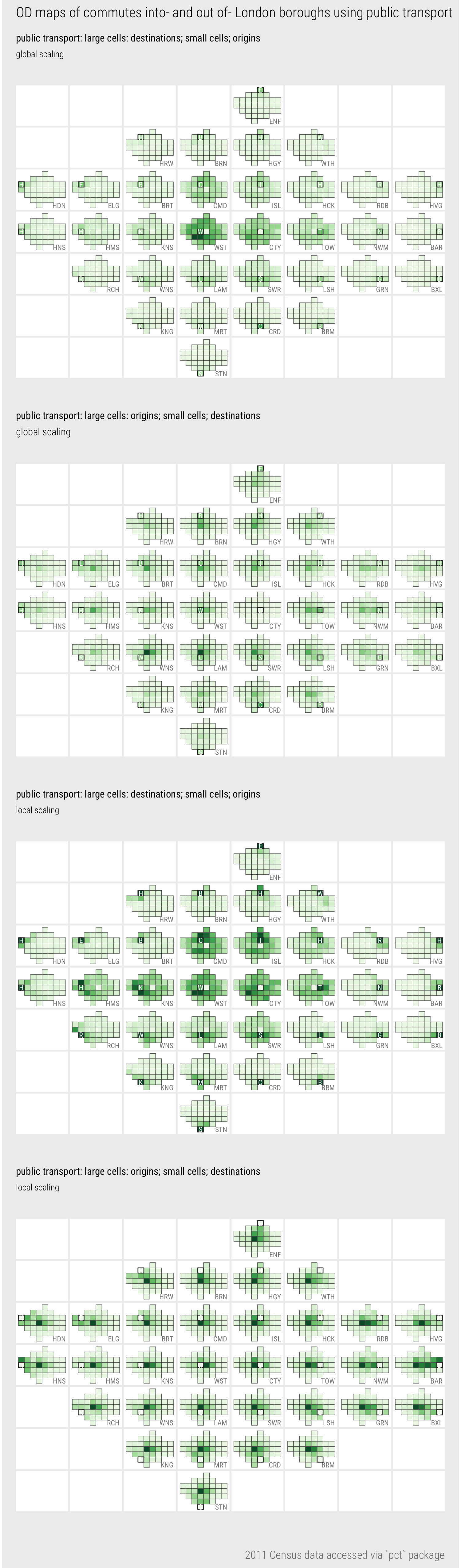
Figure 1: OD map of commutes between London boroughs
Task 1: Read
For a clear explanation of OD maps and interesting application, read Slingsby, Kelly, and Dykes (2014)’s very short paper: OD maps for showing changes in Irish female migration between 1851 and 1911.
Task 2: Interpret
Considering the OD maps in Figure 1, try to answer the following tasks. Write your answers in the 05-template.Rmd file.
Look-up tasks
- For jobs filled in the City of London (CTY), from which borough does largest number of workers commute using public transport?
- Enter your answer in the template
- Which borough in London has the largest absolute number living and working in that borough (and travelling to work by public transport)?
- Enter your answer in the template
- For workers living in Barnet (BRN), what are the top 3 boroughs to which they commute?
- Enter your answer in the template
Insights
Identify three isights that can be made around the geography of commuting patterns in London from reading any/each of the graphics in Figure 1. Briefly identify which graphic(s) led to the insight and how. Please do not spend too long over this activity – the idea is to encourage you to make inferences from graphics, as you will do in your coursework.
- Insight 1
- Enter your answer in the template
- Insight 2
- Enter your answer in the template
- Insight 3
- Enter your answer in the template