Visualization fundamentals
Contents
Session Outcomes
By the end of this homework session you should be able to:
- Formally describe data graphics according to their visual encoding.
- Reproduce graphics by writing
ggplot2specifications. - Combine
dplyrand conditional statements to prep data for plotting.
Introduction
This homework requires you to apply the concepts and skills developed in the class session on visualization fundamentals.
Task 1: Describe and evaluate
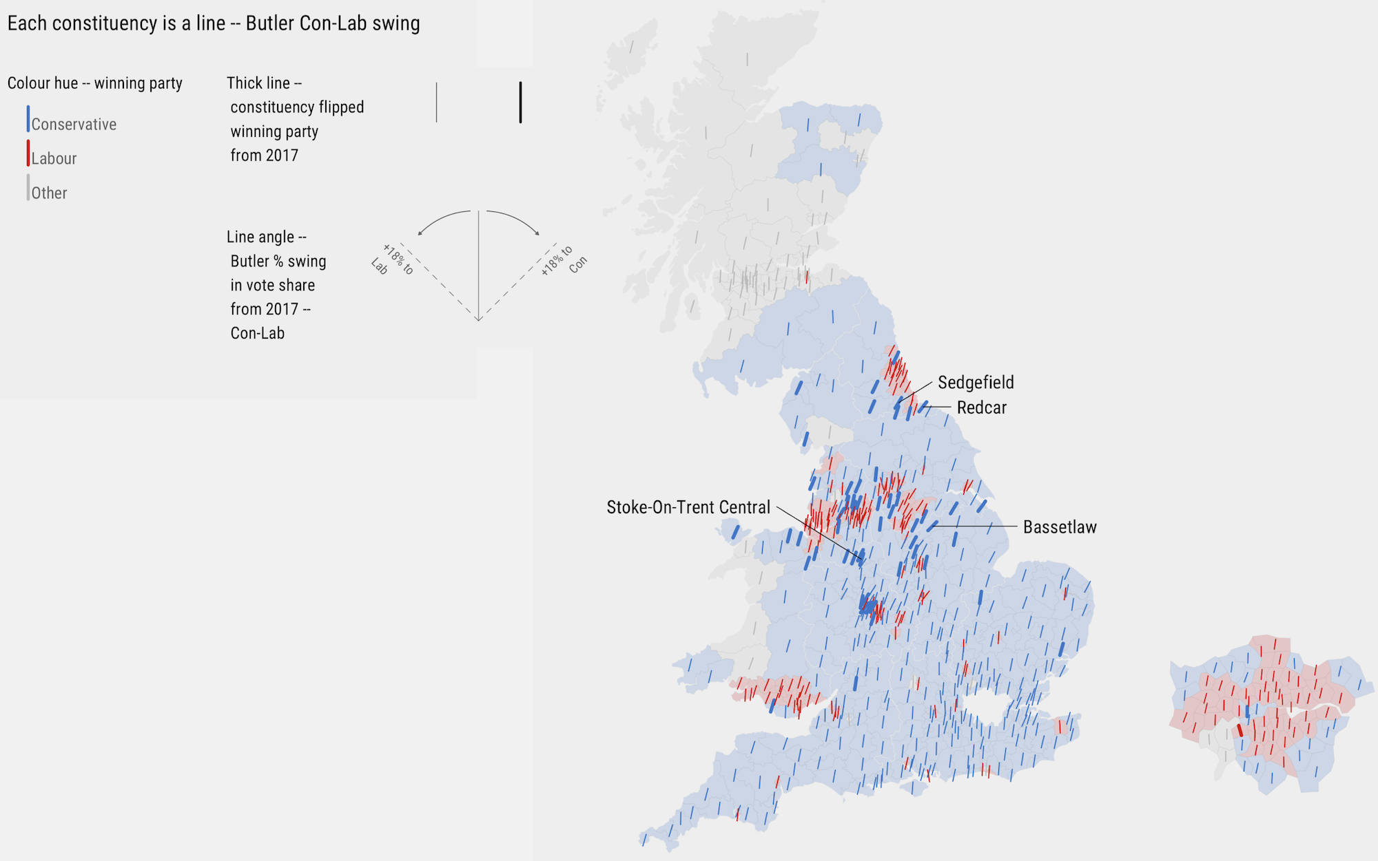
Figure 1: Map of Butler Con-Lab Swing in 2019 General Election.
Complete the description table below identifying each data item that is encoded along with its measurement level, visual mark and visual channel and the effectiveness rank, according to Munzner (2014), of this encoding.
| Data item | Measurement level | Visual mark | Visual channel | Rank |
|---|---|---|---|---|
location |
||||
... |
... |
... |
... |
... |
... |
... |
... |
... |
... |
... |
... |
... |
... |
... |
... |
... |
... |
... |
... |
... |
... |
... |
... |
... |
Task 2: Reproduce
Histograms faceted by region
Write some code for reproducing something similar to the graphic below – a set of histograms of the Swing variable, faceted by region. Place your code into the 03-template.Rmd file for this session.
#######################
# Enter your code in the chunk provided.
######################- Save your plot as a
.pngfile and insert the file as a Figure into your.Rmddocument (guidance here).
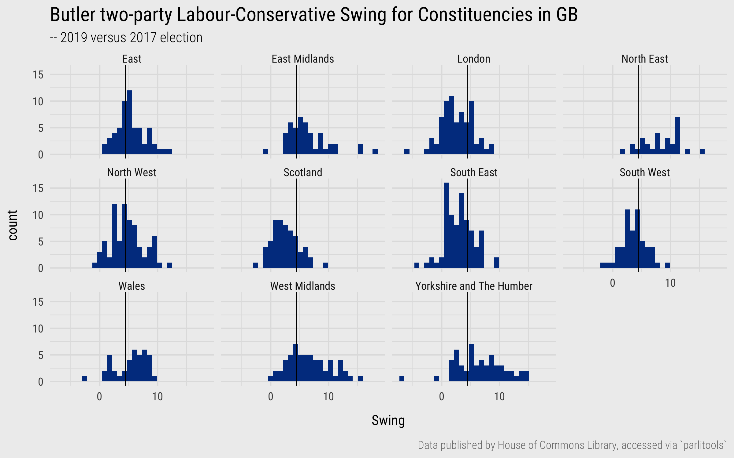
Figure 2: Histograms of Swing variable, grouped by region.
Scatterplots with multiple encodings
Write some code for reproducing something similar to the graphic below – a scatterplot comparing 2017 and 2019 vote shares for Labour. Be sure to include every encoding as it appears in the graphic (e.g. shape and alpha according to whether constituencies flipped allegiance). Hint: you may need to use a conditional statement to generate a variable for emphasising constituencies that flipped parties between 2017 and 2019. Place your code into the 03-template.Rmd file for this session.
#######################
# Enter your code in the chunk provided.
######################- Save your plot as a
.pngfile and insert the file as a Figure into your.Rmddocument (guidance here).
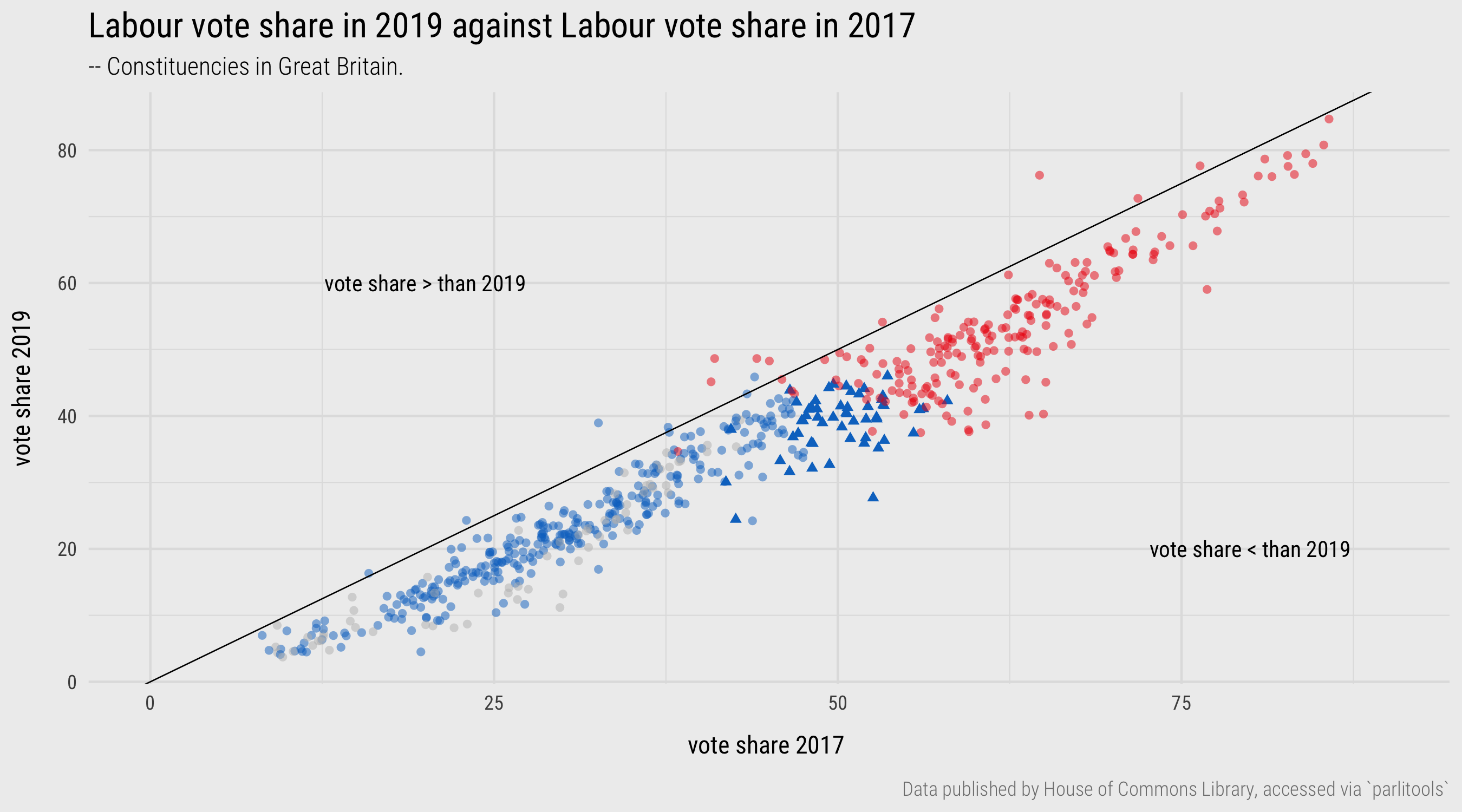
Figure 3: Plots of 2019 versus 2017 vote shares.
Task 3: Create a map
Write some code for reproducing something similar to the graphic below – a map of the estimated Leave:Remain vote margin by Parliamentary Constituency. Note that I am using a diverging colour scheme here to distinguish whether the Constituency was majority Leave and Remain – brown or green – and also the size of that majority – the darker the colour, the larger the majority.
Place your code into the 03-template.Rmd file for this session.
#######################
# Enter your code in the chunk provided.
######################- Save your plot as a
.pngfile and insert the file as a Figure into your.Rmddocument (guidance here).
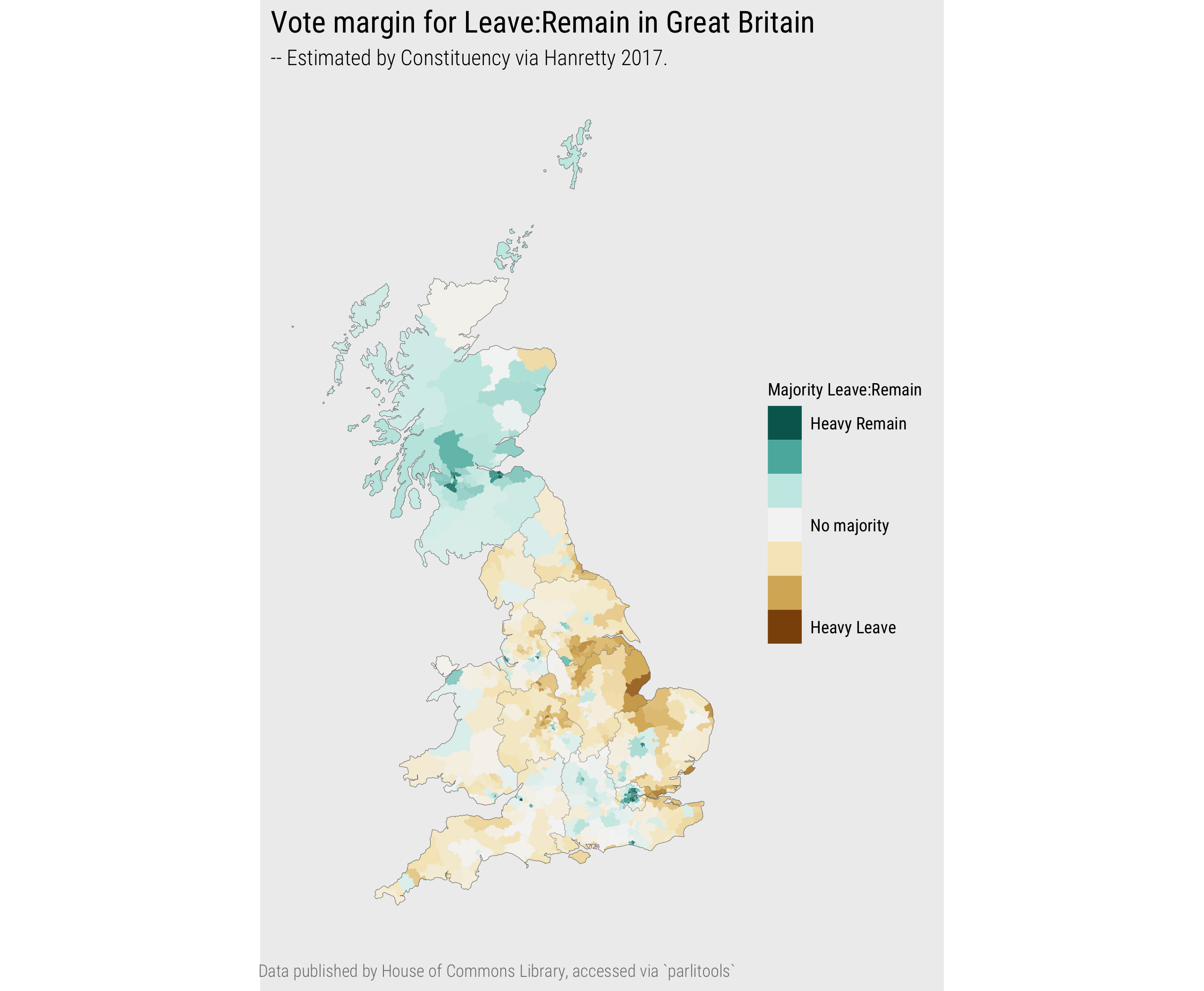
Figure 4: Map of 2016 EU Referendum vote, estimated by Parliamentary Constituency in GB.