Exploratory data analysis
Contents
Session Outcomes
By the end of this homework session you should be able to:
- Write ggplot2 specifications of your own that use colour and layout to support summary and comparison.
- Formally describe data graphics according to their visual encoding.
- Identify visual (and computational) techniques for supporting comparison.
Introduction
This homework requires you to apply the concepts and skills developed in the class session on exploratory data anlsysis.
Visualization design challenge
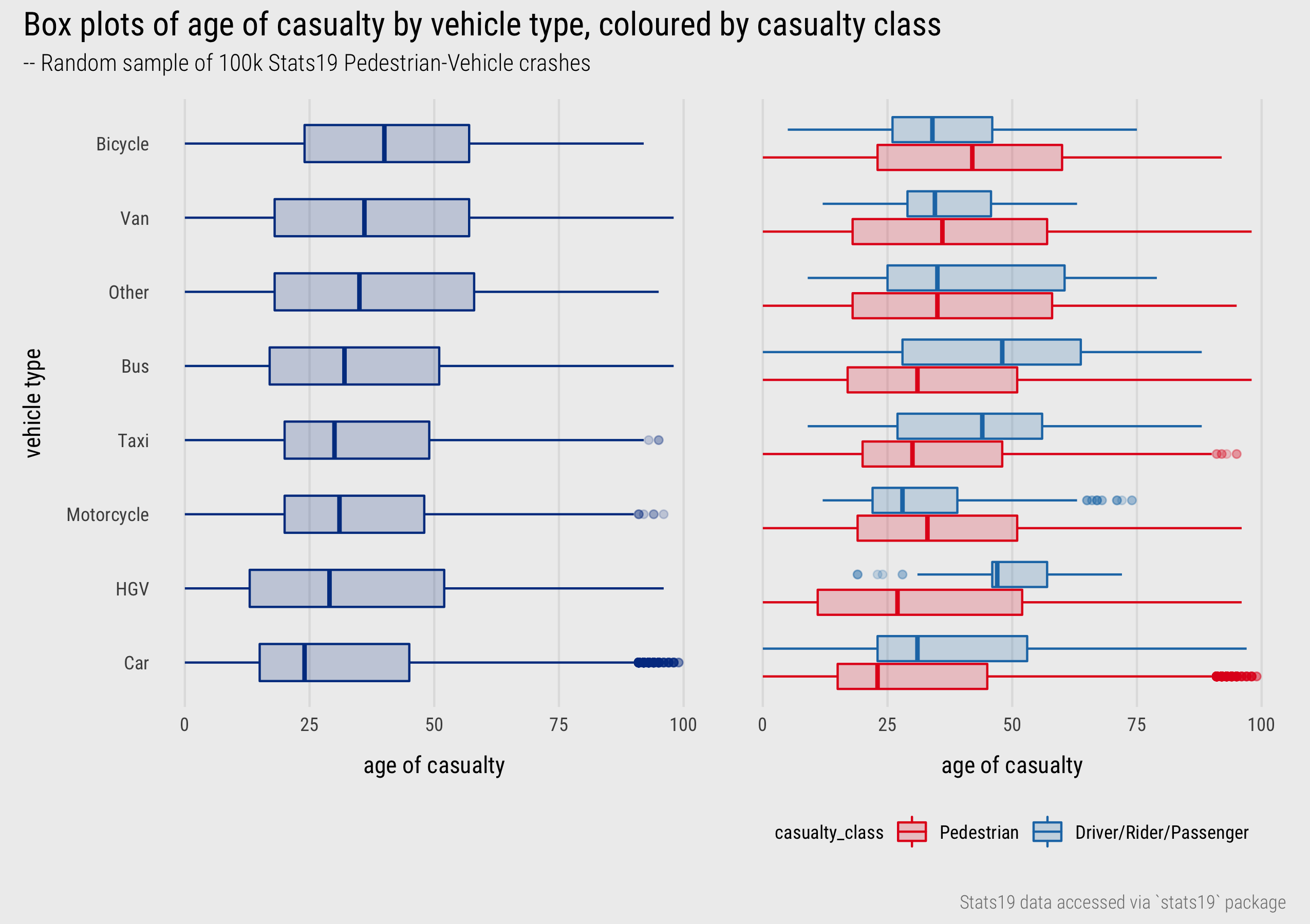
Figure 1: Boxplots of casualty age by vehicle type and class.
This week’s homework is a single visualization design task. Please do not spend too long on this. The aim of this session is to get you to apply some of the technical detail introduced in the session rather than to overly burden you with additional work.
In the session we discussed visual approaches to summarising within-variable variation in a dataset and later the use of layout and colour for supporting comparison across categories. In Figure 1 above, boxplots are used to summarise the age distribution of those involved in pedestrian road crashes, comparing the ages of the injured pedestrians, drivers and how this varies by the vehicle types involved.
Your task is to generate a single data graphic (I would class Figure 1 as a single graphic) to summarise how casualty age varies by some other interesting combination of categorical variable. For example, you may wish to explore how casualty age varies by injury severity.
Once you have generated the graphic, save it as a .png file and insert a link to it in the associated code block in the 04-template.Rmd. Next, complete the table that asks you to describe your graphic according to its visual encoding. After the table, and using no more than three sentences, note how your graphic and any computed values support comparison – e.g. via juxtaposition, superposition and/or direct encoding (Gleicher and Roberts 2011).
- Save your plot as a
.pngfile and insert the file as a Figure into your.Rmddocument (guidance here).
#######################
# Enter your code in the chunk provided.
######################| Data item | Measurement level | Visual mark | Visual channel |
|---|---|---|---|
location |
|||
... |
... |
... |
... |
... |
... |
... |
... |
... |
... |
... |
... |
... |
... |
... |
... |
... |
... |
... |
... |
#######################
# Text here explaining how your graphic, and any computed values, support comparison. No more than three sentences.
######################