Visualization for exploratory data analysis: using colour and layout for comparison
Contents
By the end of this session you should gain the following knowledge:
- An appreciation of the exploratory data analysis (EDA) worklow.
- The main chart types (or idioms Munzner 2014) for summarising variation within- and between- variables.
- The three strategies that can be used for supporting comparison in EDA: juxtaposition, superposition and direct encoding (Gleicher and Roberts 2011)
By the end of this session you should gain the following practical skills:
- Write
ggplot2specifications that use colour and layout to support comparison.
Introduction
Exploratory Data Analysis (EDA) is a data-driven approach to analysis which aims to expose the properties and structure of a dataset, and from here suggest directions for analytic inquiry. In an EDA, relationships are quickly inferred, anomalies labelled, assumptions tested and new hypotheses and ideas are formulated. EDA relies heavily on visual approaches to analysis – it is common to generate many dozens of (often throwaway) data graphics.
This session will demonstrate how the concepts and principles introduced previously – of data types and their visual encoding – can be applied to support EDA. It will do so by analysing STATS19, a dataset containing detailed information on every reported road traffic crash in Great Britain that resulted in personal injury. STATS19 is highly detailed, with many categorical variables. This session will start by revisiting commonly used chart idioms (Munzner 2014) for summarising within-variable variation and between-variable co-variation in a dataset. It will then focus more directly on the STATS19 case, and how detailed comparison across many categorical variables can be effected using colour, layout and statistical computation.
Concepts
Exploratory data analysis and statistical graphics
The simple graph has brought more information to the data analyst’s mind than any other device.
John Tukey
In an Exploratory Data Analysis (EDA), graphical and statistical summaries are variously used to build knowledge and understanding of a dataset. The goal of EDA is to infer relationships, identify anomalies and test new ideas and hypotheses: it is a knowlegde-building activity. Rather than a formal set of techniques, EDA should be considered an approach to analysis. It aims to reveal the underlying properties of variables in a dataset (central tendency and dispersion) and their structure (how variables relate to one another) and from there formulate hypotheses to be investigated.
Wickham and Grolemund (2017) identify two main questions that an EDA should address:
- What type of variation occurs within variables of a dataset?
- What type of covariation occurs between variables of a dataset?
| Measurement | Statistics | Chart idiom |
|---|---|---|
| Within-variable variation | ||
Nominal
|
mode | entropy | bar charts, dot plots … |
Ordinal
|
median | percentile | bar charts, dot plots … |
Continuous
|
mean | variance | histograms, box plots, density plots … |
| Between-variable variation | ||
Nominal
|
contingency tables | mosaic/spine plots … |
Ordinal
|
rank correlation | slope/bump charts … |
Continuous
|
correlation | scatterplots, parallel coordinate plots … |
You will recall from early statistics classes, usually under the theme descriptive statistics, that when summarising within-variable variation, we are interested in a variable’s spread or dispersion and its location within this distribution (central tendency). Different statistics can be applied, but a familiar distinction is between measures of central tendency that are or are not robust to outliers (e.g. mode and median versus mean). Correlation statistics are most obviously applied when studying between-variable covariation, but other statistics, such as odds ratios and chi-square tests are commonly used when studying covariation in contingency tables.
Decisions around which statistic to use depend on a variable’s measurement-level (e.g. Table 1). As demonstrated by Anscombe’s quartet, statistical summaries can hide important structure, or assume structure that doesn’t exist. None of the measures of central tendency in Table 1 would expose whether a variable for instance is multi-modal and only when studying all measures of central tendency and dispersion together might it be possible to guess at the presence of outliers that could undermine statistical assumptions. It is for this reason that data visualization is seen as intrinsic to EDA (Tukey 1977).
Plots for continuous variables
Within-variable variation: histograms, desity plots, boxplots
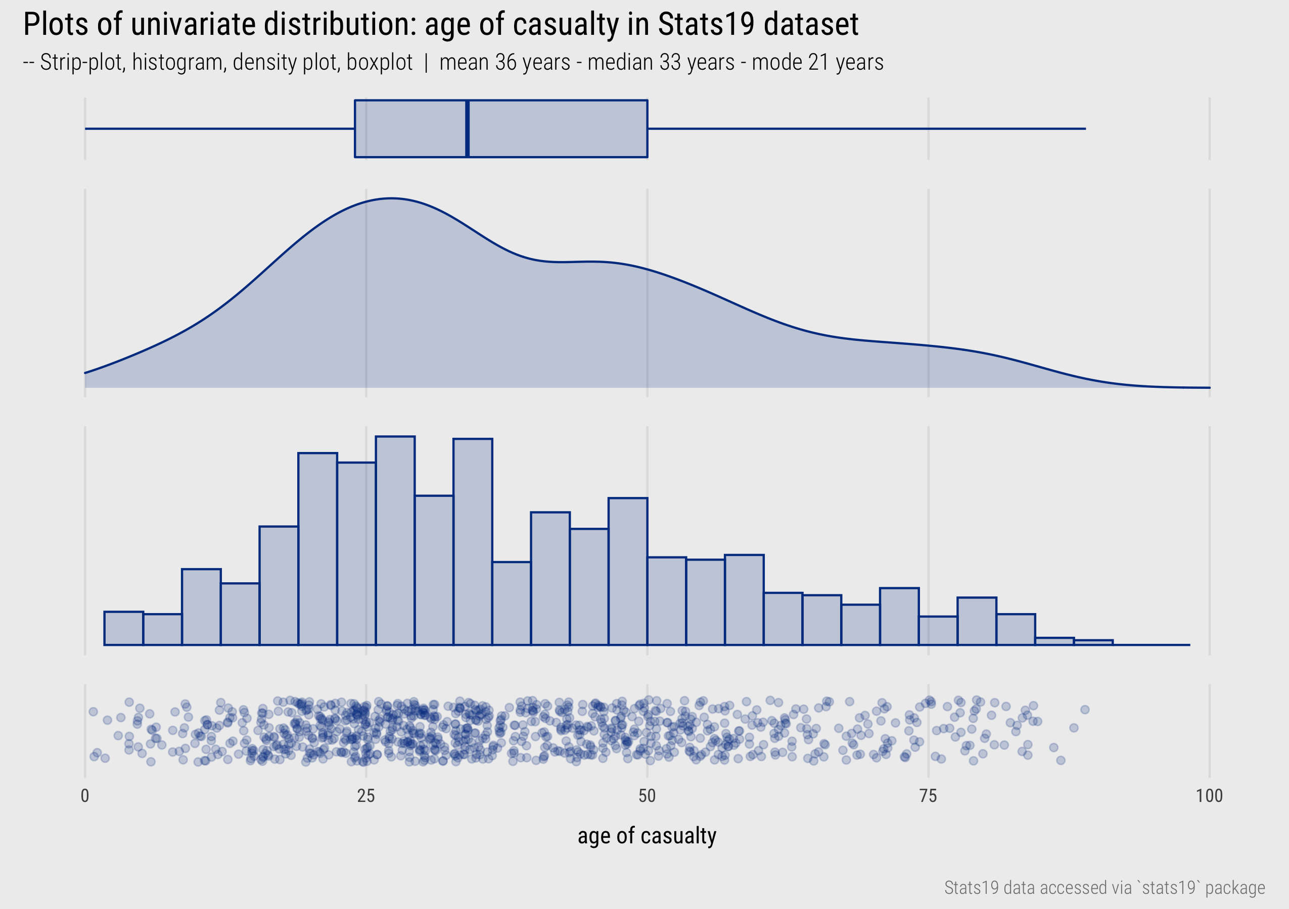
Figure 1: Univariate plots of dispersion.
Figure 1 presents statistical graphics that are commonly used to display the distribution of continuous variables measured on a ratio or interval scale – in this instance the age of casualty for a random sample of Stast19 road crashes (casualty_age).
In the bottom row is a strip-plot. Every observation is displayed as a dot and mapped to x-position, with transparency and a random vertical perturbation applied to resolve occlusion due to overlapping observations. Although strip-plots scale poorly, the advantage is that all observations are displayed without the need to impose an aggregation. It is possible to visually identify the location of the distribution – denser dots towards 20-25 age range – but also that there is quite a degree of spread across the age values.
Histograms were used in the previous session when analysing the 2019 UK General Election dataset. Histograms partition continuous variables into equal-range bins and observations in each bin are counted. These counts are encoded on an aligned scale using bar height. Increasing the size of the bins increases the resolution of the graphical summary. If reasonable decisions are made around choice of bin, histograms give distributions a “shape” that is expressive. It is easy to identify the location of a distribution and, in using length on aligned scale to encode frequency, estimate relative densities between different parts of the distribution. Different from the strip-plot, the histogram allows us to intuit that despite the heavy spread, the distribution of casualty_age is right-skewed, and we’d expect this given the location of the mean (36 years) relative to the median (33 years).
A problem with histograms is the potential for discontinuities and artificial edge-effects around the bins. Density plots overcome this and can be thought of as smoothed histograms. They use kernel density estimation (KDE) to show the probability density function of a variable – the relative amount of probability attached to each value of casualty_age. As with histograms, there are decisions to be made around how data are partitioned into bins (or KDE bandwidths). From glancing at the density plots an overall “shape” to the distribution can be immediately derived. It is also possible to infer statistical properties: the mode of the distribution (the highest density), the mean (by visual averaging) and median (finding the midpoint of the area under the curve). Density plots are better suited to datasets that contain a reasonably large number of observations and due to the smoothing function it is possible to generate a density plot that suggests nonsensical values (e.g. negative ages in this case if I hadn’t censored the plot range).
Finally, boxplots, or box and whisker plots (McGill and Larsen 1978), encode the statistical properties that we infer from strip-plots, histograms and density plots directly. The box is the interquartile range (\(IQR\)) of the casualty_age variable, the vertical line splitting the box is the median, and the whiskers are placed at observations \(\leq 1.5*IQR\). Whilst we lose information around the shape of a distribution, box-plots are space-efficient and useful for comparing many distributions at once.
This discussion was a little prosaic – we haven’t made too many observations to advance our knowledge of the dataset. I was surprised at the low average age of road casualties and so quickly explored the distribution of casualty_age conditioning on another variable and differentiating between variable values using colour. Figure 2 displays boxplots of the location and spread in casualty_age by vehicle type (left) and also by casualty_class for all crashes involving pedestrians. A noteworthy pattern is that riders of bicycles and motorcycles tend to be younger than the pedestrians they are contacting with, whereas for buses, taxis, HGVs and cars the reverse is true. Pedestrians involved in crashes with cars are especially skewed towards the younger ages.
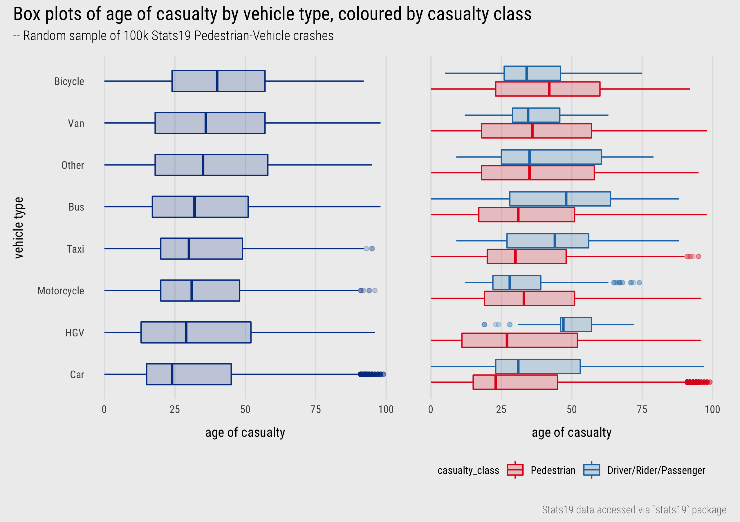
Figure 2: Boxplots of casualty age by vehicle type and class.
Between-variable covariation: scatterplots
The previous session included several scatterplots for displaying association between two quantitative variables. Scatterplots are used to check whether the association between variables is linear, as in Anscombe’s quartet, but also to make inferences about the direction and intensity of linear correlation between variables – the extent to which values in one variable depend on the values of another – and also around the nature of variation between variables – the extent to which variation in one variable depends on another (heteroscedasticity). Although other chart idioms (Munzner 2014) for displaying bivariate data exist, empirical studies in Information Visualization have demonstrated that aggregate correlation statistics can be reliably estimated from scatterplots (Rensink and Baldridge 2010; Harrison et al. 2014; Kay and Heer 2016; Correll and Heer 2017a).
There are few variables in the STATS19 dataset measured on a continuous scale, but based on the analysis above, we may wish to explore more directly whether an association exists between the age of pedestrians and drivers for pedestrian-vehicle crashes. The scatterplots in Figure 3 show that no obvious linear association exists.
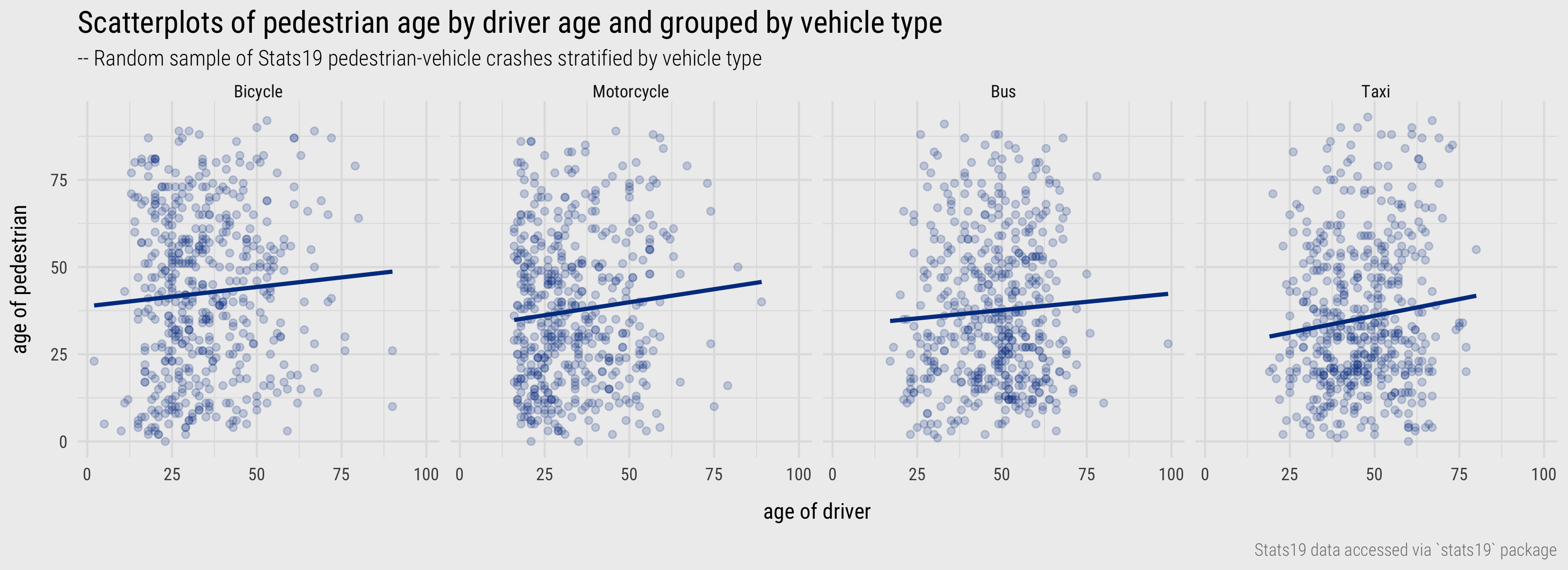
Figure 3: Scatterplots of pedestrian age by driver age and grouped by vehicle type.
Plots for categorical variables
Within-variable variation: bars, dotplots, heatmaps
With categorical variables we are interested in exploring how relative frequencies distribute across the variable’s categories. Bar charts are most commonly used. As established in the previous session, length is an efficient visual channel for encoding quantities, counts in this case. Often it is useful to flip bar charts on their side so that category labels are arranged horizontally for ease of reading and, unless there is a natural ordering to categories, arrange the bars in descending order based on their frequency, as in Figure 4.
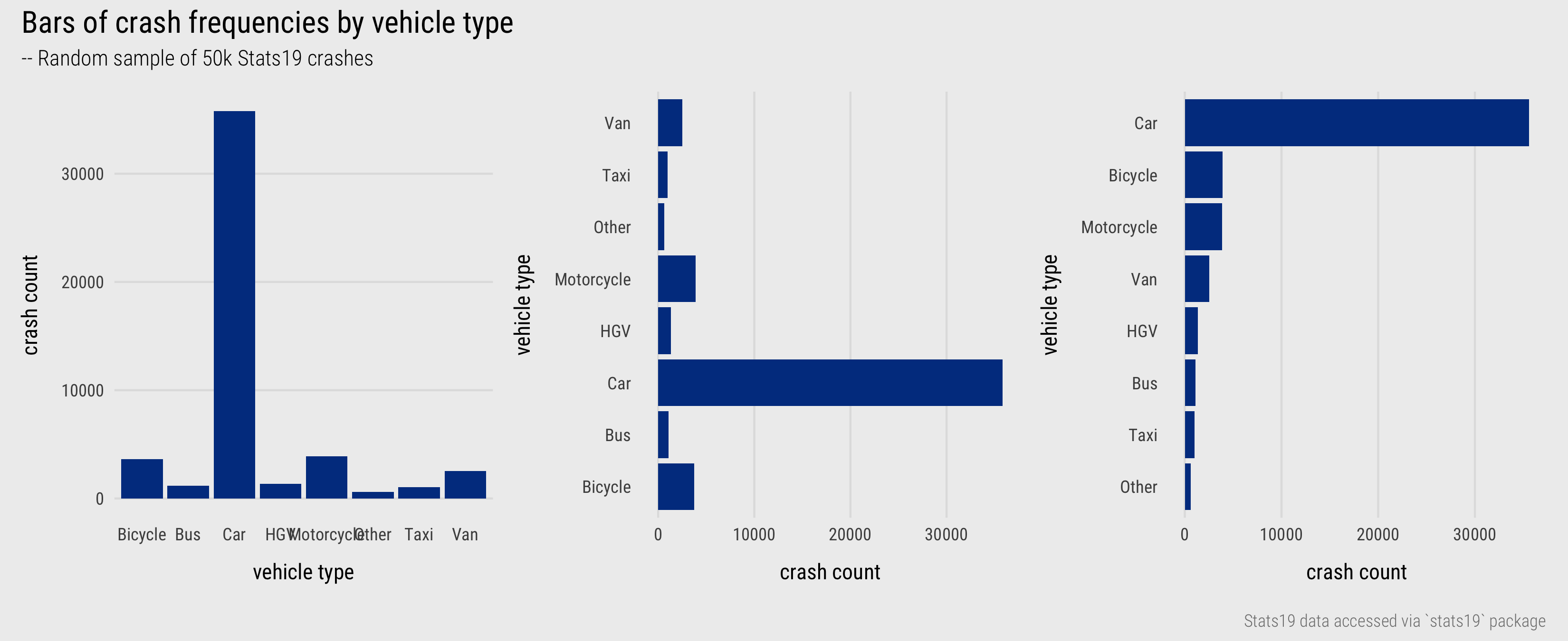
Figure 4: Bars displaying crash frequencies by vehicle type.
Bar charts are effective at conveying frequencies where the number of categories is reasonably small. For summarising frequencies across many categories, alternatives chart types that minimise non-data-ink, such as Cleveland dot plots and heatmaps may be appropriate. The left plot in Figure 5 displays crash counts for boroughs in London, ordered by crash frequency and grouped by whether boroughs are in inner- or outer- London. To the right is a heatmap with the same ordering and grouping of boroughs applied to the rows and with columns coloured according to crash frequencies by time period and further grouped by day of week. From scanning the graphic we can make several observations: that reported crashes tend to occur in the midday or evening peak (the middle two columns of a day are typically darker); that in relative terms there are more crashes recorded in outer London boroughs than inner London boroughs during the middle of the day on weekends (salient dark strips corresponding with midday Saturday and Sunday).
) and heatmaps summarising crash frequencies by London borough and period of day.](../../class/04-class_files/borough-freqs.png)
Figure 5: Cleveland dot plots and heatmaps summarising crash frequencies by London borough and period of day.
Between-variable covariation: contingency tables, standardised bars, mosaic plots
To study the association between two categorical variables, contingency tables are routinely used. Each cell in a contingency table is the joint frequency of two category outcomes occurring together. The contingency table below (Table 2) looks at how crashes by vehicle type co-vary with injury severity. The question being posed is:
- Are crashes involving certain vehicle associated with more/less severe injury than others?
The table presents counts by injury severity for pedestrians only; so these are pedestrians being hit by cars, vans, bicycles etc. Injury severity is either slight or serious/fatal (KSI).
| Vehicle type | KSI | Slight | Row Total |
|---|---|---|---|
| Car | 42305 | 137924 | 180229 |
| Van | 3786 | 11422 | 15208 |
| Taxi | 2580 | 9188 | 11768 |
| Bus | 2951 | 8425 | 11376 |
| Motorcycle | 2137 | 7102 | 9239 |
| HGV | 2030 | 3195 | 5225 |
| Other | 1096 | 3302 | 4398 |
| Bicycle | 1033 | 3184 | 4217 |
| Column Total | 57918 | 183742 | NA |
To display these quantities graphically we could update our earlier bar chart to create stacked bars that use colour to distinguish injury severity (Figure 6). Injury severity is an ordinal variable and the choice of colour in Figure 6 reflects this order – dark red for KSI, light red for slight.
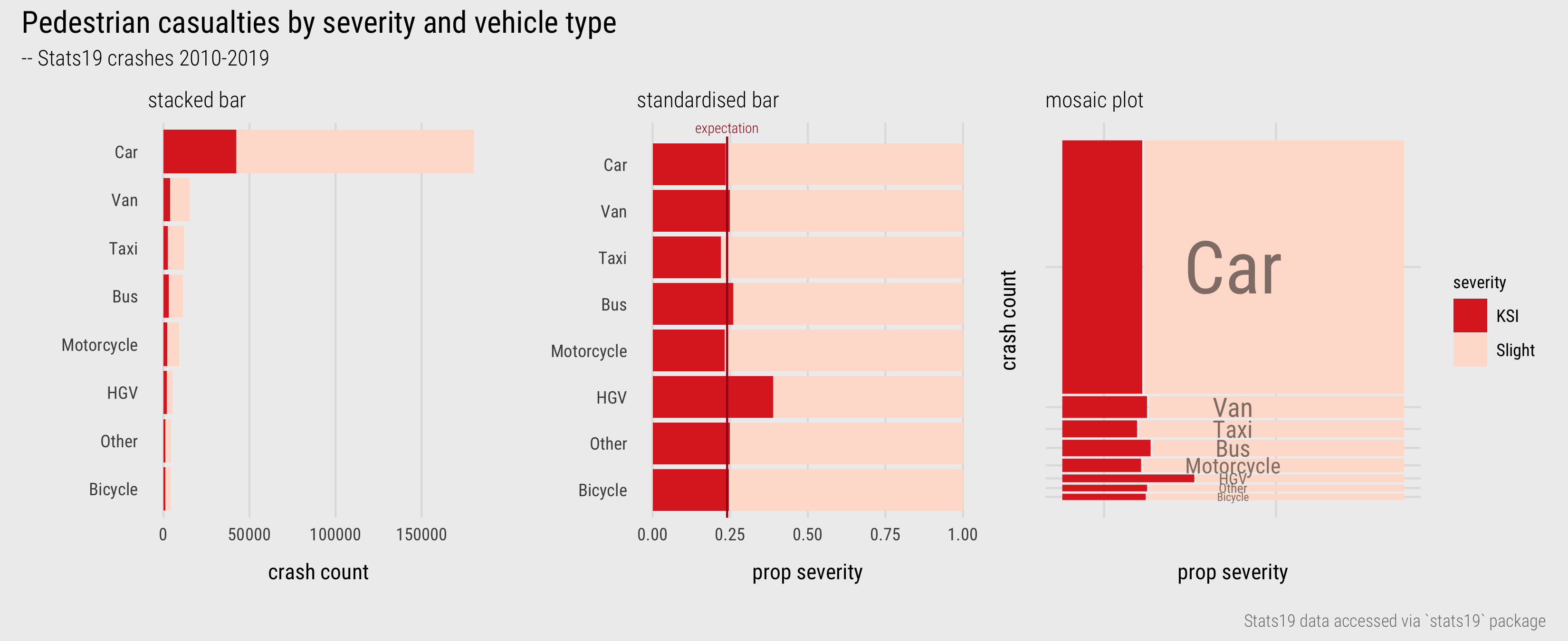
Figure 6: Bars (and Mosaic plot) displaying association between vehicle type and injury severity.
Cars are by far the dominant travel mode, causing the largest number of slight and serious injuries to pedestrians. Whether or not cars result in more severe injury rates than other travel modes is not clear from the left-most chart. Length effectively encodes absolute crash counts but relative comparison of injury severity between vehicle types is challenging. The graphic can be reconfigured to emphasise relative comparison – fixing the absolute length of bars and splitting the bars according to proportional injury severity (middle). Now we see that relative injury severity of pedestrians – KSI as a proportion of all crashes – varies slightly between modes (c.22% Taxis - c.26% Buses) except for HGVs where around 40% of crashes result in a serious injury or fatality to the pedestrian. However, we lose a sense of the absolute numbers involved.
This can be problematic in an EDA when comparisons of absolute and relative frequencies over many category combinations are made. For combinations in a contingency table that are rare, for example bicycle-pedestrian casualties, it may only take a small number observations in a particular direction to change the KSI rate. Since proportional summaries are agnostic to sample size, they can induce false discoveries, overemphasising patterns that may be unlikely to replicate. It is sometimes desirable, then, to update standardised bar charts so that they are weighted by frequency – to make more visually salient those categories that occur more often and visually downweight those that occur less often. This is possible using mosaic plots (Friendly 1992). Bar widths and heights are allowed to vary; so bar area is proportional to absolute number of observations and bars are further subdivided for relative comparison across category values. Mosaic plots are useful tools for exploratory analysis. That they are space-efficient and regularly sized (squarified) means that that they can be laid out for comparison.
ggmosaic package, an extension to ggplot2. We won’t cover the details of how to implement Mosaic plots in this session. Should you wish to apply them as part of the data challenge element of the homework for this session, ggmosaic’s documentation pages are an excellent resource.
Deriving effect sizes from contingency tables
When generating the contingency table on which these plots are based, there are some implied questions:
- Does casualty severity vary depending on the type of vehicle involved in the crash?
- For which vehicle types is injury severity the highest or lowest?
An imbalance is clearly to be expected, but we may start by assuming that injury severity rates, the proportion of pedestrian injuries that are KSI, is independent of vehicle type and look to quantify and locate any imbalance in these proportions. This happens automatically when comparing the relative widths of the dark red bars in Figure 6. Annotating with an expectation – e.g. the injury severity rate for all pedestrian casualties (middle plot) – helps to further locate differences from expectation for specific vehicles.
Effect size estimates could also be computed directly using risk ratios (RR) – comparing the observed severity rates by vehicle type against an expectation of independence of severity rates by vehicle type. From this, we could find that the RR for HGVs is 1.64: a crash involving an HGV is 64% more likely to result in a fatality or serious injury to the pedestrian than one not involving an HGV. Alternatively, we could calculate signed chi-score residuals (Visalingam 1981), a measure of effect size that is sensitive both to absolute and relative differences from expectation. Expected values are counts calculated for each observation (each cell in our contingency table). Observations (\(O_i ... O_n\)) are then compared to expected values (\(E_i ... E_n\)) as below:
\(\chi=\frac{O_i - E_i}{\sqrt{E_i}}\)
The way in which the differences (residuals) between observed and expected values are standardised in the denominator is important. If the denominator was simply the raw expected value, the residuals would express the proportional difference between each observation and its expected value. The denominator is instead transformed using the square root (\(\sqrt{E_i}\)), which has the effect of inflating smaller expected values and squashing larger expected values, thereby giving greater saliency to differences that are large in both relative and absolute number. The Mosaic plot sort of does this visually.
Expected values are calculated in the same way as the standard chi-square statistic that tests for independence – so in this case, that counts of crashes by vehicle type distribute independently of injury severity (Slight or KSI) – and can be derived from the contingency table:
\(E_i = \frac{C_i \times R_i}{GT}\)
So for an observed value (\(O_i\)), \(C_i\) is its column total in the contingency table; \(R_i\) is its row total; and \(GT\) is the grand total. Below is the contingency table updated with expected values and signed-chi-scores. A score \(>0\) means that casualty counts for that injury type and vehicle is greater than expected; a score \(<0\) means casualty counts for that injury type and vehicle is less than expected. The signed chi-square residuals have mathematical properties and can be interpreted as any standard score. They are assumed to have a mean \(\sim1\) and standard deviation of \(\sim0\), with residuals of \(±2\) having statistical “significance”.
| Vehicle type | KSI | Slight | Row Total | KSI Exp | Slight Exp | KSI Resid | Slight Resid |
|---|---|---|---|---|---|---|---|
| Car | 42305 | 137924 | 180229 | 43195 | 137034 | -4.28 | 2.40 |
| Van | 3786 | 11422 | 15208 | 3645 | 11563 | 2.34 | -1.31 |
| Taxi | 2580 | 9188 | 11768 | 2820 | 8948 | -4.53 | 2.54 |
| Bus | 2951 | 8425 | 11376 | 2726 | 8650 | 4.30 | -2.41 |
| Motorcycle | 2137 | 7102 | 9239 | 2214 | 7025 | -1.64 | 0.92 |
| HGV | 2030 | 3195 | 5225 | 1252 | 3973 | 21.98 | -12.34 |
| Other | 1096 | 3302 | 4398 | 1054 | 3344 | 1.29 | -0.73 |
| Bicycle | 1033 | 3184 | 4217 | 1011 | 3206 | 0.70 | -0.39 |
| Column Total | 57918 | 183742 | NA | NA | NA | NA | NA |
The benefit for EDA is that the signed-scores are very quick and easy to compute, can be derived entirely from the contingency table without applying prior knowledge. They help to identify and locate anomalies, or deviations from expectation, in a way that is sensitive to both absolute and relative numbers. A common workflow in EDA is (e.g. Correll and Heer 2017b):
- Expose pattern
- Model an expectation derived from pattern
- Show deviation from expectation.
The heatmap in Figure 5 is effectively a contingency table, so we could demonstrate this by generating a modelled expectation – signed chi-score residuals for each cell. Figure 7 does this for days of the week and periods of the day separately. The signed residuals are mapped to a diverging colour scheme – purple for cells with fewer crash counts than expected, green for cells with more crash counts than expected. To simplify things a little I generated heatmaps separately for day of week and period of day. In each case the assumption, the modelled expectation, is that crash counts by borough distribute independently of day of week or period of day.
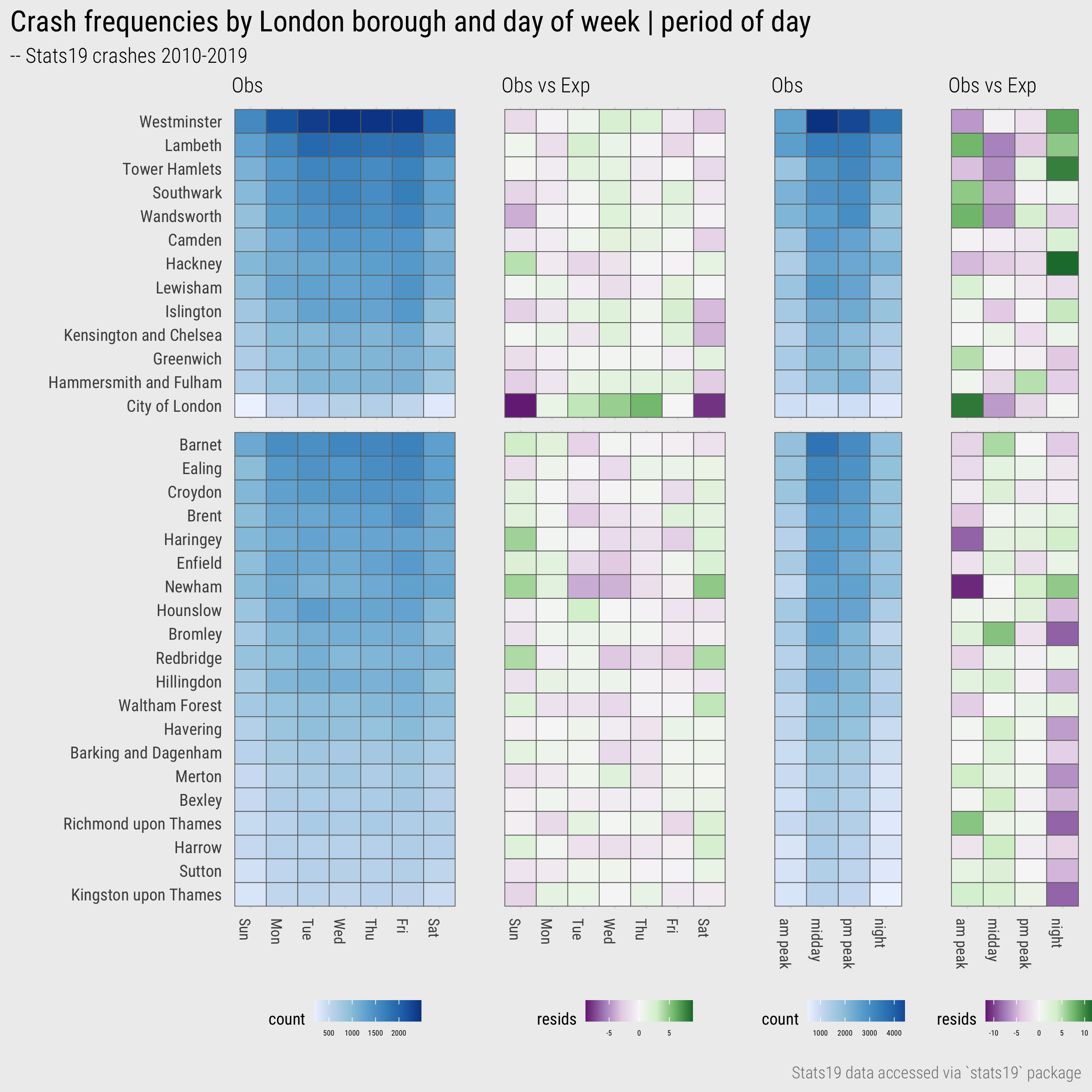
Figure 7: Heatmaps of crashes by day and time period for London Boroughs.
Looking first by day of week, we see that inner London boroughs generally have fewer than expected crash counts during the weekends and that the reverse is true for outer London boroughs – the first column (Sunday) and last column (Saturday) are purple for the top half of the graphic and green for the bottom half. Unsurprisingly this pattern is most extreme for City of London, London’s financial centre. Looking a little more closely at the outer London boroughs we can also identify where this tendency is stronger: Enfield and Haringey, Newham, Redbridge and Waltham Forest. With some knowledge of London’s social and economic geography we could speculate around these patterns and investigate further as part of our EDA. Notice also that whilst we can interpret the direction of relative differences using colour hue (green:positive | purple:negative) for boroughs containing comparatively few crashes (bottom of graphic), these patterns are de-emphasised by the chi-score residuals which are mapped to colour value (lightness).
For the period of day heatmap, the pattern is of higher than expected crash frequencies at night for particular inner London boroughs – Westminster, Lambeth, Tower Hamlets and especially Hackney – and lower than expected for particular outer London boroughs – Kingston upon Thames, Bromley, Richmond upon Thames. For the morning peak, City of London, Wandsworth, Southwark and Lambeth contain greater than expected crash frequencies. Again, with knowledge of London’s geography, one could speculate about why this might be the case and investigate further.
After reading this section, you might have felt that the process of generating modelled expectations extends beyond an initial EDA. I’d argue that the sort of statistical computations described above are necessary as when visually analysing raw values the dominant “signal” is one that is often already obvious and subject to heavy confounding variables. We will return to this in the technical element of the session.
Additional aside: The discussion of Risk Ratios (RRs) was reasonably abbreviated. RRs are very interpretable measures of effect size, especially when considered alongside absolute risk (observed KSI rates in this case). As they are a ratio of ratios, and therefore agnostic to sample size, RRs can nevertheless be unreliable. Two ratios might be compared that have very different sample sizes and no compensation is made for the one that contains more data. Although this was our justification for selecting signed chi-scores, this can be addressed by estimating confidence intervals or using robust Bayesian estimates for RRs (representing RRs as distributions) (Greenland 2006).
Supporting comparison with layout and colour
Fundamental to EDA, and to the data graphics above, is the process of comparison. Effective data graphics are arranged in such a way as to support and invite relevant comparison. There are three ways in which this can be achieved (via Gleicher and Roberts 2011):
- Juxtaposition: Laying the data items to be compared side-by-side, for example the regional comparison of Swing in the small multiple histograms that appeared in the previous session.
- Superposition: Laying the data items to be compared on top of each other on the same coordinate space, for example the gendered comparison of trip counts by hour of day and day of week in the line chart in session 2.
- Direct encoding: Computing some comparison values and encoding those values explicitly, for example the signed chi-scores in Figure 7.
Throughout this module you will generate data graphics that support comparison using each of these strategies. Table 4 is a useful guide for their implementation in ggplot2.
| Strategy | Function | Use |
|---|---|---|
| Juxtaposition |
facetting
|
Create separate plots in rows and/or columns by conditioning on a categorical variable. Each plot has same encoding and coordinate space. |
| Juxtaposition |
patchwork
|
Flexibly arrange plots of different data types, encodings and coordinate space. |
| Superposition |
geoms
|
Layering marks on top of each other. Marks may be of different data types but must share the same coordinate space. |
| Direct encoding | NA | No strategy specialised to direct encoding. Often variables cross \(0\) and so diverging schemes, clearly annotated or symbolised thresholds are important. |
As with most visualization design, these strategies require careful implementation. Particularly when juxtaposing views for comparison, it is important to use layout or arrangement in a way that best supports comparison. In the practical we will consider some more routine ways in which plots can be composed to support comparison as we analyse pedestrian casualties in the Stats19 dataset. To demonstrate how layout and colour can be used for effecting spatial comparison, we will return to our analysis of pedestrian injuries by vehicle type, and explore variation by London Borough.
In Figure 8 Westminster and Harrow, two very different London Boroughs, are compared. Bar size heights vary according to absolute number of recorded injuries by vehicle type and widths according to relative number of injuries recorded on weekday versus weekends. Whilst the modal vehicle type involved in pedestrian injuries is the same for both boroughs (cars), it is far more dominant for crashes recorded in the outer London borough of Harrow. Where cars are involved in crashes in Westminster these occur more frequently (when compared with Harrow) on weekends. Notice that Taxis, Motorcycles, Vans and Bicycles take up a reasonable share of crashes involving pedestrian injuries and that for Bicycles, Vans and Motorcycles these occur more frequently on weekdays.
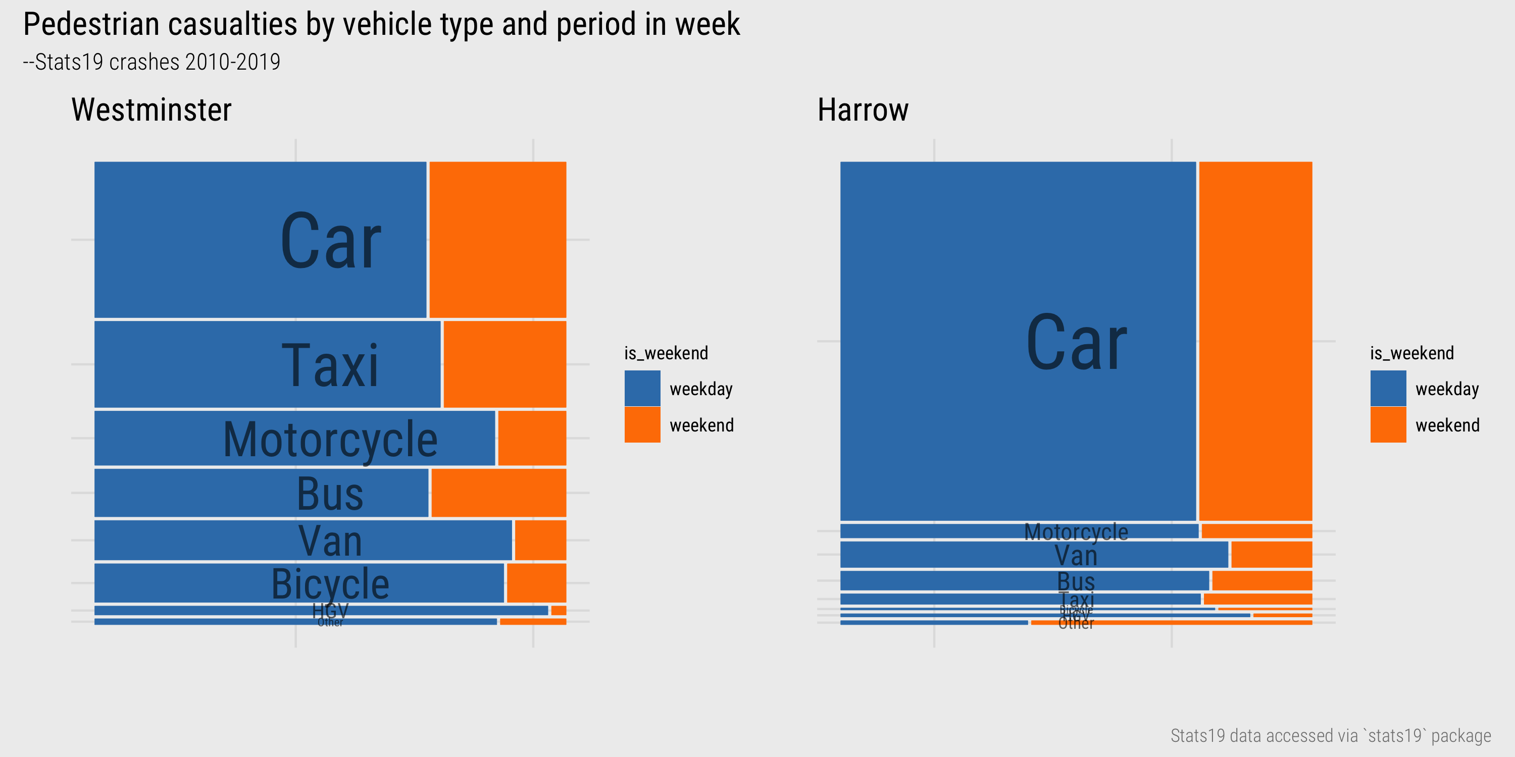
Figure 8: Mosaic plots of vehicle type and injury severity for Westminster and Harrow.
Given these differences, it may be useful to compare across all 33 Boroughs in London, juxtaposing mosaic plots for each borough side-by-side (Figure 9). That the mosaic plots are annotated with labels for each vehicle type whose size varies according to frequency helps with interpretation. However, we can use colour hue to enable selecting and associating of individual vehicle types. This allows very central (City, Westminster, to a lesser extent Camden and Islington) inner (Wandsworth, Southwark, Lambeth) and outer (Croydon, Sutton) London boroughs to be related.
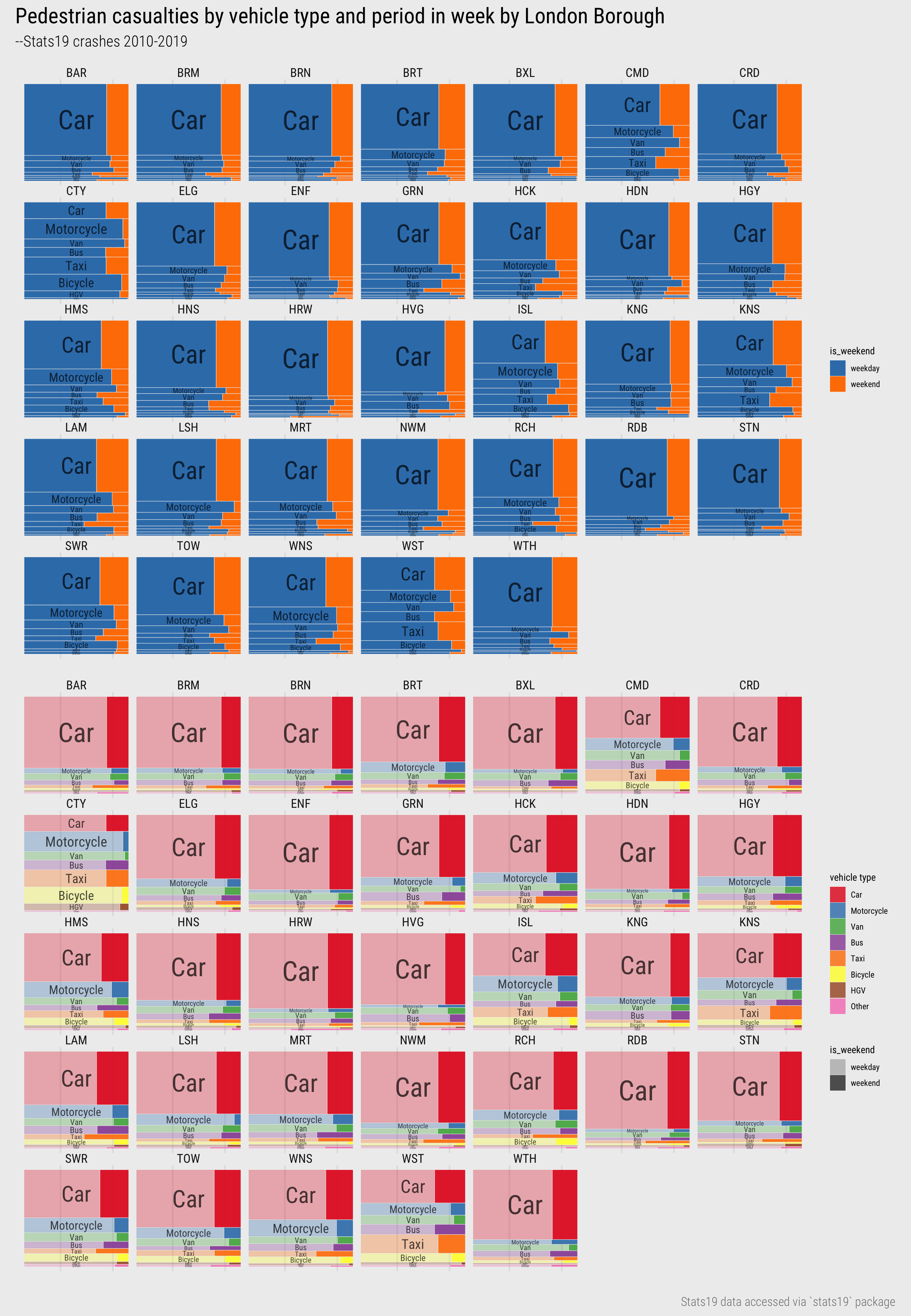
Figure 9: Mosaic plots of vehicle type and injury severity for London Boroughs.
The alphabetical layout of boroughs helps with look-up-type tasks, but since we have already identified that patterns of pedestrian injuries by vehicle type varies by central-inner-outer London, we could further support this comparison by giving the mosaic plots a spatial arrangement, as in Figure 10. This ‘map’ may at first seem alien as you are most likely familiar seeing maps with a precise geographic arrangement. However, when studying spatial patterns in a dataset, such levels of precision are not always needed. Relaxing geography frees up space to introduce richer, more complex designs. In the layout in Figure 10, taken from AfterTheFlood, each borough is represented as a square of regular size and arranged in its approximate geographic position, allowing the centrsl-inner-outer and London distinctions to be more efficiently made.
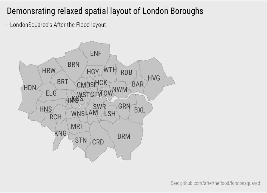
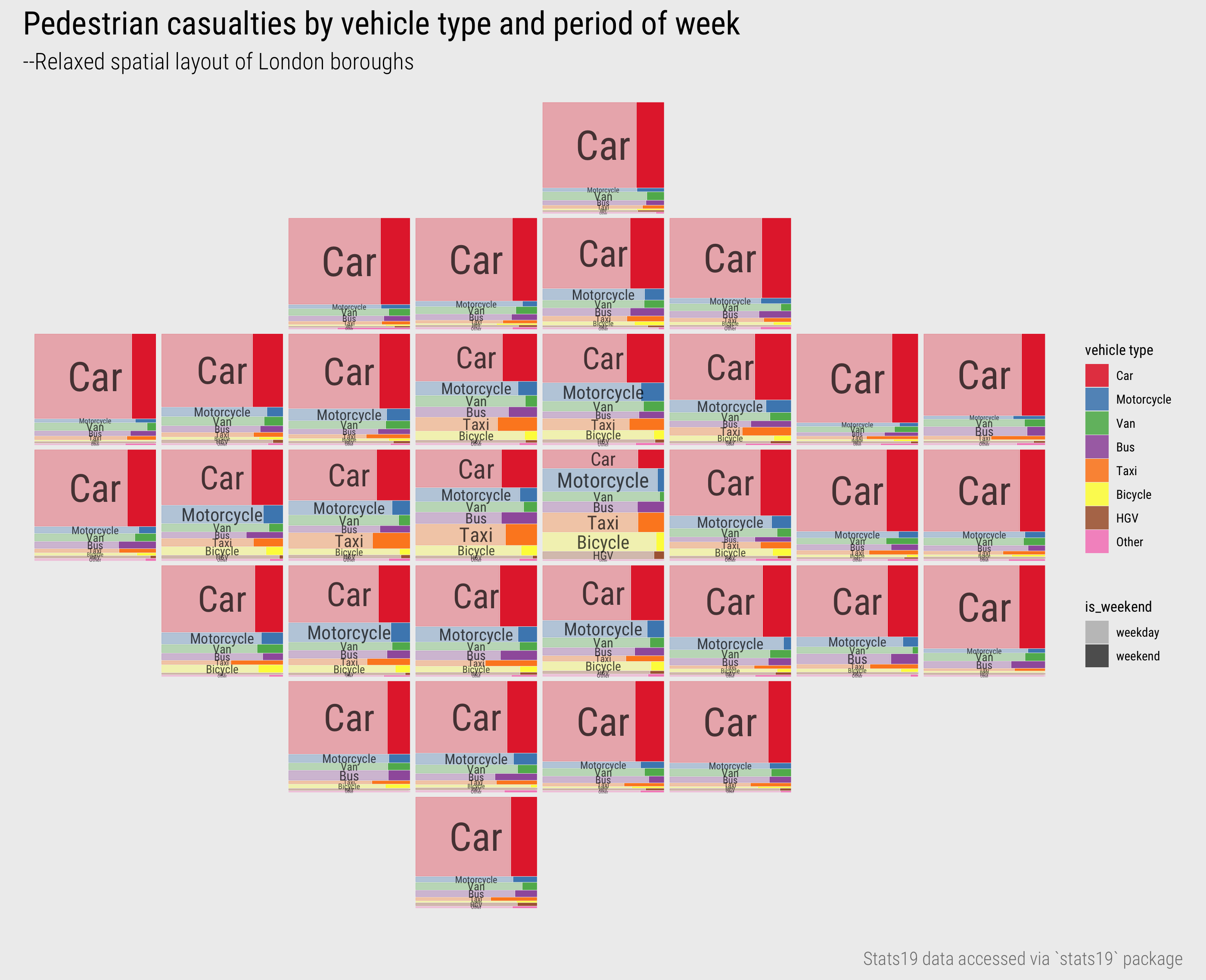
Figure 10: Mosaic plots of vehicle type and injury severity for London Boroughs with spatial arrangement.
Techniques
The technical element to this session continues in our analysis of STATS19 road crash data. After importing and describing the dataset, you will generate statistical summaries and data graphics for analysing pedestrian casualties. You will focus on visual design choices – colour and layout – that support comparison of pedestrian casualties, conditioning on numerous categorical variables held in the STATS19 dataset.
- Download the 04-template.Rmd file for this session and save it to the
reportsfolder of yourvis-for-gdsproject. - Open your
vis-for-gdsproject in RStudio and load the template file by clickingFile>Open File ...>reports/04-template.Rmd.
Import
The template file lists the required packages – tidyverse, sf and also the stats19 package for downloading and formatting the road crash data. STATS19 is a form used by the police to record road crashes that result in injury. Raw data are released by the Department for Transport as a series of .csv files spread across numerous .zip folders. This makes working with the dataset somewhat tedious and behind the stats19 package is some laborious work combining, recoding and relabelling the raw data files.
STATS19 data are organised into three tables:
- Accidents (or Crashes): Each observation is a recorded road crash with a unique identifier (
accident_index), date (date) and time (time), location (longitude,latitude). Many other characteristics associated with the crashes are also stored in this table. - Casualties: Each observation is a recorded casualty that resulted from a road crash. The Crashes and Casualties data can be linked via the
accident_indexvariable. As well as thecasualty_severity(Slight,Serious,Fatal), information on casualty demographics and other characteristics is stored in this table. - Vehicles: Each observation is a vehicle involved in a crash. Again Vehicles can be linked with Crashes and Casualties via the
accident_indexvariable. As well as the vehicle type and manoeuvre being made, information on driver characteristics is recorded in this table.
In 04-template.Rmd is code for downloading each of these tables using the stats19 package’s API. You will collect data on crashes, casualties and vehicles for 2010-2019, so these datasets take a little time to download. For this reason, I suggest that once downloaded you write the data out and read in as .fst. In fact I have made a version of this available for download on a separate repository in case you are having problems with the stats19 download.
The data analysis that follows is concerned with pedestrian-vehicle crashes. Pedestrian casualties resulting from those crashes are filtered with the purpose of exploring how casualties vary by the socio-economic characteristics of the area in which the crashes took place.
The first data processing task is to generate a subset of data describing these casualties and the crashes and vehicles to which they are linked. I provide code for generating this subset. The crashes (crashes_all) and casualties (casualties_all) tables are joined and pedestrian casualties filtered filter(casualty_type=="Pedestrian"). This new table is then joined on vehicles (vehicles_all).
There are some simplifications and assumptions made here. Some pedestrian crashes involve many vehicles, but ideally for the analysis we need a single vehicle (and vehicle type) to be attributed to each crash. For each casualty, the largest vehicle involved in the crash is assigned. This is achieved by filtering all vehicle records in vehicles_all involved in a pedestrian casualty, a semi_join on the pedestrian casualty table. We then recode the vehicle_type variable as an ordered factor, group the vehicles table by the crash identifier (accident_index), and for each crash identify the largest vehicle involved, and then filter these largest vehicles. It is common to have several vehicles of the same type involved in a crash, so a final filter is on a vehicle_reference variable. This is an integer variable starting from 1 to n assigned to each vehicle involved in the crash. I do not know whether there is an inherent order to this variable, but make the assumption that vehicle_reference=1 is the main vehicle involved in the crash. So single vehicles are linked to single casualties based first on the largest vehicle involved and then on vehicle_reference.
A focus for our analysis is around the geo-demographic characteristics of the locations in which crashes occur, and of the pedestrians and vehicles involved in each crash. Collected in the STATS19 dataset is the Indices of Multiple Deprivation decile of the small area neighbourhood in which casualties and drivers live. Often IMD is reported at the quintile level (5 rather than 10 quantiles), and aggregating to this level may be useful as we condition on many categorical variables in our EDA. Code for performing this aggregation using an SQL-style case_when is in the template.
The crashes data does not automatically contain information on the IMD for the location of crashes. However, the neighbourhood area (LSOA) at which IMD is measured is recorded for each crash location. A final bit of data processing code in the template is for downloading the IMD dataset and assigning IMD ranks to quintiles (using an SQL-style ntile() function). IMD measures deprivation for LSOAs in England and so when joining this on the crashes dataset we filter only crashes taking place in England.
Explore
Crash location geodemographics
To start we explore month-on-month frequencies of pedestrian road crashes by IMD of the location in which the crash took place (Figure 11). From this we see that there is some seasonality to pedestrian casualties, that there are more crashes recorded in locations containing higher deprivation – unsurprising as cities tend to contain comparatively high/mid deprivation levels – and that overall recorded pedestrian crash frequencies are reasonably static over the 10-year period.
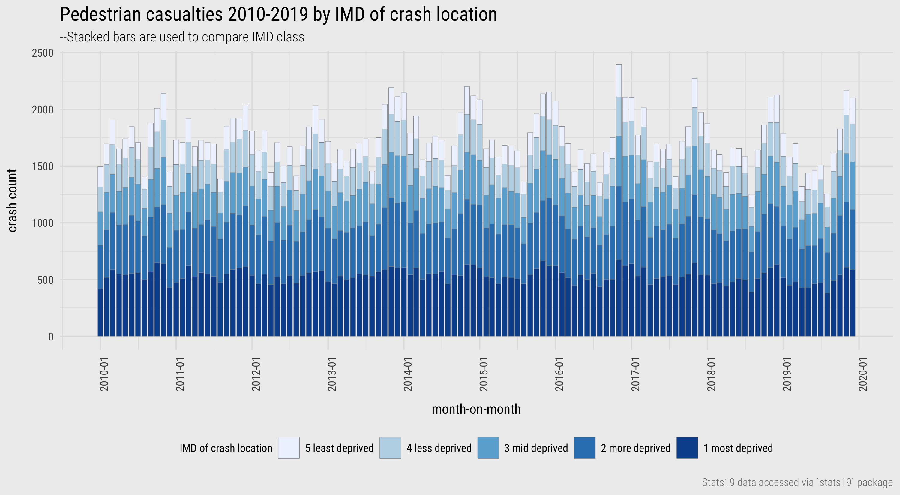
Figure 11: Pedestrian casualties by month and IMD.
The code:
ped_veh %>%
 mutate(year_month=floor_date(date, "month")) %>%
 group_by(year_month,  crash_quintile) %>%
 summarise(total=n()) %>%
 mutate(
   crash_quintile=factor(
     crash_quintile, levels=c("5 least deprived","4 less deprived","3 mid deprived", "2 more deprived", "1 most deprived")
   )
 ) %>%
 ggplot(aes(x=year_month, y=total)) +
 geom_col(aes(fill=crash_quintile),colour="#8d8d8d", size=.1 ) +
 scale_fill_brewer(palette = "Blues", type="seq") +
 scale_x_date(date_breaks = "1 year", date_labels = "%Y-%m")+
 theme(axis.text.x = element_text(angle=90))
The plot specification:
- Data: Create a new variable of the year and month in which crash occurred (
year_month), usinglubridate’sfloor_date()function. Summarise over this and IMDcrash_quintileand makecrash_quintilean ordered factor for charting. - Encoding: Bar length varies according to crash counts, so map the date variable (
year_month) to the x-axis and crash counts (total) to the y-axis. Fill the bars according tocrash_quintile. - Marks:
geom_col()for bars. - Scale:
scale_fill_brewer()for a perceptually valid sequential scheme for IMD – the darker the colour the higher the level of deprivation.scale_x_date()for control over the intervals at which we wish to draw labels on the x-axis. - Setting: A consequence of using very light colours for the low-deprivation quintile is that bar height becomes difficult to discern. We therefore draw thin grey outlines around the bars, specified with
colour="#8d8d8d"andsize=.1. Additionally rotate the date labels 90 degrees to resolve overlaps:axis.text.x=....
With only five data categories (IMD quintiles) and counts that do not differ wildly per category, the stacked bars are reasonably effective. However, to better support trends within category, it is useful to have a common baseline and juxtapose separate charts for crashes in each IMD category (using facet_wrap). This improves height comparison between IMD categories, but also within category temporal trends are easier to detect – for example, that of slightly increasing seasonality across all quintiles, especially in the second most deprived quintile. By default facet_wrap() lays out individual charts across rows and columns. We could instead arrange the bars on top of each other, in rows, by parameterising the call to facet_wrap(): facet_wrap(~crash_quintile, ncol=1).
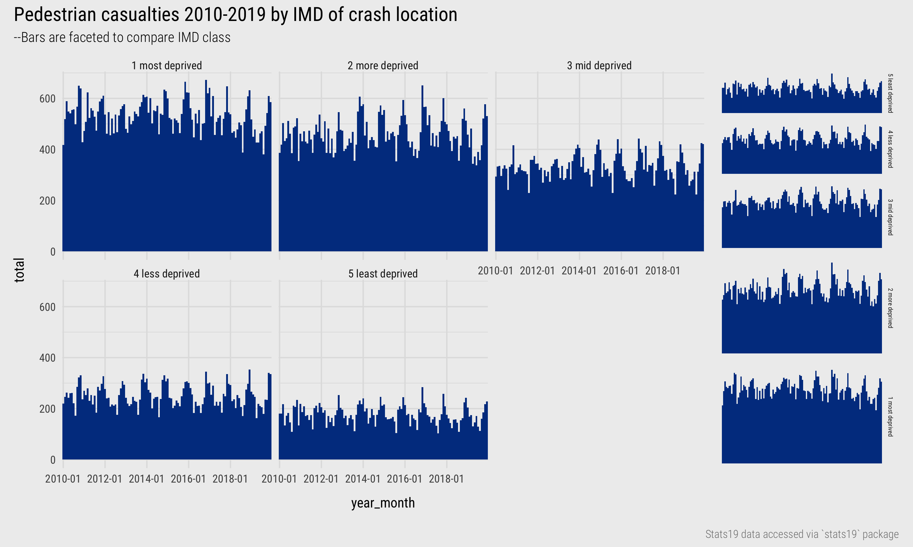
Figure 12: Pedestrian casualties by year and IMD.
Picking seasonality in these plots is still challenging; so too whether overall crashes are increasing or decreasing. To support seasonal comparison we could consider arranging in two dimensions such that the bars are grouped according to year along the columns and by IMD decile along the rows. This can be achieved with facet_grid(). To support relative comparison within IMD decile we may choose to give each IMD decile its own (local) y-axis scaling. Rather than comparing absolute heights between IMD deciles we compare instead relative shapes in the month-on-month bars. To further explore whether crash counts are increasing by year, we include the monthly average by year using a horizontal line. This arrangement – Figure 13 – better exposes the fact that seasonal variation is greater for crashes that occur in the least deprived quintile. There are many speculative explanations for why this might be the case – many confounding factors, also that this may be a spurious observation due to differences in sample size, that would need to be explored/eliminated as part of an EDA.
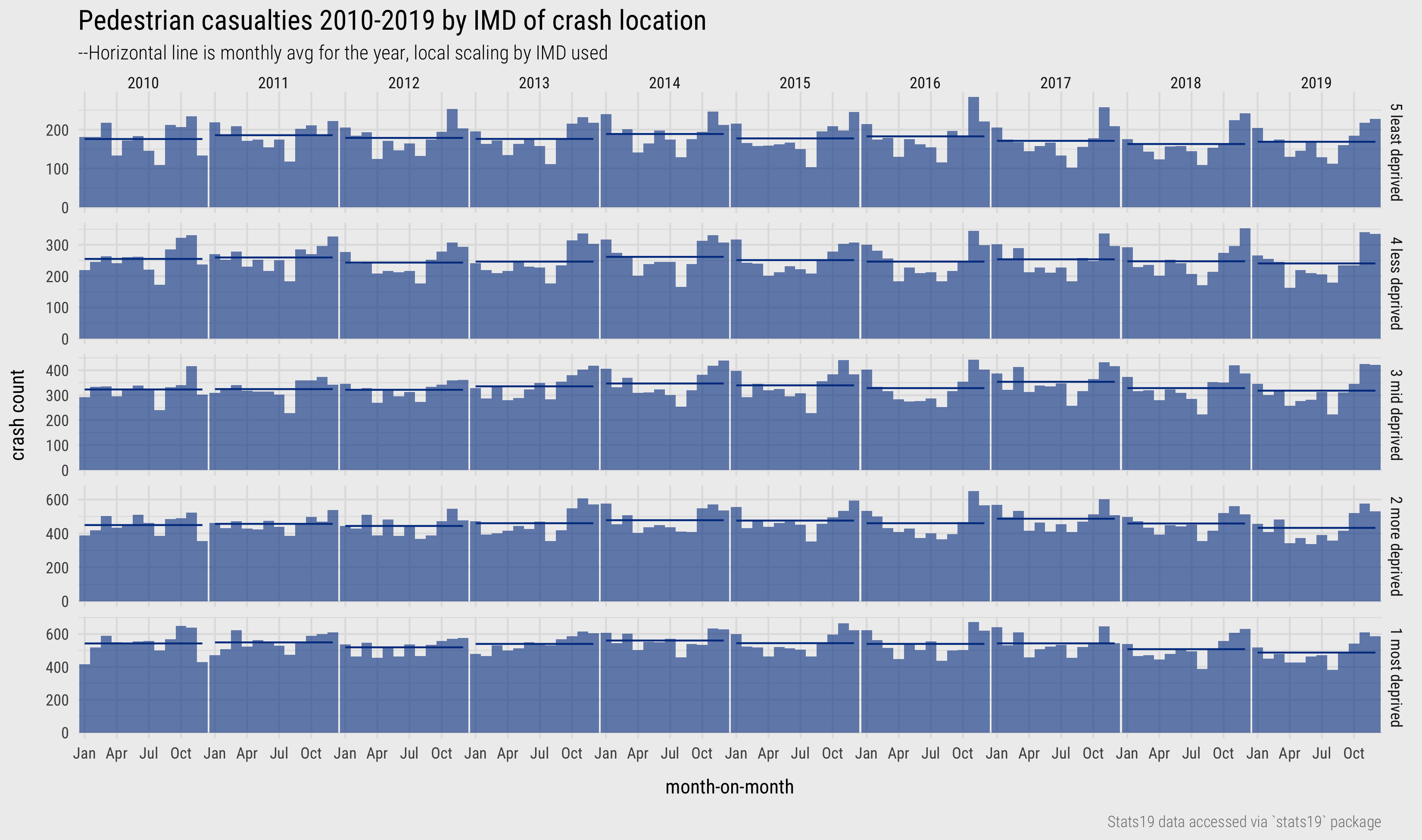
Figure 13: Pedestrian casualties by year and IMD.
The code:
ped_veh %>%
  mutate(
    year=year(date),
    month=month(date, label=TRUE),
  ) %>%
  group_by(year, month,  crash_quintile) %>%
  summarise(total=n()) %>% ungroup() %>%
  group_by(year, crash_quintile) %>%
  mutate(month_avg=mean(total)) %>% ungroup %>%
  mutate(
    crash_quintile=factor(
      crash_quintile, levels=c("5 least deprived","4 less deprived","3 mid deprived", "2 more deprived", "1 most deprived")
    )
  ) %>%
  ggplot(aes(x=month, y=total)) +
  geom_col(width=1, alpha=.6)+
  geom_line(aes(y=month_avg, group=interaction(year, crash_quintile))) +
  scale_x_discrete(breaks=c("Jan", "Apr", "Jul", "Oct")) +
  facet_grid(crash_quintile~year, scales="free_y")
The plot specification:
- Data: Create new variables for the year and month in which crash occurred using
lubridatefunctions. Summarise over this and IMDcrash_quintile. Also generate amonthly_avgvariable, grouping by year and IMD but not month. - Encoding: Bar length varies according to crash counts by month, so map the month variable (
month) to the x-axis and crash counts (total) to the y-axis. The monthly average lines use the same coordinate space as the bars, so x-position remains unchanged, but the y-position is the monthly average variable rather than month count. We need to explicitly say how the lines are grouped – a concatenation of year and IMD, specified viainteraction(). This is withinaes()as it describes encoding of the lines with data, not some additional setting. - Marks:
geom_col()for bars,geom_line()for lines. - Scale:
scale_x_discretefor control over the intervals at which we wish to draw labels on the x-axis. Our x-axis variable is an ordered factor and we supply a vector of the months that we wish to label. - Facets:
facet_grid()for faceting on two variables. Parameterise withscales="free_y"in order to apply a local scaling and therefore support relative comparison by month within IMD group (at the expense of absolute number between IMD). - Setting: De-emphasise the bars in order to see the monthly average reference lines by applying transparency (
alpha).
Crash location and driver purpose
Collected in the STATS19 vehicles table is the reported journey purpose of the driver. Prior to 2011 this field was not available and unfortunately is “not known” for a large proportion (67%) of pedestrian-vehicle crashes. Figure 14 is an updated version of the previous plot, but with bars additionally coloured by journey purpose. Persisting with the analysis of monthly frequencies is useful here as it exposes the fact that an “Other” category has been used inconsistently over time. Further investigation of what this category constitutes is therefore necessary. We would also want to explore in detail the nature of non-reporting – whether there is systematic biases here. Any inferences drawn from Figure 14 are therefore very speculative, but it does appear that the “school run” is reported more frequently in relative terms for crashes occurring in the least deprived quintile – relatively more blue (“school run”) and less green (“commute”). Again, there are speculative explanations for this that could be investigated as part of an EDA and an immediate task might be to update the plot to make the bars standardised (equal height).
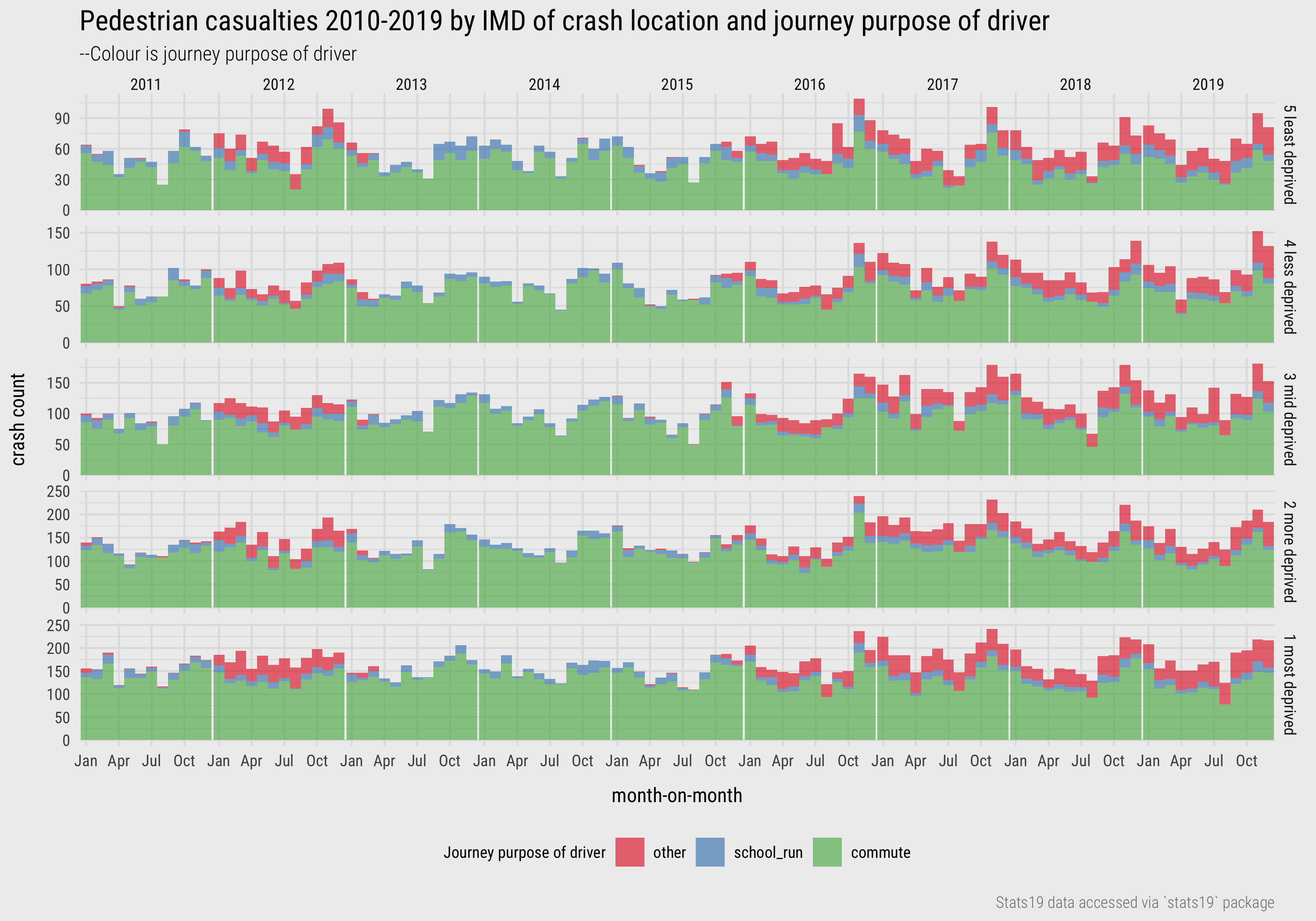
Figure 14: Pedestrian casualties by year, IMD and driver purpose.
Crash location and driver-casualty geodemographics
For the final part of our EDA, we consider the geodemographics of the individuals involved in crashes. In the casualties and vehicles data geodemographic characteristics are recorded – the IMD decile of the neighbourhood in which the driver and pedestrian lives. Geodemographic variables need to be treated cautiously (e.g. ecological fallacy), but it may be instructive to explore how the characteristics of drivers and pedestrians co-vary.
To do this we can construct contingency tables of the joint frequency of each permutation of driver-pedestrian IMD group co-occurring. For consistency with the earlier analysis, IMD is aggregated to quintiles, so our contingency table contains 25 cells – 5x5 driver-pedestrian combinations. It may be useful to display these counts in a way that enables linearity to be inferred. Firstly this is because IMD is an ordered category variable, making it possible to explore linear association in ordered ranks. Secondly, we’d expect similarity in the IMD status of drivers-pedestrians – that is, drivers crashing with pedestrians within the neighbourhoods, or nearby neighbourhoods, in which they both live.
In Figure 15 a heatmap matrix shows this association. Cells in the matrix are ordered along the x-axis according to the IMD quintile of the casualty (pedestrian) and along the y-axis according to the IMD quintile of the driver. The darker blues in the diagonals demonstrate that, as expected, it is more common for drivers-pedestrians involved in crashes to share the same geodemographic characteristics. That colour concentrates in the bottom left is therefore also to be expected. Previously we established that a greater number of pedestrian-vehicle crashes occur in high deprivation neighbourhoods and given there is an association between driver-casualty geodemographics, the largest cell frequencies will be concentrated in the bottom left of the matrix.
This trend can be further investigated through direct encoding - constructing a modelled expectation and representing deviation from expectation – the right heatmap in the top row of Figure 15. Expected values are generated based on the assumption that crash frequencies distribute by driver IMD class independently of the IMD class of the pedestrian injured. I have also plotted raw expected values and the column and row marginals from which the residuals are derived. This demonstrates how expected values are spread across cells in the contingency table based on the overall size of each IMD class. Signed chi-scores are mapped to a diverging colour scale – green for residuals that are positive (cell counts are greater than expected), purple for residuals that are negative (cell counts are less than expected).
The observed-versus-expected plot highlights that the largest positive residuals are in and around the diagonals and the largest negative residuals are those furthest from the diagonals: we see many more crash frequencies between drivers and pedestrians living in the same or similar IMD quintiles and fewer between those in different quintiles. That the bottom left cell – high-deprivation-driver + high-deprivation-pedestrian – is dark green can be understood when remembering that signed chi-scores emphasise effect sizes that are large in absolute as well as relative terms. Not only is there an association between the geodemographics of drivers and casualties, but larger crash counts are recorded in locations containing the highest deprivation and so residuals here are large. The largest positive residuals (the darkest green) are nevertheless recorded in the top right of the matrix – and this is more surprising. Against an expectation of no association between the geodemographic characteristics of drivers and pedestrians involved in road crashes, there is a particularly high number of crashes between drivers and pedestrians living in neighbourhoods containing the lowest deprivation. An alternative phrasing: the association between the geodemographics of drivers and pedestrians is greater for those living in the lowest deprivation quintiles.
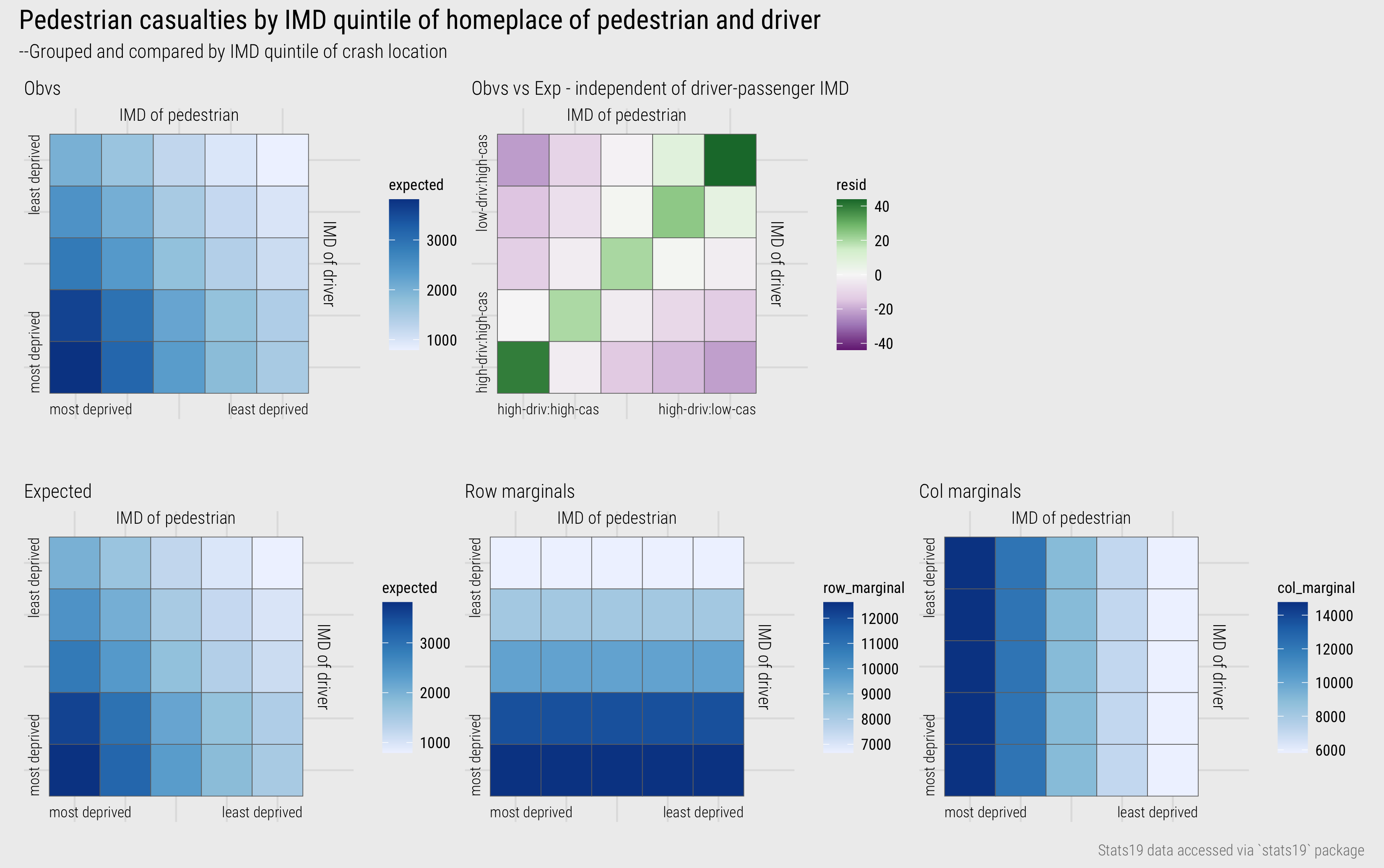
Figure 15: IMD of driver-casualty.
The code:
# Data staging
plot_data <- ped_veh %>%
  # Filter out crashes for which the IMD of the driver and pedestrian is not missing.
  filter(
    !is.na(casualty_imd_decile), !is.na(driver_imd_decile),
    casualty_imd_decile!="Data missing or out of range",
    driver_imd_decile!="Data missing or out of range", !is.na(crash_quintile)) %>%
  # Calculate the grand total -- used for deriving singed-chi-scores.
  mutate(grand_total=n()) %>%
  # Calculate row margins -- total crashes by IMD of driver.
  group_by(driver_imd_quintile) %>%
  mutate(row_total=n()) %>% ungroup %>%
  # Calculate col margins -- total crashes by IMD of pedestrian.
  group_by(casualty_imd_quintile) %>%
  mutate(col_total=n()) %>% ungroup %>%
  # Summarise over cells of contingency table -- observed, expected and residuals.
  group_by(casualty_imd_quintile, driver_imd_quintile) %>%
  summarise(
    observed=n(),
    row_total=first(row_total),
    col_total=first(col_total),
    grand_total=first(grand_total),
    expected=(row_total*col_total)/grand_total,
    resid=(observed-expected)/sqrt(expected),
    max_resid=max(abs(resid))
  ) %>% ungroup

# Plot observed
plot_data %>%
  ggplot(aes(x=casualty_imd_quintile, y=driver_imd_quintile)) +
  geom_tile(aes(fill=observed), colour="#707070", size=.2) +
  scale_fill_distiller(palette="Blues", direction=1)

# Plot signed chi-score
plot_data %>%
  ggplot(aes(x=casualty_imd_quintile, y=driver_imd_quintile)) +
  geom_tile(aes(fill=resid), colour="#707070", size=.2) +
  scale_fill_distiller(
    palette="PRGn", direction=1, limits=c(-max(plot_data$max_resid), max(plot_data$max_resid)))
The plot specification:
- Data: As it is to be re-used (and reasonably lengthy) I have created a staged data frame for charting (
plot_data). Hopefully you can see how variousdplyrcalls are used to generate row and column marginals of the contingency table and that the calculation for the signed chi-scores is as described earlier. You might have noticed that I also calculate a variable storing the absolute maximum value of these scores (max_resid). This is to help centre the diverging colour scheme in the residuals plot. - Encoding: For both heatmaps, the IMD class of pedestrians is mapped to the x-axis and drivers to the y-axis. Tiles are coloured according to observed counts (
fill=observed) or signed chi-scores (fill=resid). - Marks:
geom_tile()for cells of the heatmap. - Scale:
scale_fill_distiller()for continuous colorbrewer colour schemes. Note that for the diverging scheme (palette=“PRGn”) I setlimitsbased on the maximum absolute value of the residuals. Try deleting the limits call to see what happens to the plot without this. - Setting: Note that I apply a
colourtogeom_tile()– this draws a border around each cell.
Detailed analysis of crash location and driver-casualty geodemographics
Figure 16 shows frequencies by driver-pedestrian IMD group faceted on the IMD class of the location in which the road crash occurred. A local scaling is applied by IMD class of location. It demonstrates an obvious confounding pattern – that pedestrians and drivers are far more likely to be involved in crashes in locations with same geodemographic characteristics as those in which they live. Ideally we want to update our expectations to model explicitly for some of this pattern. We have established that an association between the IMD class of drivers, pedestrians and crash locations exists. The more interesting question is whether this is association is stronger for certain driver-pedestrian-location combinations than others: that is, net of the dominant pattern, in which cells are there greater or fewer crash counts.
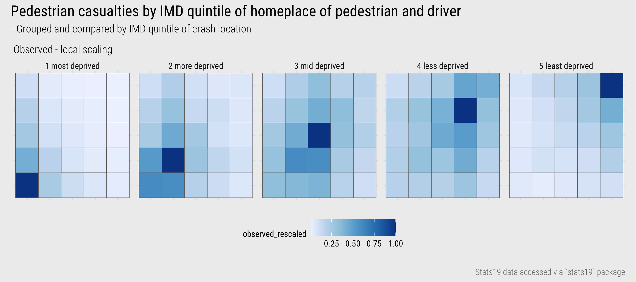
Figure 16: IMD driver-casualty.
This is not a straightforward task as the dependency is baked-in to our contingency table. Essentially we are interested in how crash counts vary depending on geodemographic distance – of drivers, pedestrians, crash locations. I calculated a new variable measuring this distance directly – the euclidian distance between the geodemographics of the driver and pedestrian from the location of each crash, treating the ordinal IMD class variable as a continuous variable ranging from 1-5. To illustrate this, in Figure 17 I’ve mapped this distance variable to each cell of the heatmap matrix.
Figure 17: IMD driver-pedestrian-location geodemographic distance.
I then generated counts of pedestrian casualties by demographic distance, and from this, cell probabilities/likelihoods for each unique position in the matrix in Figure 17. The probabilities assume independence between crash location: that is, the relative likelihood of a crash occurring given a cell’s geodemographic distance does not vary by IMD class of the crash location.
Figure 18: IMD driver-pedestrian-location with modelled expectations based on geodemographic distance.
Salient in Figure 18 is the vertical block of green in the left column of the plot for injuries occurring in the most deprived quintile. Remembering that pedestrian IMD class is mapped to the x-axis, this indicates higher than expected injury counts where pedestrians are involved in crashes that take place in the same IMD class in which they live, even where the driver lives in a different IMD class. Pedestrian injuries occurring in the most deprived quintile appear to be experienced disproportionately by those living in that quintile. In the second-most deprived quintile are green blocks in the left corresponding with pedestrians living in that quintile, but especially the most deprived quintile (darkest green), being hit by drivers living in the most deprived quintile. In the mid deprived quintile, drivers and pedestrians living in the most deprived quintile are again overrepresented. Glancing in each of the the matrices, cells towards the right and top are generally closer to purple: pedestrians living in the less deprived quintile groups are less likely to be injured in crashes, and drivers living in those less deprived quintiles are less likely to contribute to those pedestrian injuries, even after controlling geodemographic distance. And the corollary is that those pedestrians and drivers living in the more deprived quintiles are more likely to be both the injured pedestrians, and the drivers contributing to those injuries.
There is much to unpick here, and I’m not sure about the validity of spreading estimated counts from a model based on the derived “geodemographic distance” variable. The upshot from this exploratory analysis is, like many health issues, pedestrian road injuries have a heavy socio-economic element and so is worthy of formal investigation. Hopefully from this you get a sense of the common workflow for EDA:
- Expose pattern
- Model an expectation derived from pattern
- Show deviation from expectation
Conclusions
Exploratory data analysis (EDA) is an approach to analysis that aims to expand knowledge and understanding of a dataset. The idea is to explore structure, and data-driven hypotheses, by quickly generating many often throwaway statistical and graphical summaries. In this session we discussed chart idioms (Munzner 2014) for exposing distributions and relationships in a dataset, depending on data type. We also showed that EDA is not model-free. Data graphics help us to see dominant patterns and from here formulate expectations that are to be modelled. Different from so-called confirmatory data analysis, however, in an EDA the goal of model-building is not “to identify whether the model fits or not […] but rather to understand in what ways the fitted model departs from the data” (see Gelman 2004). We covered visualization approaches to supporting comparison between data and expectation using juxtaposition, superimposition and/or direct encoding (Gleicher and Roberts 2011). The session did not provide an exhaustive survey of EDA approaches, and certainly not an exhaustive set of chart idioms for exposing distributions and relationships. By locating the session closely in the STATS19 dataset, we learnt a workflow for EDA that is common to most effective data analysis (and communication) activity.