Explore structure in area-level voting behaviour
Task 1. Update your bar chart 1: population density and voting behaviour
You will recall from the histogram at the end of the previous session that the net_trump variable has a negative skew: many more counties voted in favour of Trump than Clinton. This distribution becomes even more interesting when you consider the popular vote share (48% Clinton | 46% Trump).
This fact prompts questions that can inform our visual data analysis. For example, if many more counties voted Trump than Clinton, but more people in absolute terms voted for Clinton, then pro-Clinton counties are likely more densely populated than are pro-Trump counties. We can investigate this by slightly affecting our ggplot2 specification to draw separate bars for each US county, with bar height mapped to net_trump , bars ordered according to this variable and bar colour mapped to population density.
# Take another look at the distribution of the net_trump variable.
trump %>%
  mutate(rank=row_number(-net_trump)) %>%
  ggplot(aes(x=rank, y=net_trump, fill=log(pop_density)))+
  geom_col(width=1)+
  scale_fill_distiller(palette = "Blues", direction=1, guide="none")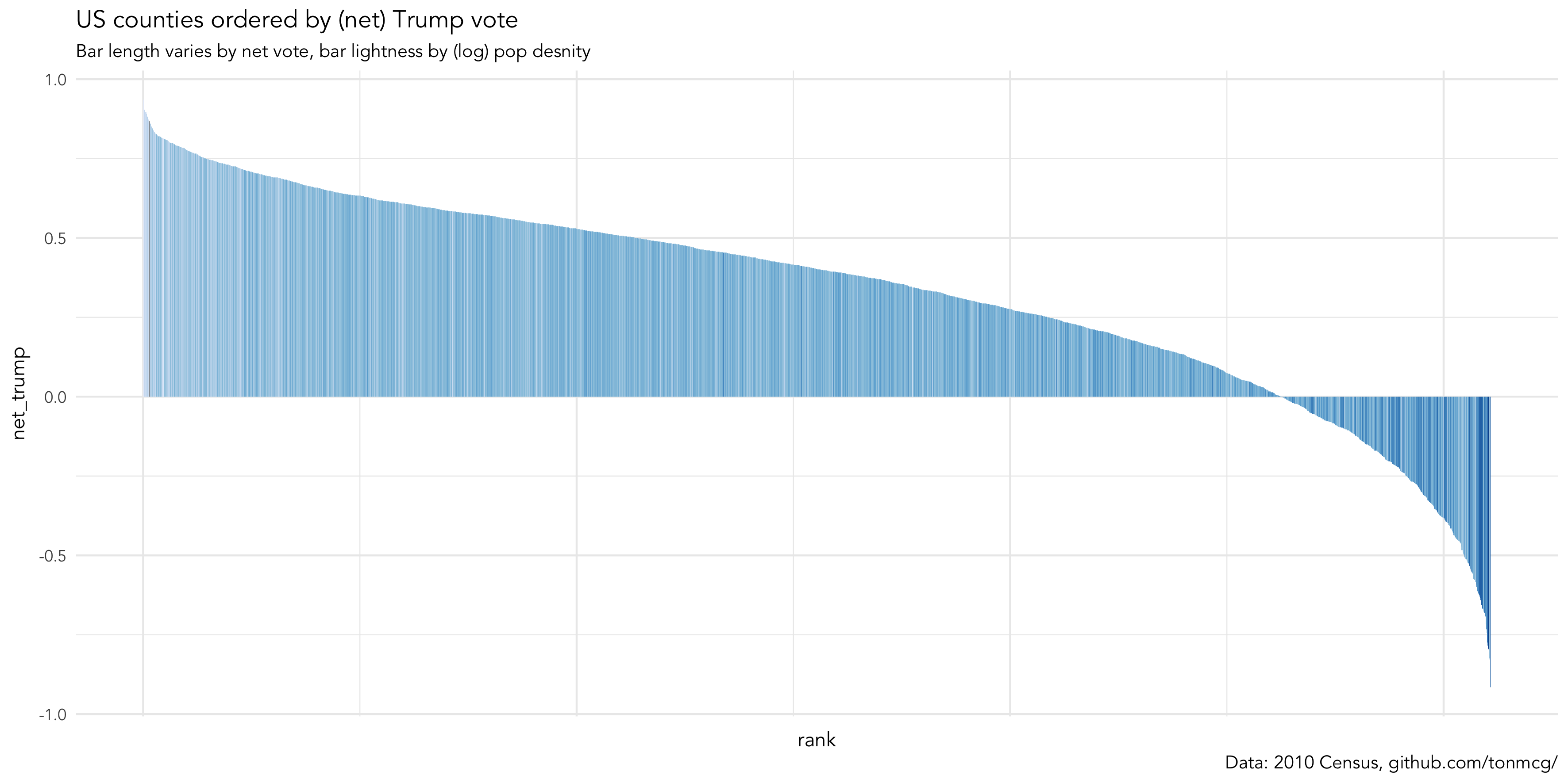
Task 2. Update your bar chart 2: test for population density and voting behaviour
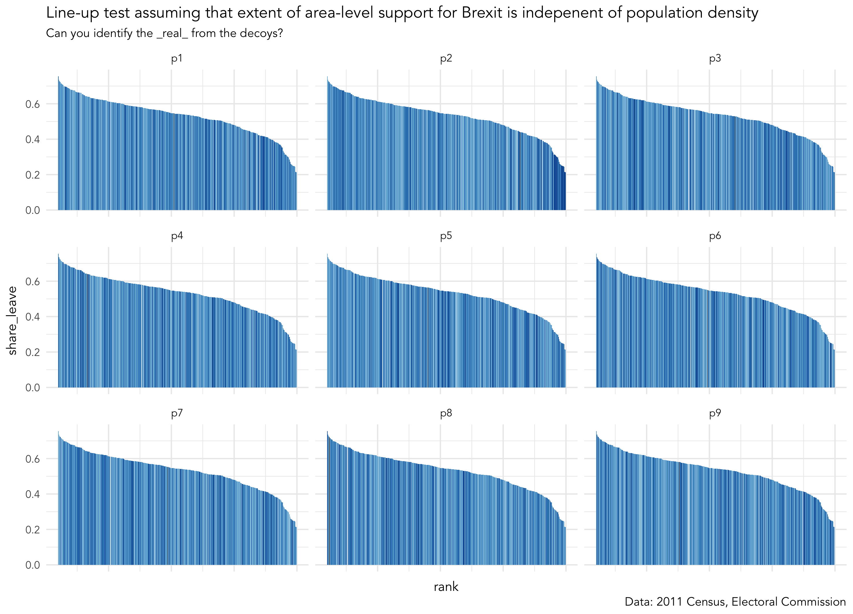
We’ve so far established that there is variation in county-level voting for Trump and LAD-level voting for Brexit and that this variation may be systematic. Glancing at Figure 1 there seems to be a general left-to-right trend in bar lightness: counties with lower vote shares for Trump tend to be less populated. For the Brexit data this pattern exists to a lesser extent. You will have noticed that for both the Trump and Brexit plots the association between voting preference and population density is most evident towards the end of the distribution — the darkest bars appear at the extreme right of the plot. We’ll be dealing with these sorts of associations more formally in the next session. For now, we can investigate this by performing a visual line-up test under the assumption that voting preference varies independently of population density. We construct copies of the our dataset but randomly swap (permute) the values of the population density variable. We then plot each of these copies — or decoy plots — and amongst the decoys add the real dataset (Figure 2). If we can successfully identify the real from the decoys then this adds credibility to our claim that extent of area-level Trump / Brexit support varies with population density.
Keen observes will have noticed that Figure 2 is effectively a visual equivalent of a null hypothesis test. The idea was first proposed in Hadley Wickham et al.'s influential paper on graphical inference (Wickham et al. 2010). There are various challenges associated with performing tests in this way — I (with colleagues) investigated some of these when applying line-up tests to geo-spatial data (Beecham et al. 2017). However, the visual element allows informal testing of structure that would be difficult to test through a numerical equivalent. For example, scanning across the line-up by eye we can look for a consistent pattern at the extremes of the distribution — it’s pretty obvious that LADs with the least Brexit are the most densely populated. However, the patterns isn’t so obvious outside of these extremes. A separate lineup excluding the most heavily Leave LADs would allow a more direct read on this.
# I've created a function for generating line-up data. Load it into your R session.
source(paste0(session_url, "./src/do_lineup.R"))

# Create lineup data.
lineup_data <- brexit %>%
  mutate(value=log(pop_density)) %>%
  select(share_leave, value)
# Remove the geometry data (there's a boring reason for this).
st_geometry(lineup_data) <- NULL
lineup_data <- do_lineup(lineup_data, 2)

# Plot the line-up.
lineup_data %>%
  mutate(rank=-row_number(share_leave)) %>%
  select(-real) %>%
  gather(key="perm", value="perm_values", -c(rank, share_leave)) %>%
  ggplot(aes(x=rank, y=share_leave, fill=perm_values))+
  geom_col(width=1)+
  scale_fill_distiller(palette = "Blues", direction=1, guide="none")+
  facet_wrap(~perm)+
theme(axis.text.x = element_blank())|
At this point, you might be exasperated by the fact that you’ve been copying and pasting plenty of code snippets but have no idea what the code is instructing R to do (because it’s not been properly explained). This was a deliberate strategy as I really want to demonstrate how graphics can be used in Tidyverse workflows to quickly support analytic thinking. If I’ve not already broken off to do some 'live coding' to demonstrate what’s happening in these code blocks, then do shout out at this point! |
Task 3. Swap bars for (spatially ordered) polygons: create maps of the results data
The analysis above suggests a spatial element to area-level voting behaviour — or at least that variation may be systematic with different categories of location. Of course, you already know this to be the case (unless you missed the 2016 news coverage and Data Visualization page). Hopefully you’ll see from the code below that we can quickly generate choropleth maps of the results data by affecting our ggplot2 specification to transition from 1-d ordered bars to spatially ordered polygons.
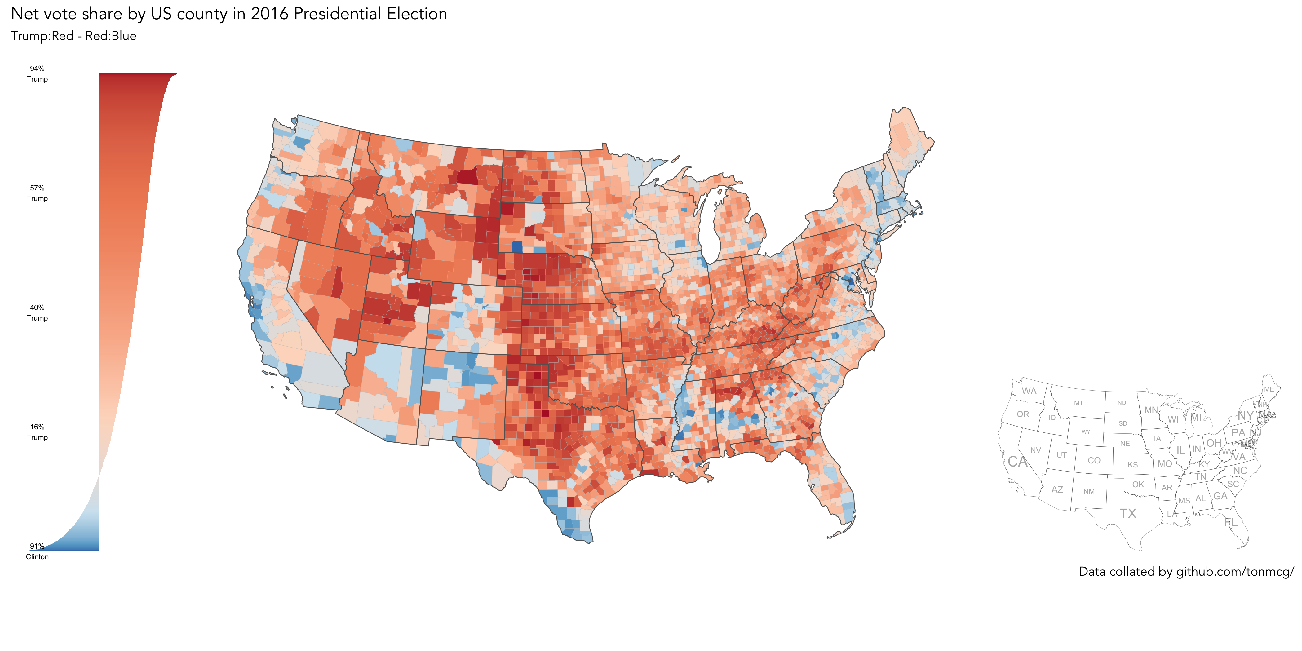
The maps displaying the net_trump and net_leave variables are probably familiar to you. Whilst London and Scotland overwhelmingly voted in favour of Remain, the vast majority of LADs in England and Wales voted Leave. You might be able to spot a few exceptions — the green blob representing Cambridgeshire, with an even darker centre for Cambridge city. The net_trump map is a also reasonably familiar pattern of Republican versus Democrat voting. The shift_trump map is interesting. Whilst shift_trump is present across much of the US (87% of counties experienced an enlarged Republican vote share from 2012), the extent of shift is most apparent in historically blue-collar counties located around the Great Lakes area and rural North East. You will recall that this pattern was neatly captured in the The Washington Post maps. After lunch, we will develop graphics that explore whether or not these interesting area-level patterns vary with with demographics and local context in consistent and predictable ways.
# If you are working from your own machine and have the development version of ggplot2 loaded.
# Paired-back choropleth map of net_trump vote using geom_sf
trump %>%
  ggplot()+
  geom_sf(aes(fill = net_trump), size=0.1)+
  coord_sf(crs = st_crs(trump), datum = NA)+
  scale_fill_distiller(palette="RdBu", direction=-1, guide="colourbar", limits=c(-0.95,0.95), name="")

# If you are working from a lab machine, use the tmap package.
# The way in which tmap objects are parameterised is similar ggplot2.
trump %>%
  tm_shape() +
  tm_fill(col="net_trump", style="cont", size=0.2, id="county_name", palette="-RdBu", title="")+
  tm_borders(col="#636363", lwd=0.2)+
  tm_layout(
    frame=FALSE,
    legend.outside=TRUE)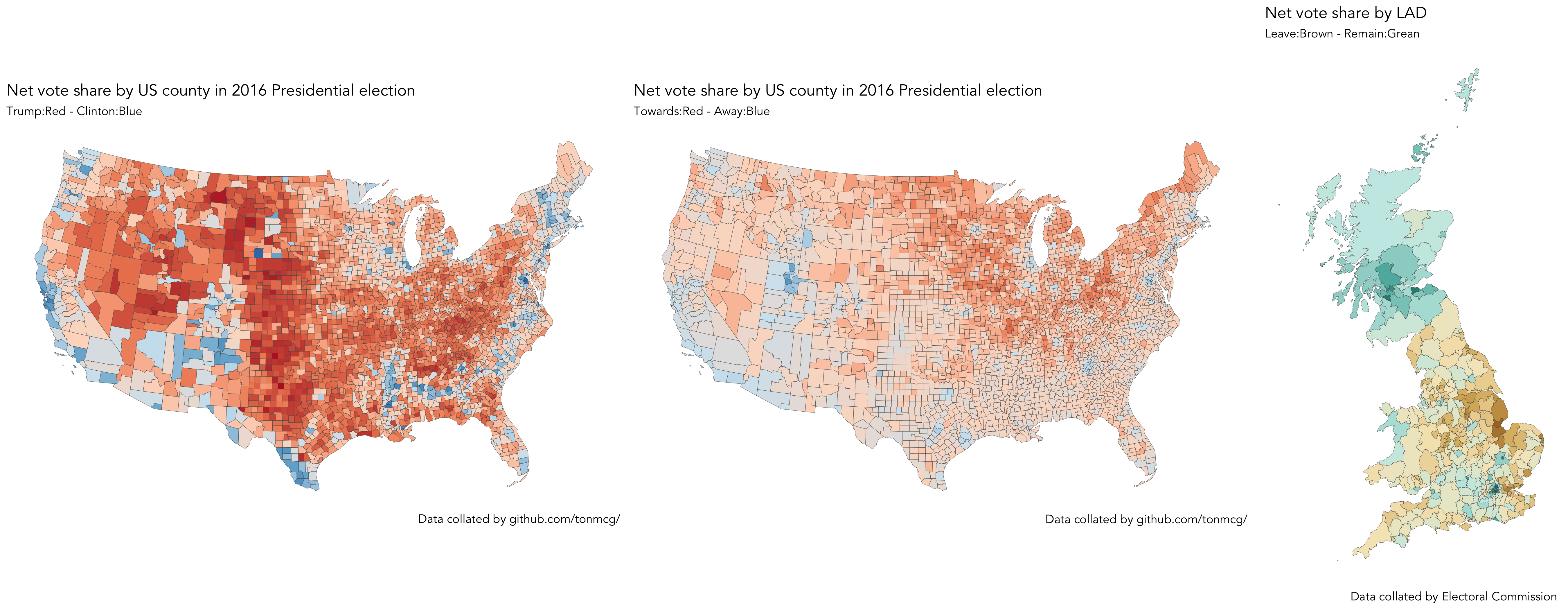
|
A cool feature of the |
Task 4 (optional). Generate 'production-ready' maps
This session principally aims to demonstrate how visualization can (should) be embedded in data analysis workflow. We’ve been rapidly re-configuring ggplot2 specifications to expose structure in the Trump and Brexit datasets — structure that then informs analytic decision-making. Attention has been placed on manipulating the mapping of data to visuals rather than generating 'production-ready' plots. However, you may well have noticed people in your community publish graphics produced in ggplot2 that have a little more polish than those that you’ve created so far today. Below I provide link to an example code block I prepared for producing such a graphic. This uses some more elaborate parameterisations to ggplot2. The example also assumes that you have a working development version of ggplot2 installed via devtools::install.github("tidyverse/ggplot2").
# If you are working from your own machine and successfully installed the dev
# version of ggplot2 (to access geom_sf() family of functions).
source(paste0(session_url, "./src/production_map.R"))|
Apologies if the code in More importantly, there are very real benefits to creating graphics through code. Clearly, if something doesn’t work, you can find the error, fix things, and re-run. But also, the ggplot2 specifications themselves are coherent, descriptive and reproducible. You start with some data, identify the |
References
-
Beecham, R. et al. (2017) Map line-ups: effects of spatial structure on graphical inference. IEEE Transactions on Visualization & Computer Graphics, 23(1):391–400. We propose and evaluate through a large crowd-sourced experiment a particular approach to graphical inference testing using maps. Full data analysis code and talk is available at the paper website.
-
Wickham, H. et al. (2010) Graphical Inference for Infovis. IEEE Transactions on Visualization and Computer Graphics, 16(6):973–979. Hadley Wickham’s seminal piece on graphical inference — well worth a read, if only for his erudite description of statistical testing and NHST.
Content by Roger Beecham | 2018 | Licensed under Creative Commons BY 4.0.