What is Tableau?
Tableau is a commercial software tool for visual data analysis. It has roots in academia; its research department has contributed several notable papers to the InfoVis discipline in recent years. And those of you with an interest in Data Visualization may well have come across Robert Kosara, of Tableau Research, and his influential blog. What makes Tableau distinct from other data analysis tools is the very heavy emphasis on the visual perspective in data analysis.
Getting Tableau
Tableau is commercial software — so is not free to use and in fact is quite expensive. However, great for you: it is free to students and university staff. The University of Leeds also has an institutional licence — so it is fully installed on the machines in the labs. It also makes sense to have a version of Tableau Desktop running on your own machines. You can do this by following the links below.
Why Tableau?
Since the company was founded in 2003, Tableau has seen rapid growth and is widely used in industry (e.g. companies list). Whilst Tableau has its frustrations, underpinning its design and layout are key tenets of visualization design: of data types and their mapping through visual variables. In a similar way to ggplot2 and vega-lite, Tableau forces its users to consider the visual grammar behind their graphics and data analysis. Finally, although not open and free to use, Tableau is sustained by a very large community of users, which is cultivated by Tableau through its Zen Masters programme. Should you wish to develop some expertise in Tableau, you may find their MakeOverMonday useful. Rob Radburn, a UK-based Zen Master, has posted some great examples with an implied geographic flavour.
Why not Tableau?
Tableau is a software tool rather than programming language. It therefore relies on point-and-click interactions, making reproduction of workflows problematic. As with all software tools, it can be slightly idiosyncratic — you need to understand/convert your thinking into a Tableau way of organising data. You may at first find particularly confusing the means through which data are aggregated and grouped in Tableau. Related to this, there is a layer of abstraction between the user and dataset. Tableau does not offer much support for data cleaning and since aggregation and summarisation tends to be performed by Tableau automatically, a user may not know quite what a plot is showing — you’ll discover this for yourselves. Despite these problems, Tableau is a very accessible software tool. Crucially, and probably uniquely, it is a genuine, off-the-shelf interactive visual data analysis tool.
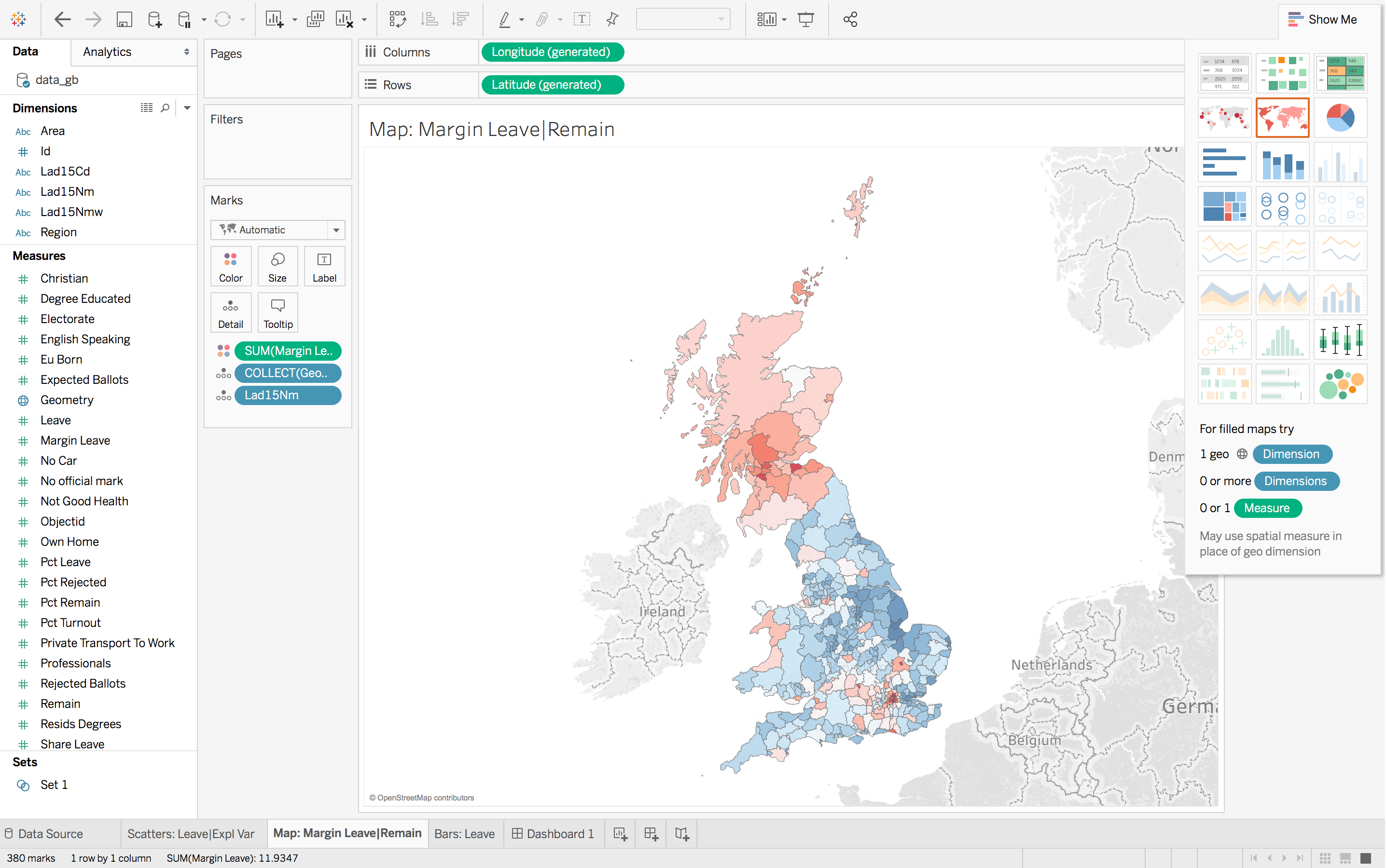
How the Tableau display is organised
Data handling
Tableau works with tabular data — where rows are populated with observations and columns with variables that describe observations. Once loaded into Tableau, data are automatically organised into Dimensions and Measures (left margin of Figure 1). Dimensions are typically categorical variables used for grouping and pivoting data, which might be achieved via faceting to form small multiples or through colour hue, shape or other visual channels. Measures are quantitative (numerical) variables and mapped to size, colour and other visual channels. As of Tableau --version 10.2, spatial data types are supported. Geometry information is converted and stored in a variable called Geometry, each element of which contains a list of type MULTIPOLYGON.
Windows
At the top of Figure 1 are the Columns and Rows shelves. These can be loosely thought of as the x-position and y-position for your charts in Tableau.
In the second margin of Figure 1 is the Marks window. This provides access to the numerous visual channels to which data can be mapped.
You will soon discover that Tableau aggregates data according to the configuration provided to Rows, Columns and Marks. You will often wish to disaggregate, and to do so you will need to drag an attribute to the Detail icon (under Marks).
Task : Listen and explore
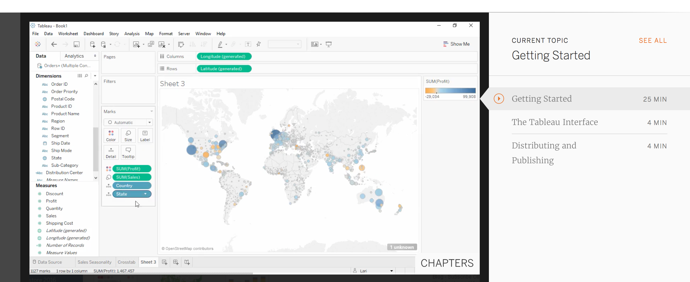
Perhaps the best means of introducing Tableau is through the introductory tutorial provided by Tableau themselves. The tutorial can bebe accessed from this link. Note that you will need to sign in to access the tutorial.
Content by Roger Beecham | 2018 | Licensed under Creative Commons BY 4.0.