Introduction: Computational Methods for Social Data Science
Contents
By the end of this session you should gain the following knowledge:
- Appreciate the motivation for this course – why visualization, why
Rand whyggplot2
By the end of this session you should gain the following practical skills:
- Navigate the materials on this course website, having familiarised yourself with its structure
- Open
Rusing the RStudio Integrated Developer Environment (IDE) - Install and enable
Rpackages and query package documentation - Perform basic calculations via the
R Console - Render
R Markdownfiles - Create
RProjects - Read-in datasets from external resources as objects (specifically
tibbles)
Why comp-sds?
Social Data Science and Visualization
Glancing at this list, visualization could be interpreted as a single facet of Data Science process 2 – something that happens after data gathering, preparation, exploration, but before modelling. In this course you’ll learn that visualization is intrinsic to, and should inform, each of these activities, especially so when working with data sets that are spatial – for Social Data Science.
Let’s develop this idea by asking why data visualizations are used in the first place. In her book Visualization Analysis and Design, Tamara Munzner (2014) considers how humans and computers interface in the decision-making process. She makes the point that data visualization is ultimately about connecting people with data in order to make decisions – or to install humans in a ‘decision-making-loop’. There are occasionally decision-making loops that are entirely computational and where an automated solution exists and is trusted. However, most require some form of human intervention.
The canonical example demonstrating how relying on computation alone can be problematic, and so for the use of visualization, is Anscombe’s quartet. Here, Anscombe (1973) presents four datasets, each containing eleven observations and two variables for each observation. The data are synthetic, but let’s say that they are the weight and height of independent samples taken from a population of postgraduate students studying Data Science.
Presented with a new dataset it makes sense to compute some summaries and doing so, we observe that the data appear identical – they contain the same means, variances and strong positive correlation coefficient. This seems appropriate since the data are measuring weight and height. Although there may be some variation, we’d expect taller students to be heavier. Given these statistical summaries we can be assured that we are drawing samples from the same population of (Data Science) students.
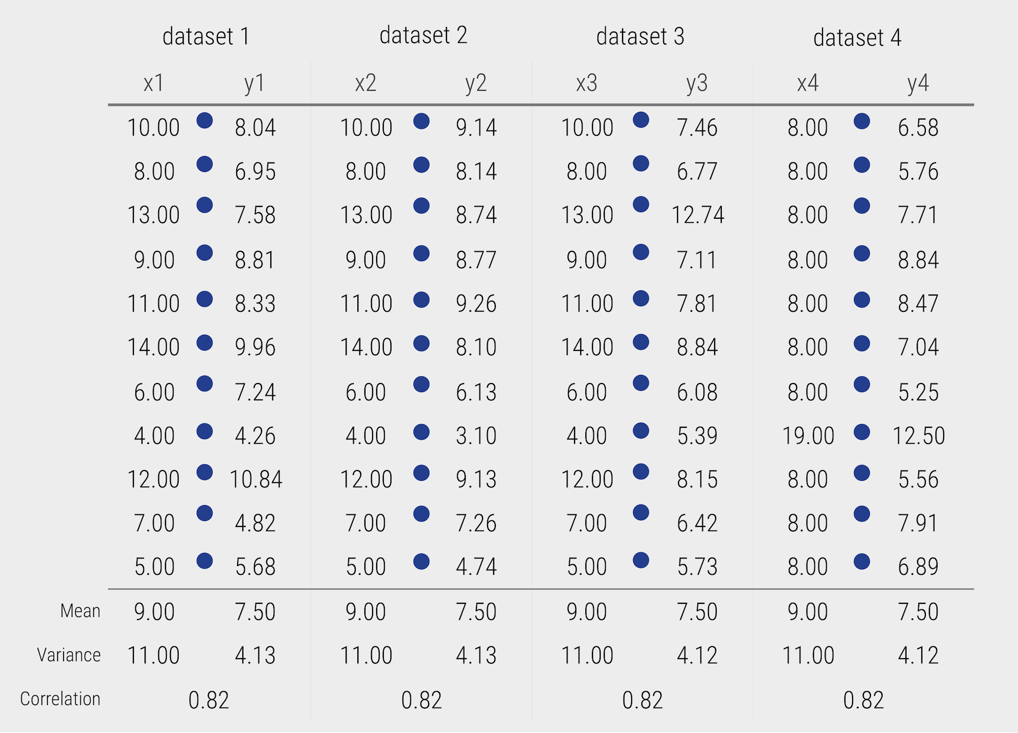
Figure 1: Data from Anscombe’s quartet
Laying out, or visually encoding, the data in a sensible way, horizontally according to weight (x) and vertically according to the height (y) to form a scatterplot, we quickly see that whilst these data contain the same statistical properties they are very different. Only dataset #1 now looks plausible if it were truly a measure of weights and heights drawn from a population of students.
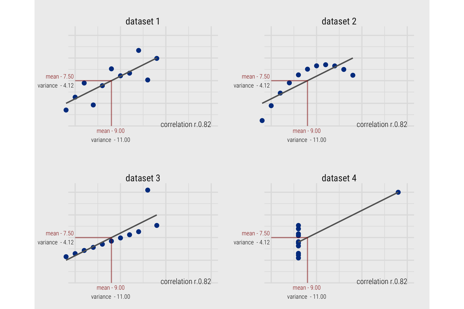
Figure 2: Plots of Anscombe’s quartet
Anscombe’s is a deliberately contrived example3, but there are real cases of important structure being missed, leading to poorly specified models and potentially faulty claims. This is also not to undermine the importance of numerical analysis. Numeric summaries that simplify patterns are extremely useful and Statistics has at its disposal an array of tools for helping to guard against making false claims from datasets – a theme that we will return to in session 6, 7 and 8 when we think critically about the use of visual approaches for data anlysis. There remain, though, certain classes of relation and context that cannot be easily captured through statistics alone.
Geographic context is undoubtedly challenging to capture numerically. Many of the early examples of data visualization have been of spatial phenomena and generated by Geographers (see Friendly 2007). We can also probably make a special case for the use of visualization in Social Data Science (SDS) applications due to its exploratory nature. Often datasets are being repurposed for social and natural sciences research for the first time; contain complex structure and geo-spatial relations that cannot be easily captured by statistical summaries alone; and so the types of questions that can be asked and the techniques deployed to answer them cannot be easily specified in advance. In this course we will demonstrate this as we explore (Session 4 and 5), model under uncertainty (Session 6 and 7) and communicate (Session 8 and 9) with various social science datasets.
What comp-sds?
This is a very practical course. With the exception of this Introduction, the sessions will blend both theory and practical coding activity. We will cover fundamentals around visual data analysis from Information Visualization and Statistics. As you read the session materials you will be writing data processing and analysis code and so be generating analysis outputs of your own. We will also be working with real datasets – from the Political Science, Urban and Transport Planning and Health domains. So we will hopefully be generating real findings and knowledge.
To do this in a genuine way – to generate real knowledge from datasets – we will have to cover a reasonably broad set of data processing and analysis procedures. As well as developing expertise around designing data-rich, visually compelling graphics (of the sort demonstrated in Jo Wood’s TEDx talk), we will need to cover more tedious aspects of data processing and wrangling. Additionally, if we are to learn how to communicate and make claims under uncertainty with our data graphics, then we will need to cover some aspects of estimation and modelling from Statistics. In short, we will cover most of Donoho (2017)’s six key facets of a data science discipline:
- data gathering, preparation, and exploration (Sessions 2, 3, 5);
- data representation and transformation (Sessions 2, 3);
- computing with data (Session 2, All sessions);
- data visualization and presentation (All sessions);
- data modelling (Sessions 4, 6, 7, 8);
- and a more introspective “science about data science” (All sessions)
There is already a rich and impressive set of open Resources practically introducing how to do modern Data Science, Visualization and Geographic Analysis. We will certainly draw on these at different stages in the course. What makes this course different from these existing resources is that we will be doing applied data science throughout – we will be identifying and diagnosing problems when gathering data, discovering patterns (some maybe even spurious) as we do exploratory analysis, and attempt to make claims under uncertainty as we generate models based on observed patterns. We will work with both new, passively-collected datasets as well as more traditional, actively collected datasets located within various social science domains.
How comp-sds?
R for modern data analysis
Through the course we will apply modern approaches to data analysis. All data collection, analysis and reporting activity will be completed using R and the RStudio Integrated Development Environment (IDE). Released as open source software as part of a research project in 1995, for some time R was the preserve of academics. From 2010s onwards, the R community expanded rapidly and along with Python is regarded as the key technology for doing data analysis. R is used increasingly outside of academia, by organisations such as Google [example], Facebook [example], Twitter [example], New York Times [example], BBC [example] and many more.
There are many benefits that come from being fully open-source, with a critical mass of users. Firstly, there is an array of online forums, tutorials and code examples from which to learn. Second, with such a large community, there are numerous expert R users who themselves contribute by developing libraries or packages that extend its use. As a result R is employed for a very wide set of use cases – this website was even built in R using amongst other things the blogdown package.
R is the ecosystem of users and packages that have emerged in recent years. An R package is a bundle of code, data and documentation, usually hosted on the CRAN (Comprehensive R Archive Network).
Of particular importance is the tidyverse package. This is a set of packages for doing Data Science authored by a software development team at RStudio led by Hadley Wickham. tidyverse packages share a principled underlying philosophy, syntax and documentation. Contained within the tidyverse is its data visualization package, ggplot2. This package pre-dates the tidyverse – it started as Hadley Wickham’s PhD thesis and is one of the most widely-used toolkits for generating data graphics. As with other heavily used visualization toolkits (Tableau, vega-lite) it is inspired by Leland Wilkinson’s The Grammar of Graphics, the gg in ggplot stands for Grammar of Graphics. Understanding the design principles behind the Grammar of Graphics (and tidyverse) is necessary for modern data analysis and so we will cover this in detail in Session 3.
Rmarkdown for reproducible research
Reproducible research is the idea that data analyses, and more generally, scientific claims, are published with their data and software code so that others may verify the findings and build upon them.
Roger Peng, Jeff Leek and Brian Caffo
In recent years there has been much introspection into how science works – around how statistical claims are made from reasoning over evidence. This came on the back of, amongst other things, a high profile paper published in Science, which found that of 100 recent peer-reviewed psychology experiments, the findings of only 39 could be replicated. The upshot is that researchers must now make every possible effort to make their work transparent, such that “all aspects of the answer generated by any given analysis [can] be tested” (Brunsdon and Comber 2020).
A reproducible research project should be accompanied with:
- code and data that allows tables and figures appearing in research outputs to be regenerated
- code and data that does what it claims (the code works)
- code and data that can be justified and explained through proper documentation
If these goals are met, then it may be possible for others to use the code on new and different data to study whether the findings reported in one project might be replicated or to use the same data, but update the code to, for example, extend the original analysis (to perform a re-analysis). This model – generate findings, test for replicability in new contexts and re-analysis – is essentially how knowledge development has always worked. However, to achieve this the data and procedures on which findings were generated must be made open and transparent.
In this setting, traditional proprietary data analysis software such as SPSS and Esri’s ArcGIS that support point-and-click interaction is problematic. First, whilst these software may rely on the sorts of packages and libraries with bundled code that R and Python uses for implementing statistical procedures, those libraries are closed. It is not possible, and therefore less common, for the researcher to fully interrogate into the underlying processes that are being implemented and the results need to be taken more or less on faith. Second, but probably most significantly (for us), it would be tedious to make notes describing all interactions performed when working with a dataset in SPSS or ArcGIS.
As a declarative programming language, it is very easy to provide such a provenance trail for your workflows in R since this necessarily exists in the analysis scripts. But more importantly, the Integrated Development Environments (IDEs) through which R (and Python) are most often accessed provide notebook environments that allow users to curate reproducible computational documents that blend input code, explanatory prose and outputs. In this course we will prepare these sorts of notebooks using R Markdown.
Getting started with R and RStudio
I mentioned that the sessions will blend both theory and practical coding activity. This Introduction has been dedicated more towards conceptual and procedural matters. For the practical element this time, we want to get you configured and familiar with R and RStudio.
Install R and RStudio
- Install the latest version of R. Note that there are installations for Windows, macOS and Linux. Run the installation from the file you downloaded (an
.exeor.pkgextension). - Install the latest version of RStudio Desktop. Note again that there are separate installations depending on operating system – for Windows an
.exeextension, macOS a.dmgextension.
Open the RStudio IDE
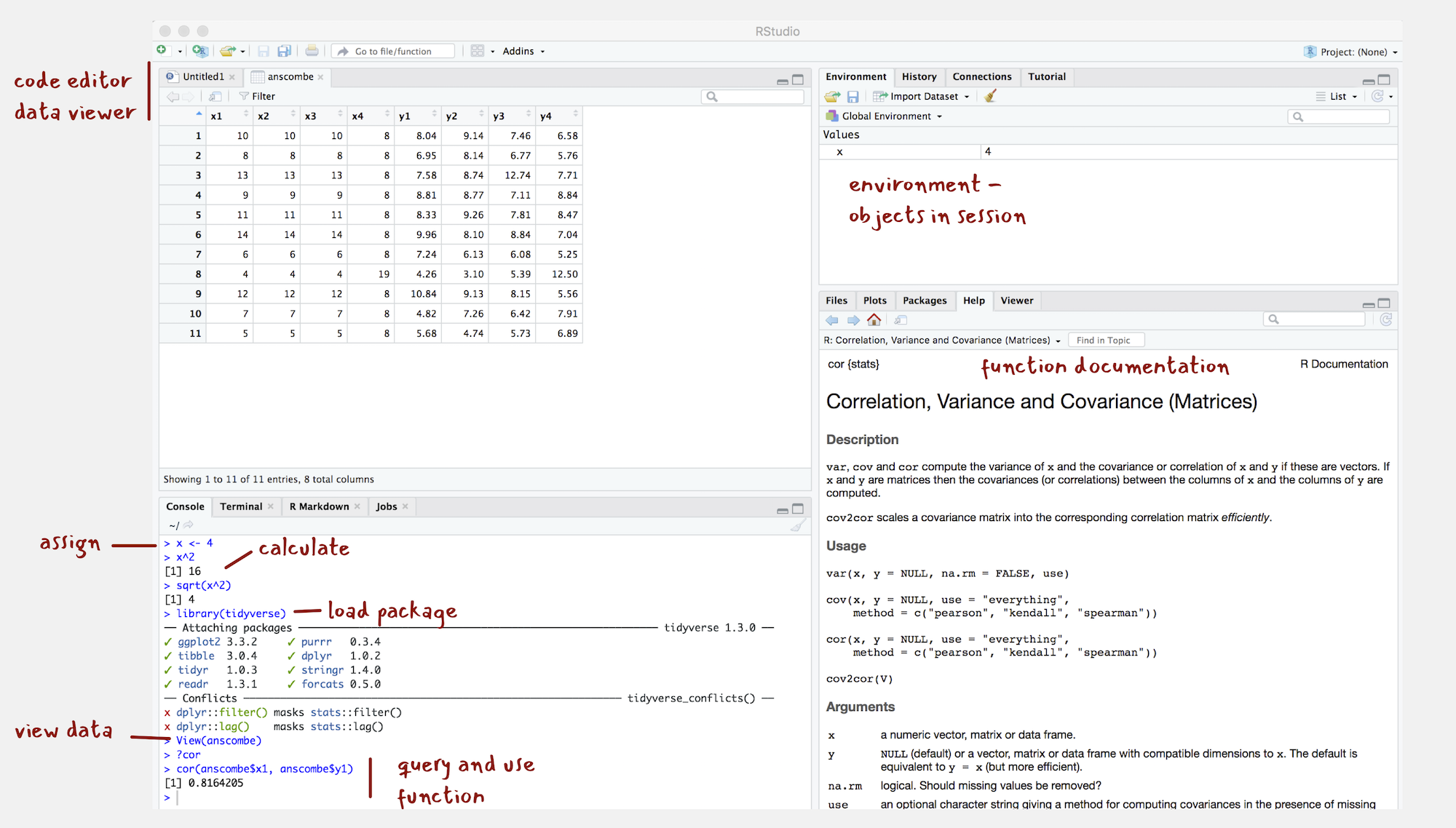
Figure 3: The RStudio IDE
- Once installed, open the RStudio IDE.
- Open an R Script by clicking
File>New File>R Script.
You should see a set of windows roughly similar to those in the Figure (although I’ve already started on some of the computing exercises in the next section). The top left pane is used either as a Code Editor (the tab named Untitled1) or data viewer. This is where you’ll write, organise and comment R code for execution or inspect datasets as a spreadsheet representation. Below this in the bottom left pane is the R Console, in which you write and execute commands directly. To the top right is a pane with the tabs Environment and History. This displays all objects – data and plot items, calculated functions – stored in-memory during an R session. In the bottom right is a pane for navigating through project directories, displaying plots, details of installed and loaded packages and documentation on their functions.
Compute in the console
You will write and execute almost all code from the code editor pane. To start though let’s use R as a calculator by typing some commands into the Console. You’ll create an object (x) and assign it a value using the assignment operator (<-), then perform some simple statistical calculations using functions that are held within the base package.
base package is core and native to R. Unlike all other packages, it does not need to be installed and called explicitly. One means of checking the package to which a function you are using belongs is to call the help command (?) on that function: e.g. ?mean().
- Type the commands contained in the code block below into your R Console. Notice that since you are assigning values to each of these objects they are stored in memory and appear under the Global Environment pane.
# Create variable and assign a value.
x <- 4
# Perform some calculations using R as a calculator.
x_2 <- x^2
# Perform some calculations using functions that form baseR.
x_root <- sqrt(x_2)
Install some packages
There are two steps to getting packages down and available in your working environment:
install.packages("<package-name>")downloads the named package from a repository.library(<package-name>)makes the package available in your current session.
- Install the
tidyverse, the core collection of packages for doing Data Science inR, by running the code below:
install.packages("tidyverse")If you have little or no experience in R, it is easy to get confused around downloading and then using packages in a session. For example, let’s say we want to make use of the simple features package (sf), which we will draw on heavily in the course for performing spatial operations.
- Run the code below:
library(sf)Unless you’ve previously installed sf, you’ll probably get an error message that looks like this:
> Error in library(sf): there is no package called ‘sf’So let’s install it.
- Run the code below:
install.packages("sf")And now it’s installed, why not bring up some documentation on one of its functions (st_contains()).
- Run the code below:
?st_contains()Since you’ve downloaded the package but not made it available to your session, you should get the message:
> No documentation for ‘st_contains’ in specified packages and librariesSo let’s try again, by first calling library(sf).
- Run the code below:
library(sf)
## Linking to GEOS 3.7.2, GDAL 2.4.1, PROJ 6.1.0
?st_contains()
Now let’s install some of the remaining core packages on which the course depends.
- Run the block below, which passes a vector of package names to the
install.packages()function:
install.packages(c("devtools","here", "rmarkdown", "knitr","fst","tidyverse",
"lubridate", "tidymodels"))library(<package-name>), using this syntax: <package-name>::<function_name>, e.g. ?sf::st_contains().
Experiment with R Markdown
R Markdown documents are suffixed with the extension .Rmd and based partly on Markdown, a lightweight markup language originally used as a means of minimising tedious mark-up tags (<header></header>) when preparing HTML documents. The idea is that you trade some flexibility in the formatting of your HTML for ease-of-writing. Working with R Markdown is very similar to Markdown. Sections are denoted hierarchically with hashes (#, ##, ###) and emphasis using * symbols (*emphasis* **added** reads emphasis added ). Different from standard Markdown, however, R Markdown documents can also contain code chunks to be run when the document is rendered – they are a mechanism for producing elegant reproducible notebooks.
Each session of the course has an accompanying R Markdown file. In later sessions you will use these to author computational notebooks that blend code, analysis prose and outputs.
- Download the 01-template.Rmd file for this session and open it in RStudio by clicking
File>Open File ...><your-downloads>/01-template.Rmd.
A quick anatomy of an R Markdown files :
- YAML - positioned at the head of the document and contains metadata determining amongst other things the author details and the output format when typesetting.
- TEXT - incorporated throughout to document and comment on your analysis.
- CODE chunks - containing discrete that are to be run when the .Rmd file is typeset or knit.
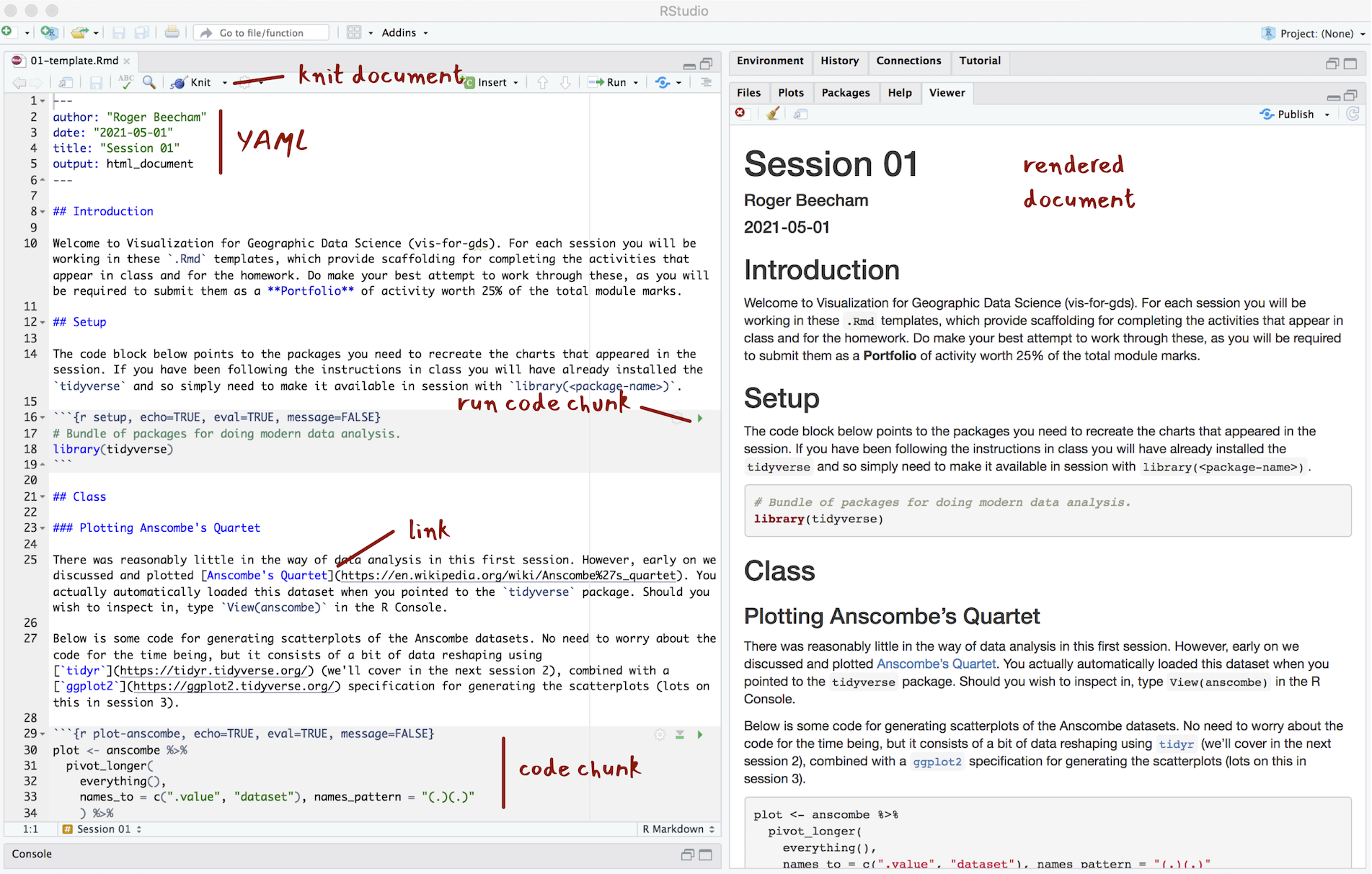
Figure 4: The anatomy of R Markdown
The YAML section of an .Rmd file controls how your file is typeset and consists of key: value pairs enclosed by ---. Notice that you can change the output format – so should you wish you can generate for example .pdf, .docx files for your reports.
---
author: "Roger Beecham"
date: '2021-05-01'
title: "Session 01"
output:html_document
---
R Markdown files are rendered or typeset with the Knit button, annotated in the Figure above. This starts the knitr package and executes all the code chunks and outputs a markdown (.md) file. The markdown file can then be converted to many different output formats via pandoc.
- Knit the 01-template.Rmd file for this session, either by clicking the Knit button or by typing ctrl + ⇧ + K on Windows, ⌘ + ⇧ + K on macOS.
You will notice that R Markdown code chunks can be customised in different ways. This is achieved by populating fields in the curly brackets at the start of the code chunk:
```{r <chunk-name>, echo=TRUE, eval=FALSE, cache=FALSE}
  # Some code that is either run or rendered.
```
A quick overview of the parameters.
<chunk-name>- Chunks can be given distinct names. This is useful for navigating R markdown files. It also supports chaching – chunks with distinct names are only run once, important if certain chunks take some time to execute.echo=<TRUE|FALSE>- Determines whether the code is visible or hidden from the typeset file. If your output file is a data analysis report you may not wish to expose lengthy code chunks as these may disrupt the discursive text that appears outside of the code chunks.eval=<TRUE|FALSE>- Determines whether the code is evaluated (executed). This is useful if you wish to present some code in your document for display purposes.cache=<TRUE|FALSE>- Determines where the results from the code chunk are cached.
As part of the homework from this session you will do some more research on R Markdown. It is worth in advance downloading RStudio’s cheatsheets, which provide comprehensive details on how to configure R Markdown documents:
- Open RStudio and select
Help>Cheatsheets>R Markdown Cheat Sheet|R Markdown Reference Guide
R Scripts
Whilst there are obvious benefits to working in R Markdown documents when doing data analysis, there may be occasions where working in an script is preferable. Scripts are plain text files with the extension .R. Comments – text not executed as code – are denoted with the # symbol.
I tend to use R Scripts for writing discrete but substantial code blocks that are to be executed. For example, I might generate a set of functions that relate to a particular use case and bundle these together in an R script. These then might be referred to in a data analysis from an .Rmd in a similar way as one might import a package. Below is an example script that we will encounter later in the course when creating flow visualizations in R very similar to those that appear in Jo Wood’s TEDx talk. This script is saved with the file name bezier_path.R. If it were stored in a sensible location, like a project’s code folder, it could be called from an R Markdown file with source(./code/bezier_path). R Scripts can be edited in the same way as R Markdown files in RStudio, via the Code Editor pane.
# bezier_path.R
#
# Author: Roger Beecham
##############################################################################

#' Functions for generating input data for asymmetric bezier curve for OD data,
#' such that the origin is straight and destination curve. The retuned tibble
#' is passed to geom_bezier().Parametrtisation follows that published in
#' Wood et al. 2011. doi: 10.3138/carto.46.4.239.
#' @param data A df with origin and destination pairs representing 2D locations
#' (o_east, o_north, d_east, d_north) in cartesian (OSGB) space.
#' @param degrees For converting to radians.
#' @return A tibble of coordinate pairs representing asymmetric curve

get_trajectory <- function(data) {
  o_east=data$o_east
  o_north=data$o_north
  d_east=data$d_east
  d_north=data$d_north
  od_pair=data$od_pair

  curve_angle=get_radians(-90)
  east=(o_east-d_east)/6
  north=(o_north-d_north)/6
  c_east=d_east + east*cos(curve_angle) - north*sin(curve_angle)
  c_north=d_north + north*cos(curve_angle) + east*sin(curve_angle)
  d <- tibble(
    x=c(o_east,c_east,d_east),
    y=c(o_north,c_north,d_north),
    od_pair=od_pair
  )
}

# Convert degrees to radians.
get_radians <- function(degrees) {
  (degrees * pi) / (180)
}
To an extent R Scripts are more straightforward than R Markdown files in that you don’t have to worry about configuring code chunks. They are really useful for quickly developing bits of code. This can be achieved by highlighting over the code that you wish to execute and clicking the Run icon at the top of the Code Editor pane or by typing ctrl + rtn on Windows, ⌘ + rtn on macOS
Create an RStudio Project
Throughout this course we will use project-oriented workflows. This is where all files pertaining to a data analysis – data, code and outputs – are organised from a single root folder and where file path discipline is used such that all paths are relative to the project’s root folder (see Bryan & Hester 2020). You can imagine that this sort of self-contained project set-up is necessary for achieving reproducibility of your research. It allows anyone to take a project and run it on their own machines without having to make any adjustments.
You might have noticed that when you open RStudio it automatically points to a working directory, likely the home folder for your local machine, denoted with ~/ in the Console. RStudio will by default save any outputs to this folder and will also expect any data you use to be saved there. Clearly if you want to incorporate neat, self-contained project workflows then you will want to organise your work from a dedicated project folder rather than the default home folder for your machine. This can be achieved with the setwd(<path-to-your-project>) function. The problem with doing this is that you insert a path which cannot be understood outside of your local machine at the time it was created. This is a real pain. It makes simple things like moving projects around on your machine an arduous task and most importantly it hinders reproducibility if others are to reuse your work.
RStudio Projects are a really excellent feature of the RStudio IDE that resolve these problems. Whenever you load up an RStudio Project, R starts up and the working directory is automatically set to the project’s root folder. If you were to move the project elsewhere on your machine, or to another machine, a new root is automatically generated – so RStudio projects ensure that relative paths work.
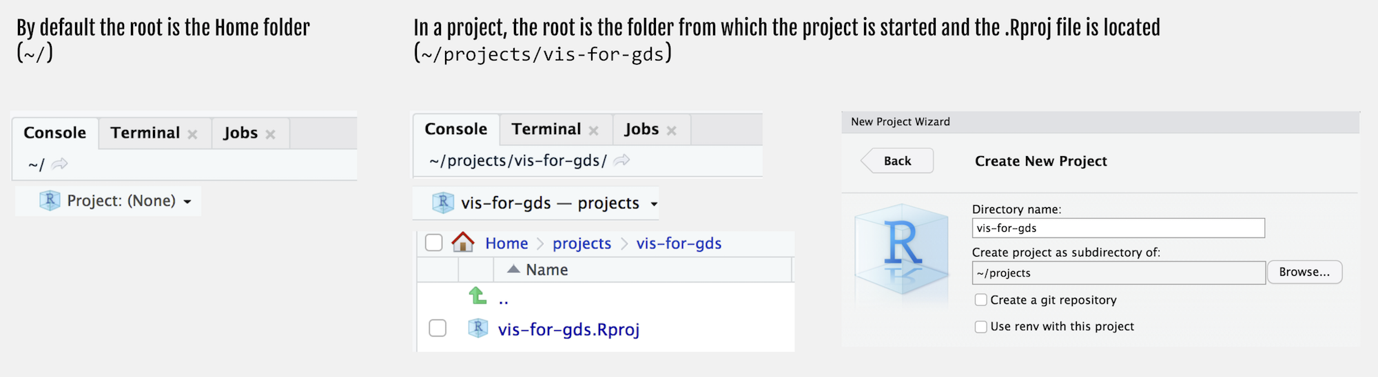
Figure 5: Creating an RStudio Project
Let’s create a new Project for this course:
- Select
File>New Project>New Directory. - Browse to a sensible location and give the project a suitable name. Then click
Create Project.
You will notice that the top of the Console window now indicates the root for this new project, in my case ~projects/comp-sds.
- In the root of your project, create folders called
reports,code,data,figures. - Save this session’s 01-template.Rmd file to the
reportsfolder.
Your project’s folder structure should now look like this:
comp-sds\
  comp-sds.Rproj
  code\
  data\
  figures\
  reports\
    01-template.Rmd
Conclusions
Visual data analysis approaches are necessary for exploring complex patterns in data and to make and communicate claims under uncertainty. This is especially true of Social Data Science applications, where:
- datasets are being repurposed for social and natural sciences research for the first time;
- contain complex structure and geo-spatial relations that cannot be easily captured by statistical summaries alone;
- and, consequently, where the types of questions that can be asked and the techniques deployed to answer them cannot be easily specified in advance.
In this course we will demonstrate this as we explore (Session 4 and 5), model under uncertainty (Session 6 and 7) and communicate (Session 8 and 9) with various social science datasets. We will work with both new, large-scale behavioural datasets, as well as more traditional, administrative datasets located within various social science domains: Political Science, Crime Science, Urban and Transport Planning.
We will do so using the statistical programming environment R, which along with Python, is the programming environment for modern data analysis. We will make use of various tools and software libraries that form part of the R ecosystem – the tidyverse for doing modern data science and R Markdown for authoring reproducible research projects.
Social Data Science
It is now taken-for-granted that over the last decade or so new data, new technology and new ways of doing science have transformed how we approach the world’s problems. Evidence for this can be seen in the response to the Covid-19 pandemic. Enter Covid19 github into a search and you’ll be confronted with hundreds of repositories demonstrating how an ever-expanding array of data related to the pandemic can be collected, processed and analysed. Data Science is a term used widely to capture this shift.
Since gaining traction in the corporate world, the definition of Data Science has been somewhat stretched, but it has its origins in the work of John Tukey’s The Future of Data Analysis (1962). Drawing on this, and a survey of more recent work, Donoho (2017) neatly identifies six key facets that a data science discipline might encompass 1: