Data fundamentals: Describe, wrangle, tidy
Contents
Session outcomes
By the end of this session you should gain the following knowledge:
- Learn the vocabulary and concepts used to describe data.
- Appreciate the characteristics and importance of tidy data (Wickham 2014) for data processing and analysis.
By the end of this session you should gain the following practical skills:
- Load flat file datasets in RStudio via querying an API.
- Calculate descriptive summaries over datasets.
- Apply high-level functions in
dplyrandtidyrfor working with data. - Create statistical graphics that expose high-level structure in data for cleaning purposes.
Introduction
This session covers some of the basics around how to describe and organise data. Whilst this might sound prosaic, there are several reasons why being able to consistently describe a dataset is important. First: it is the initial step in any analysis and helps delimit the research themes and technical procedures that can be deployed. This is especially relevant to modern Data Science-type workflows (like those supported by tidyverse), where it is common to apply the same analysis templates for working over data. Describing your dataset with a consistent vocabulary enables you to identify which analysis templates to reuse. Second relates to the point in session 1 that Social Data Science projects usually involve repurposing datasets for social science research for the first time. It is often not obvious whether the data contain sufficient detail and structure to characterise the target behaviours to be researched and the target populations they are assumed to represent. This leads to additional levels of uncertainty and places greater importance on the initial step of data processing, description and exploration.
Through the session we will learn both language and concepts for describing and thinking about data, but also how to deploy some of the most important data processing and organisation techniques in R to wrangle over a real dataset. We will be working throughout with data from New York’s Citibike scheme, accessed through the bikedata package, an API to Citibike’s publicly available origin-destination trip data.
Concepts
Data structure
In the course we will work with data frames in R. These are spreadsheet like representations where rows are observations (case/record) and columns are variables. Each variable (column) in a data frame is a vector that must be of equal length. Where observations have missing values for certain variables – that is, where they may violate this equal-length requirement – the missing values must be substituted with something, usually with NA or similar. This constraint occasionally causes difficulties, for example when working with variables that contain values of different length for an observation. In these cases we create a special class of column, a list-column, to which we’ll return later in the course.
Organising data according to this simple structure – rows as observations, columns as variables – makes working with data more straightforward. A specific set of tools, made available via the tidyverse, can be deployed for doing most data tidying tasks (Wickham 2014).
Types of variable
| Measurement | Description | Example | Operators | Midpoint | Dispersion |
|---|---|---|---|---|---|
| Categories | |||||
Nominal
|
Non-orderable categories | Political parties; street names | = ≠ | mode | entropy |
Ordinal
|
Orderable categories | Terrorism threat levels | … | <> | … | median | … | percentile |
| Measures | |||||
Interval
|
Numeric measurements | Temperatures; years | … | + - | … | mean | … | variance |
Ratio
|
… | Counts | Distances; prices | … | × ÷ | … | mean | … | variance |
A classification you may have encountered for describing variables is that developed by Stevens (1946), which considers the level of measurement of a variable. Stevens (1946) classed variables into two groups: variables that describe categories of things and variables that describe measurements of things. Categories include attributes like gender, title, Subscribers or Casual users of a bikeshare scheme and ranked orders (1st, 2nd, 3rd largest etc.). Measurements include quantities like distance, age, travel time, number of journeys made via a bikeshare scheme.
Categories can be further subdivided into those that are unordered (nominal) from those that are ordered (ordinal). Measurements can also be subdivided. Interval measurements are quantities that can be ordered and where the difference between two values is meaningful. Ratio measurements have both these properties, but also have a meaningful 0 – where 0 means the absence of something – and where the ratio of two values can be computed. The most common cited example of an interval measurement is temperature (in degrees C). Temperatures can be ordered and compared additively, but 0 degrees C does not mean the absence of temperature and 20 degrees C is not twice as “hot” as 10 degrees C.
Why is this important? The measurement level of a variable determines the types of data analysis procedures that can be performed and therefore allows us to efficiently make decisions when working with a dataset for the first time (Table 1).
Types of observation
Observations either together form an entire population or a subset, or sample that we expect represents a target population.
You no doubt will be familiar with these concepts, but we have to think a little more about this in Social Data Science applications as we may often be working with datasets that are so-called population-level. The Citibike dataset is a complete, population-level dataset in that every journey made through the scheme is recorded. Whether or not this is truly a population-level dataset, however, depends on the analysis purpose. When analysing the bikeshare dataset are we interested only in describing use within the Citibike scheme? Or are we taking the patterns observed through our analysis to make claims and inferences about cycling more generally?
If the latter, then there are problems as the level of detail we have on our sample is pretty trivial compared to traditional datasets, where we deliberately design data collection activities with a specified target population in mind. It may therefore be difficult to gauge how representative Citibike users and Citibike cycling is of New York’s general cycling population. The flipside is that passively collected data do not suffer from the same problems such as non-response bias and social-desirability bias as traditionally collected datasets.
Tidy data
I mentioned that we would be working with data frames organised such that columns always and only refer to variables and rows always and only refer to observations. This arrangement, called tidy (Wickham 2014), has two key advantages. First, if data are arranged in a consistent way, then it is easier to apply and reuse tools for wrangling them due to data having the same underlying structure. Second, placing variables into columns, with each column containing a vector of values, means that we can take advantage of R’s vectorised functions for transforming data – we will demonstrate this in the technical element of this session.
The three rules for tidy data:
- Each variable forms a column.
- Each observation forms a row.
- Each type of observational unit forms a table.
Drug treatment dataset
To elaborate further, we can use the example given in Wickham (2014), a drug treatment dataset in which two different treatments were administered to participants.
The data could be represented as:
| person | treatment_a | treatment_b |
|---|---|---|
| John Smith | – | 2 |
| Jane Doe | 16 | 11 |
| Mary Johnson | 3 | 1 |
An alternative organisation could be:
| treatment | John Smith | Jane Doe | Mary Johnson |
|---|---|---|---|
| treatment_a | – | 16 | 3 |
| treatment_b | 2 | 11 | 1 |
Both present the same information unambiguously – Table 3 is simply Table 2 transposed. However, neither is tidy as the observations are spread across both the rows and columns. This means that we need to apply different procedures to extract, perform computations on, and visually represent, these data.
Much better would be to organise the table into a tidy form. To do this we need to identify the variables:
person: a categorical nominal variable which takes three values: John Smith, Jane Doe, Mary Johnson.treatment: a categorical nominal variable which takes values: a and b.result: a measurement ratio (I think) variable with six recorded values (including the missing value): -, 16, 3, 2, 11,
Each observation is then a test result returned for each combination of person and treatment.
So, a tidy organisation for this dataset would be:
| person | treatment | result |
|---|---|---|
| John Smith | a | – |
| John Smith | b | 2 |
| Jane Doe | a | 16 |
| Jane Doe | b | 11 |
| Mary Johnson | a | 3 |
| Mary Johnson | b | 1 |
Gapminder population dataset
In chapter 12 of Wickham and Grolemund (2017), the benefits of this layout, particularly for working with R, are demonstrated using the gapminder dataset. I recommend reading this short chapter in full. We will be applying similar approaches in the technique part of this class (which follows shortly) and also the homework. To consolidate our conceptual understanding of tidy data let’s quickly look at the gapminder data, as it is a dataset we’re probably more likely to encounter.
First, a tidy version of the data:
| country | year | cases | population |
|---|---|---|---|
| Afghanistan | 1999 | 745 | 19987071 |
| Afghanistan | 2000 | 2666 | 20595360 |
| Brazil | 1999 | 37737 | 172006362 |
| Brazil | 2000 | 80488 | 174504898 |
| China | 1999 | 212258 | 1272915272 |
| China | 2000 | 213766 | 1280428583 |
So the variables:
country: a categorical nominal variable.year: a date (cyclic ratio) variable.cases: a ratio (count) variable.population: a ratio (count) variable.
Each observation is therefore a recorded count of cases and population for a country in a year.
An alternative organisation of this dataset that appears in Wickham and Grolemund (2017) is below. This is untidy as the observations are spread across two rows. This makes operations that we might want to perform on the cases and population variables – for example computing exposure rates – somewhat tedious.
| country | year | type | count |
|---|---|---|---|
| Afghanistan | 1999 | cases | 745 |
| Afghanistan | 1999 | population | 19987071 |
| Afghanistan | 2000 | cases | 2666 |
| Afghanistan | 2000 | population | 20595360 |
| Brazil | 1999 | cases | 37737 |
| Brazil | 1999 | population | 174504898 |
| … | … | … | … |
Imagine that the gapminder dataset instead reported values of cases separately by gender. A type of representation I’ve often seen in social science domains, probably as it is helpful for data entry, is where observations are spread across the columns. This too creates problems for performing aggregate functions, but also for specifying visualization designs (in ggplot2) as we will discover in the next session.
| country | year | f_cases | m_cases | f_population | m_population |
|---|---|---|---|---|---|
| Afghanistan | 1999 | 447 | 298 | 9993400 | 9993671 |
| Afghanistan | 2000 | 1599 | 1067 | 10296280 | 10299080 |
| Brazil | 1999 | 16982 | 20755 | 86001181 | 86005181 |
| Brazil | 2000 | 39440 | 41048 | 87251329 | 87253569 |
| China | 1999 | 104007 | 108252 | 636451250 | 636464022 |
| China | 2000 | 104746 | 109759 | 640212600 | 640215983 |
Techniques
The technical element to this session involves importing, describing, transforming and tidying data from a large bikeshare scheme – New York’s Citibike scheme.
- Download the 02-template.Rmd file for this session and save it to the
reportsfolder of yourcomp-sdsproject that you created in session 1. - Open your
comp-sdsproject in RStudio and load the template file by clickingFile>Open File ...>reports/02-template.Rmd.
Import
In the template file there is a discussion of how to setup your R session with key packages – tidyverse , fst, lubridate, sf – and also the bikedata package for accessing bikeshare data.
Available via the bikedata package are trip and occupancy data for a number of bikeshare schemes (as below). We will work with data from New York’s Citibike scheme for June 2020. A list of all cities covered by the bikedata package is below:
bike_cities()
##    city     city_name      bike_system
## 1    bo        Boston           Hubway
## 2    ch       Chicago            Divvy
## 3    dc Washington DC CapitalBikeShare
## 4    gu   Guadalajara           mibici
## 5    la   Los Angeles            Metro
## 6    lo        London        Santander
## 7    mo      Montreal             Bixi
## 8    mn   Minneapolis         NiceRide
## 9    ny      New York         Citibike
## 10   ph  Philadelphia           Indego
## 11   sf      Bay Area       FordGoBike
In the template there are code chunks demonstrating how to download and process these data using bikedata’s API. This is mainly for illustrative purposes and the code chunks take some time to execute. We ultimately use the fst package for serializing and reading in the these data. So I suggest you ignore the import code and calls to the bikedata API and instead follow the instructions for downloading and reading in the .fst file with the trips data and also the .csv file containing stations data, with:
# Create subdirectory in data folder for storing bike data.
if(!dir.exists(here("data", "bikedata"))) dir.create(here("data", "bikedata"))

# Read in .csv file of stations data from url.
tmp_file <- tempfile()
url <- "https://www.roger-beecham.com/datasets/ny_stations.csv"
curl::curl_download(url, tmp_file, mode="wb")
ny_stations <- read_csv(tmp_file)

# Read in .fst file of trips data from url.
tmp_file <- tempfile()
cs_url <- "https://www.roger-beecham.com/datasets/ny_trips.fst"
curl::curl_download(url, tmp_file, mode="wb")
ny_trips <- read_fst(tmp_file)

# Write out to subdirectory for future use.
write_fst(trips, here("data", "ny_trips.fst"))
write_csv(stations, here("data", "ny_stations.csv"))

# Clean workspace.
rm(url, tmp_file)
fst implements in the background various operations such as multi-threading to reduce load on disk space. It therefore makes it possible to work with large datasets in-memory in R rather than connecting to a database and serving up summaries/subsets to be loaded into R. We will be working with just 2 million records, but with fst it is possible to work in-memory with much larger datasets – in Lovelace et al. (2020) we ended up working with 80 million + trip records.
If you completed the reading and research from the Session 1 Homework, some of the above should be familiar to you. The key arguments to look at are read_csv() and read_fst(), into which we pass the path to the file. In this case we created a tmpfile() within the R session. We then write these data out and save locally to the project’s data folder. This is useful as we only want to download the data once. In the write_*<> functions we reference this location using the here package’s here() function. here is really useful for reliably creating paths relative to your project’s root. To read in these data for future sessions:
# Read in these local copies of the trips and stations data.
ny_trips <- read_fst(here("data", "ny_trips.fst"))
ny_stations <- read_csv(here("data", "ny_stations.csv"))
Notice that we use assignment here (<-) so that these data are loaded as objects and appear in the Environment pane of your RStudio window. An efficient description of data import with read_csv() is also in Chapter 11 of Wickham and Grolemund (2017).
ny_stations and ny_trips are data frames, spreadsheet type representations containing observations in rows and variables in columns. Inspecting the layout of the stations data with View(ny_stations) you will notice that the top line is the header and contains column (variable) names.
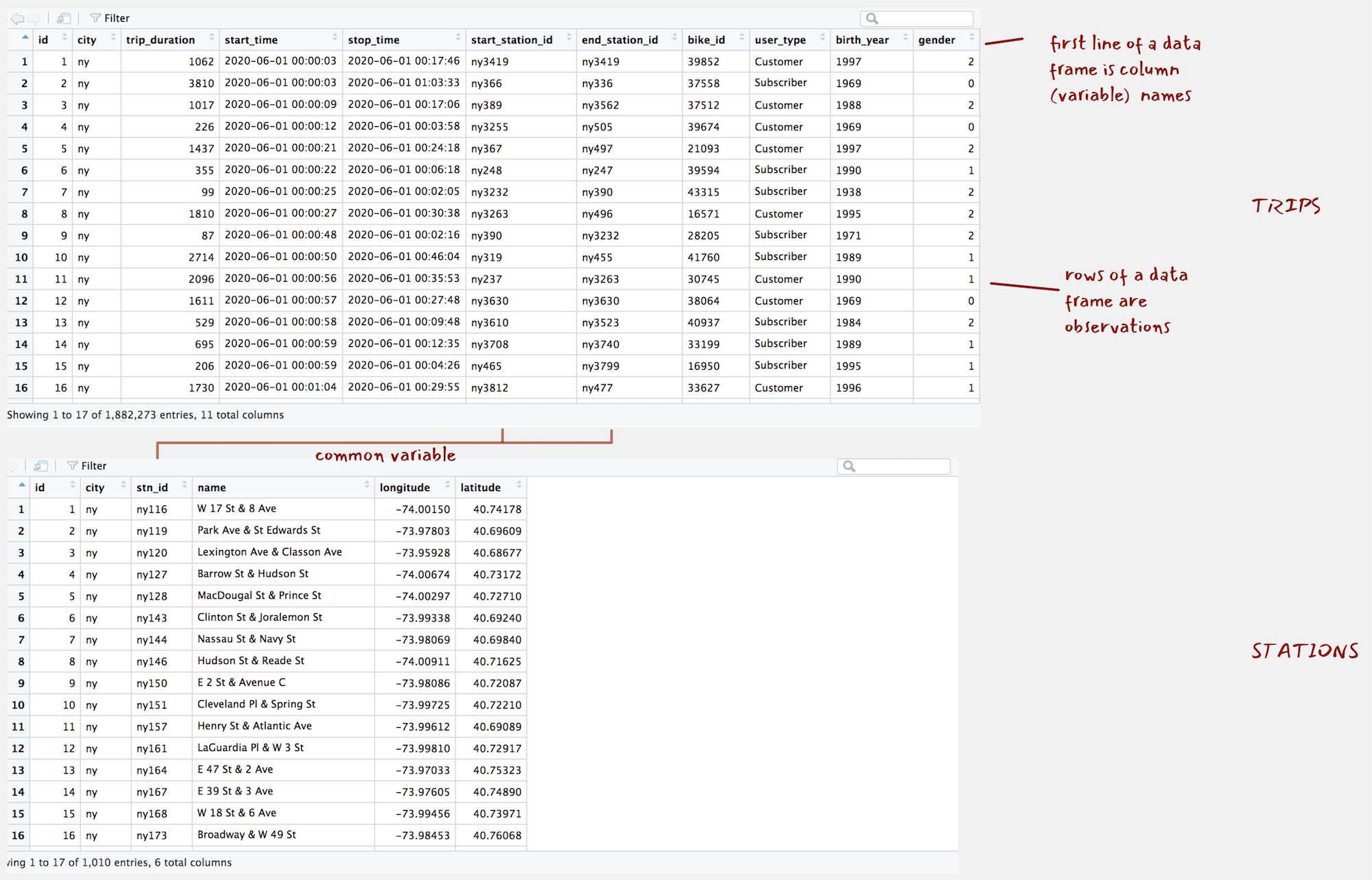
Figure 1: ny_trips and ny_stations as they appear when calling View().
Describe
There are several functions for generating a quick overview of a data frame’s contents. glimpse<dataset-name> is particularly useful. It provides a summary of the data frame dimensions – we have c. 1.9 million trip observations in ny_trips and 11 variables1. The function also prints out the object type for each of these variables, with the variables either of type int or chr in this case.
glimpse(ny_trips)
## Rows: 1,882,273
## Columns: 11
## $ id               <int> 1, 2, 3, 4, 5, 6, 7, 8, 9, 10, 11, 12, 13, 14, 15, 16, 17, 18, 19, 20, 21…
## $ city             <chr> "ny", "ny", "ny", "ny", "ny", "ny", "ny", "ny", "ny", "ny", "ny", "ny", "…
## $ trip_duration    <dbl> 1062, 3810, 1017, 226, 1437, 355, 99, 1810, 87, 2714, 2096, 1611, 529, 69…
## $ start_time       <chr> "2020-06-01 00:00:03", "2020-06-01 00:00:03", "2020-06-01 00:00:09", "202…
## $ stop_time        <chr> "2020-06-01 00:17:46", "2020-06-01 01:03:33", "2020-06-01 00:17:06", "202…
## $ start_station_id <chr> "ny3419", "ny366", "ny389", "ny3255", "ny367", "ny248", "ny3232", "ny3263…
## $ end_station_id   <chr> "ny3419", "ny336", "ny3562", "ny505", "ny497", "ny247", "ny390", "ny496",…
## $ bike_id          <chr> "39852", "37558", "37512", "39674", "21093", "39594", "43315", "16571", "…
## $ user_type        <chr> "Customer", "Subscriber", "Customer", "Customer", "Customer", "Subscriber…
## $ birth_year       <chr> "1997", "1969", "1988", "1969", "1997", "1990", "1938", "1995", "1971", "…
## $ gender           <dbl> 2, 0, 2, 0, 2, 1, 2, 2, 2, 1, 1, 0, 2, 1, 1, 1, 1, 1, 1, 1, 1, 1, 1, 1, 1…
glimpse(ny_stations)
## Rows: 1,010
## Columns: 6
## $ id <int> 1, 2, 3, 4, 5, 6, 7, 8, 9, 10, 11, 12, 13, 14, 15, 16, 17, 18, 19, 20, 21, 22, 2…
## $ city <chr> "ny", "ny", "ny", "ny", "ny", "ny", "ny", "ny", "ny", "ny", "ny", "ny", "ny", "n…
## $ stn_id <chr> "ny116", "ny119", "ny120", "ny127", "ny128", "ny143", "ny144", "ny146", "ny150",…
## $ name <chr> "W 17 St & 8 Ave", "Park Ave & St Edwards St", "Lexington Ave & Classon Ave", "B…
## $ longitude <chr> "-74.00149746", "-73.97803415", "-73.95928168", "-74.00674436", "-74.00297088", …
## $ latitude <chr> "40.74177603", "40.69608941", "40.68676793", "40.73172428", "40.72710258", "40.6…| Type | Description |
|---|---|
lgl
|
Logical – vectors that can contain only TRUE or FALSE values
|
int
|
Integers – whole numbers |
dbl
|
Double – real numbers with decimals |
chr
|
Character – text strings |
dttm
|
Date-times – a date + a time |
fctr
|
Factors – represent categorical variables of fixed and potentially orderable values |
The object type of a variable in a data frame relates to that variable’s measurement level. It is often useful to convert to types with greater specificity. For example, we may wish to convert the start_time and stop_time variables to a date-time format so that various time-related functions could be used. For efficient storage, we may wish to convert the station identifier variables as int types by removing the redundant “ny” text which prefaces end_station_id, end_station_id, stn_id. The geographic coordinates are currently stored as type chr. These could be regarded as quantitative variables, floating points with decimals. So converting to type dbl or as a POINT geometry type (more on this later in the course) may be sensible.
In the 02-template.Rmd file there are code chunks for doing these conversions. There are some slightly more involved data transform procedures in this code. Don’t fixate too much on these, but the upshot can be seen when running glimpse() on the converted data frames:
glimpse(ny_trips)
## Rows: 1,882,273
## Columns: 10
## $ id               <int> 1, 2, 3, 4, 5, 6, 7, 8, 9, 10, 11, 12, 13, 14, 15, 16, 17, 18, 19, 20, 21, 22, 2…
## $ trip_duration    <dbl> 1062, 3810, 1017, 226, 1437, 355, 99, 1810, 87, 2714, 2096, 1611, 529, 695, 206,…
## $ start_time       <dttm> 2020-06-01 00:00:03, 2020-06-01 00:00:03, 2020-06-01 00:00:09, 2020-06-01 00:00…
## $ stop_time        <dttm> 2020-06-01 00:00:03, 2020-06-01 00:00:03, 2020-06-01 00:00:09, 2020-06-01 00:00…
## $ start_station_id <int> 3419, 366, 389, 3255, 367, 248, 3232, 3263, 390, 319, 237, 3630, 3610, 3708, 465…
## $ end_station_id   <int> 3419, 336, 3562, 505, 497, 247, 390, 496, 3232, 455, 3263, 3630, 3523, 3740, 379…
## $ bike_id          <int> 39852, 37558, 37512, 39674, 21093, 39594, 43315, 16571, 28205, 41760, 30745, 380…
## $ user_type        <chr> "Customer", "Subscriber", "Customer", "Customer", "Customer", "Subscriber", "Sub…
## $ birth_year       <int> 1997, 1969, 1988, 1969, 1997, 1990, 1938, 1995, 1971, 1989, 1990, 1969, 1984, 19…
## $ gender           <chr> "female", "unknown", "female", "unknown", "female", "male", "female", "female", …
glimpse(ny_stations)
## Rows: 1,010
## Columns: 5
## $ id <dbl> 1, 2, 3, 4, 5, 6, 7, 8, 9, 10, 11, 12, 13, 14, 15, 16, 17, 18, 19, 20, 21, 22, 23, 24, …
## $ stn_id <int> 116, 119, 120, 127, 128, 143, 144, 146, 150, 151, 157, 161, 164, 167, 168, 173, 174, 19…
## $ name <chr> "W 17 St & 8 Ave", "Park Ave & St Edwards St", "Lexington Ave & Classon Ave", "Barrow S…
## $ longitude <dbl> -74.00150, -73.97803, -73.95928, -74.00674, -74.00297, -73.99338, -73.98069, -74.00911,…
## $ latitude <dbl> 40.74178, 40.69609, 40.68677, 40.73172, 40.72710, 40.69240, 40.69840, 40.71625, 40.7208…Transform
Transform with dplyr
| function() | Description |
|---|---|
filter()
|
Picks rows (observations) if their values match a specified criteria |
arrange()
|
Reorders rows (observations) based on their values |
select()
|
Picks a subset of columns (variables) by name (or name characteristics) |
rename()
|
Changes the name of columns in the data frame |
mutate()
|
Adds new columns (or variables) |
group_by()
|
Chunks the dataset into groups for grouped operations |
summarise()
|
Calculate single-row (non-grouped) or multiple-row (if grouped) summary values |
..and more
|
dplyr is one of the most important packages for supporting modern data analysis workflows. The package provides a grammar of data manipulation, with access to functions that can be variously combined to support most data processing and transformation activity. Once you become familiar with dplyr functions (or verbs) you will find yourself generating analysis templates to re-use whenever you work on a new dataset.
All dplyr functions work in the same way:
- Start with a data frame.
- Pass some arguments to the function which control what you do to the data frame.
- Return the updated data frame.
So every dplyr function expects a data frame and will always return a data frame.
Use pipes %>% with dplyr
dplyr is most effective when its functions are chained together – you will see this shortly as we explore the New York bikeshare data. This chaining of functions can be achieved using the pipe operator (%>%). Pipes are used for passing information in a program. They take the output of a set of code (a dplyr specification) and make it the input of the next set (another dplyr specification).
Pipes can be easily applied to dplyr functions, and the functions of all packages that form the tidyverse. I mentioned in Session 1 that ggplot2 provides a framework for specifying a layered grammar of graphics (more on this in Session 3). Together with the pipe operator (%>%), dplyr supports a layered grammar of data manipulation.
count() rows
This might sound a little abstract so let’s use and combine some dplyr functions to generate some statistical summaries on the New York bikeshare data.
First we’ll count the number of trips made in Jun 2020 by gender. dplyr has a convenience function for counting, so we could run the code below, also in the 02-template.Rmd for this session. I’ve commented the code block to convey what each line achieves.
ny_trips %>%  # Take the ny_trips data frame.
  count(gender, sort=TRUE) # Run the count function over the data frame and set the sort parameter to TRUE.
##    gender       n
## 1    male 1044621
## 2  female  586361
## 3 unknown  251291
There are a few things happening in the count() function. It takes the gender variable from ny_trips, organises or groups the rows in the data frame according to its values (female | male | unknown), counts the rows and then orders the summarised output descending on the counts.
summarise() over rows
| Function | Description |
|---|---|
n()
|
Counts the number of observations |
n_distinct(var)
|
Counts the number of unique observations |
sum(var)
|
Sums the values of observations |
max(var)|min(var)
|
Finds the min|max values of observations |
mean(var)|median(var)|sd(var)| ...
|
Calculates central tendency of observations |
...
|
Many more |
Often you will want to do more than simply counting and you may also want to be more explicit in the way the data frame is grouped for computation. We’ll demonstrate this here with a more involved analysis of the usage data and using some key aggregate functions (Table 10).
A common workflow is to combine group_by() and summarise(), and in this case arrange() to replicate the count() example.
ny_trips %>% # Take the ny_trips data frame.
  group_by(gender) %>% # Group by gender.
  summarise(count=n()) %>% # Count the number of observations per group.
  arrange(desc(count)) # Arrange the grouped and summarised (collapsed) rows according to count.
## # A tibble: 3 x 2
##  gender    count
##  <chr>     <int>
## 1 male    1044621
## 2 female   586361
## 3 unknown  251291
In ny_trips there is a variable measuring trip duration in seconds (trip_duration) and distinguishing casual users from those formally registered to use the scheme (user_type - Customer vs. Subscriber). It may be instructive to calculate some summary statistics to see how trip duration varies between these groups.
The code below uses group_by(), summarise() and arrange() in exactly the same way, but with the addition of other aggregate functions profiles the trip_duration variable according to central tendency and by user_type.
ny_trips %>% # Take the ny_trips data frame.
  group_by(user_type) %>% # Group by user type.
  summarise( # Summarise over the grouped rows, generate a new variable for each type of summary.
    count=n(),
    avg_duration=mean(trip_duration/60),
    median_duration=median(trip_duration/60),
    sd_duration=sd(trip_duration/60),
    min_duration=min(trip_duration/60),
    max_duration=max(trip_duration/60)
    ) %>%
  arrange(desc(count)) # Arrange on the count variable.

## # A tibble: 2 x 6
##  user_type    count avg_duration median_duration sd_duration min_duration max_duration
##  <chr>        <int>        <dbl>           <dbl>       <dbl>        <dbl>        <dbl>
## 1 Subscriber 1306688         20.2            14.4        110.         1.02         33090
## 2 Customer    575585         43.6            23.2        393.         1.02         46982
Clearly there are some outlier trips that may need to be examined. Bikeshare schemes are built to incentivise short journeys of <30 minutes, but the maximum trip duration recorded above is clearly erroneous – 32 days. Ignoring these sorts of outliers by calculating the trip durations at the 95th percentiles is instructive. The max trip duration at the 95th percentile for Subscribers was almost 27 minutes and for Customers was 1 hours 26 mins. It makes sense that more casual users may have longer trip durations, as they are more likely to be tourists or occasional cyclists using the scheme for non-utility trips.
Returning to the breakdown of usage by gender, an interesting question is whether or not the male-female split in bikehare is similar to that of the cycling population of New York City as a whole. This might tell us something about whether the bikeshare scheme could be representative of wider cycling. This could be achieved with the code below. A couple of new additions: we use filter(), to remove observations where the gender of the cyclist is unknown. We also use mutate() for the first time, which allows us to modify or create new variables.
ny_trips %>% # Take the ny_trips data frame.
  filter(gender != "unknown") %>% # Filter out rows with the value "unknown" on gender.
  group_by(gender) %>% # Group by gender.
  summarise(count=n()) %>% # Count the number of observations per group.
  mutate(prop=count/sum(count)) %>% # Add a new column called `prop`, divide the value in the row for the variable count by the sum of the count variable across all rows.
  arrange(desc(count)) # Arrange on the count variable.

## # A tibble: 2 x 3
##  gender   count  prop
##  <chr>    <int> <dbl>
## 1 male   1044621 0.640
## 2 female  586361 0.360
As I’ve commented each line you hopefully get a sense of what is happening in the code above. I mentioned that dplyr functions read like verbs. This is a very deliberate design decision. With the code laid out as above – each dplyr verb occupying a single line, separated by a pipe (%>%) – you can generally understand the code with a cursory glance. There are obvious benefits to this. Once you are familiar with dplyr it becomes very easy to read, write and share code.
%>%) take the output of a set of code and make it the input of the next set, what do you think would happen if you were to comment out the call to arrange() in the code block above? Try it for yourself. You will notice that I use separate lines for each call to the pipe operator. This is good practice for supporting readibility of your code.
Manipulate dates with lubridate
Let’s continue this investigation of usage by gender, and whether bikeshare might be representative of regular cycling, by profiling how usage varies over time. To do this we will need to work with date-time variables. The lubridate package provides various convenience functions for this.
In the code block below we extract the day of week and hour of day from the start_time variable using lubridate’s day accessor functions. Documentation on these can be accessed in the usual way (?<function-name>), but reading down the code it should be clear to you how this works. Next we count the number of trips made by hour of day, day of week and gender. The summarised data frame will be re-used several times in our analysis, so we store it as an object with a suitable name (ny_temporal) using the assignment operator.
# Create a hod dow summary by gender and assign it the name "ny_temporal".
ny_temporal <- ny_trips %>%  # Take the ny_trips data frame.
  mutate(
    day=wday(start_time, label=TRUE), # Create a new column identify dow.
    hour=hour(start_time)) %>% # Create a new column identify hod.
  group_by(gender, day, hour) %>% # Group by day, hour, gender.
  summarise(count=n()) %>% # Count the grouped rows.
ungroup()ny_temporal, in a session is not an easy decision. You want to try to avoid cluttering your Environment pane with many data objects. Often when generating charts it is necessary to create these sorts of derived tables as input data (to ggplot2) – and so when doing visual data analysis you may end up with an unhelpfully large number of these derived tables. The general rule I apply: if the derived table is to be used >3 times in a data analysis or is computationally intensive, assign it (<-) to an object.
In Figure 2 below these derived data are plotted. The template contains ggplot2 code for creating the graphic. Don’t obsess too much on it – more on this next session. The plot demonstrates a familiar weekday-weekend pattern of usage. Trip frequencies peak in the morning and evening rush hours during weekdays and mid/late-morning and afternoon during weekends. This is consistent with typical travel behaviour. Notice though that the weekday afternoon peak is much larger than the morning peak. There are several speculative explanations for this and re-running the plot on Subscriber users only may be instructive. A secondary observation is that whilst men and women share this overall pattern of usage, the relative number of trips taken each day of week varies. Men make many more trips at peak times during the start of the week than they do later in the week. The same pattern does not appear for women. This is certainly something to follow up on, for example by collecting data over a longer period of time.
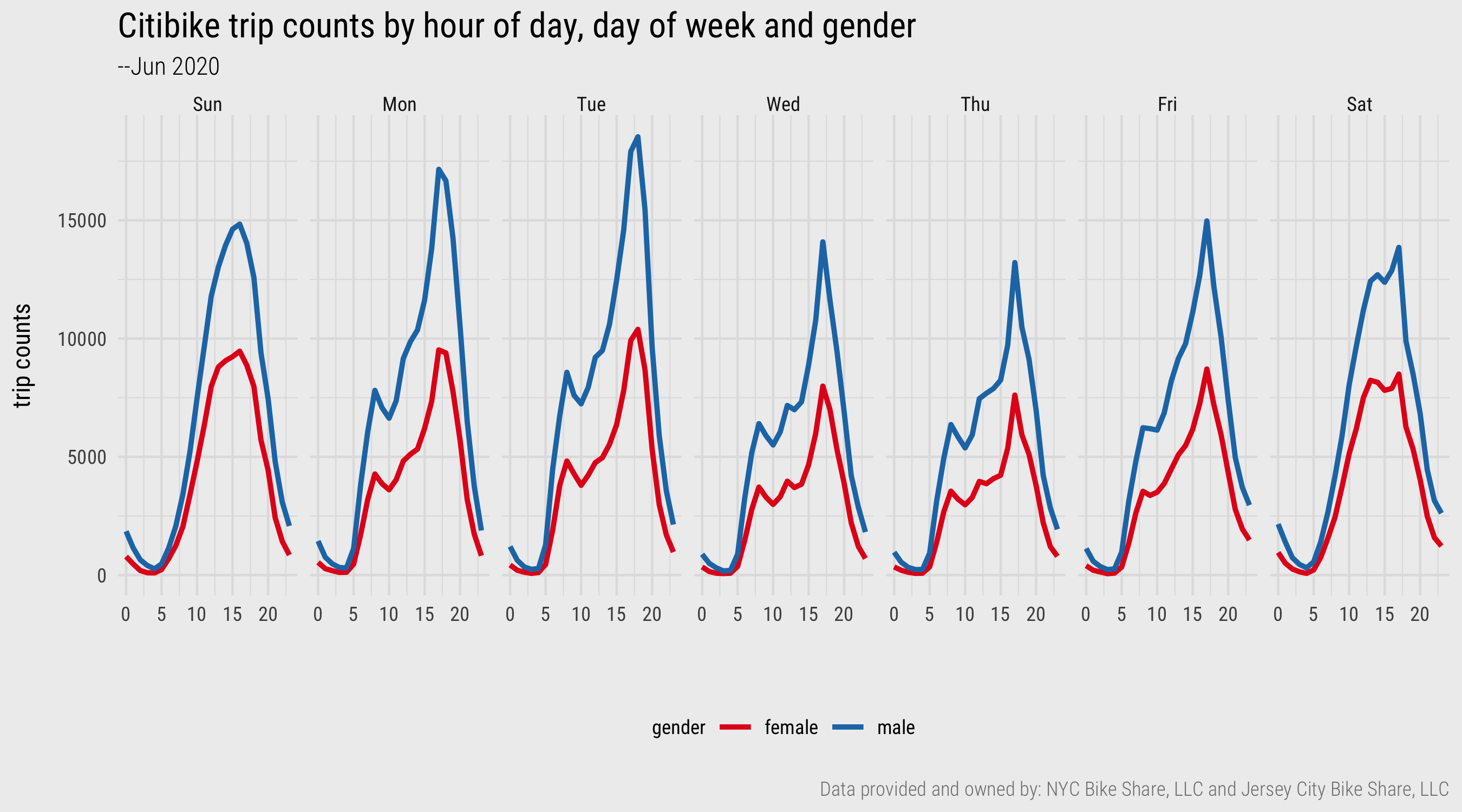
Figure 2: Line charts generated with ggplot2. Plot data computed using dplyr and lubridate.
Relate tables with join()
Trip distance is not recorded directly in the ny_trips table, but may be important for profiling usage behaviour. Calculating trip distance is eminently achievable as the ny_trips table contains the origin and destination station of every trip and the ny_stations table contains coordinates corresponding to those stations. To relate the two tables, we need to specify a join between them.
A sensible approach is to:
- Select all uniquely cycled trip pairs (origin-destination pairs) that appear in the
ny_tripstable. - Bring in the corresponding coordinate pairs representing the origin and destination stations by joining on the
ny_stationstable. - Calculate the distance between the coordinate pairs representing the origin and destination.
The code below is one way of achieving this.
od_pairs <- ny_trips %>% # Take the ny_trips data frame.
select(start_station_id, end_station_id) %>% unique() %>% # Select trip origin and destination (OD) station columns and extract unique OD pairs.
  left_join(ny_stations %>% select(stn_id, longitude, latitude), by=c("start_station_id"="stn_id")) %>% # Select lat, lon columns from ny_stations and join on the origin column.
  rename(o_lon=longitude, o_lat=latitude) %>% # Rename new lat, lon columns -- associate with origin station.
  left_join(ny_stations %>% select(stn_id, longitude, latitude), by=c("end_station_id"="stn_id")) %>% # Select lat, lon columns from ny_stations and join on the destination column.
  rename(d_lon=longitude, d_lat=latitude) %>%  # Rename new lat, lon columns -- associate with destination station.
  rowwise() %>% # For computing distance calculation one row-at-a-time.
  mutate(dist=geosphere::distHaversine(c(o_lat, o_lon), c(d_lat, d_lon))/1000) %>% # Calculate distance and express in kms.
  ungroup()
The code block above introduces some new functions: select() to pick or drop variables, rename() to rename variables and a convenience function for calculating straight line distance from polar coordinates (distHaversine()). The key function to emphasise is the left_join(). If you’ve worked with relational databases and SQL, dplyr’s join functions will be familiar. In a left_join, all the values from the main table are retained, the one on the left – ny_trips, and variables from the table on the right (ny_stations) are added. We specify explicitly the variable on which the tables should be joined with the by= parameter, station_id in this case. If there is a station_id in ny_trips that doesn’t exist in ny_stations then NA is returned.
Other join functions provided by dplyr are in the table below. Rather than discussing each, I recommend consulting Chapter 13 of Wickham and Grolemund (2017).
left_join()
|
all rows from x |
right_join()
|
all rows from y |
full_join()
|
all rows from both x and y |
semi_join()
|
all rows from x where there are matching values in y, keeping just columns from x |
inner_join()
|
all rows from x where there are matching values in y, return all combination of multiple matches in the case of multiple matches |
anti_join
|
return all rows from x where there are not matching values in y, never duplicate rows of x |
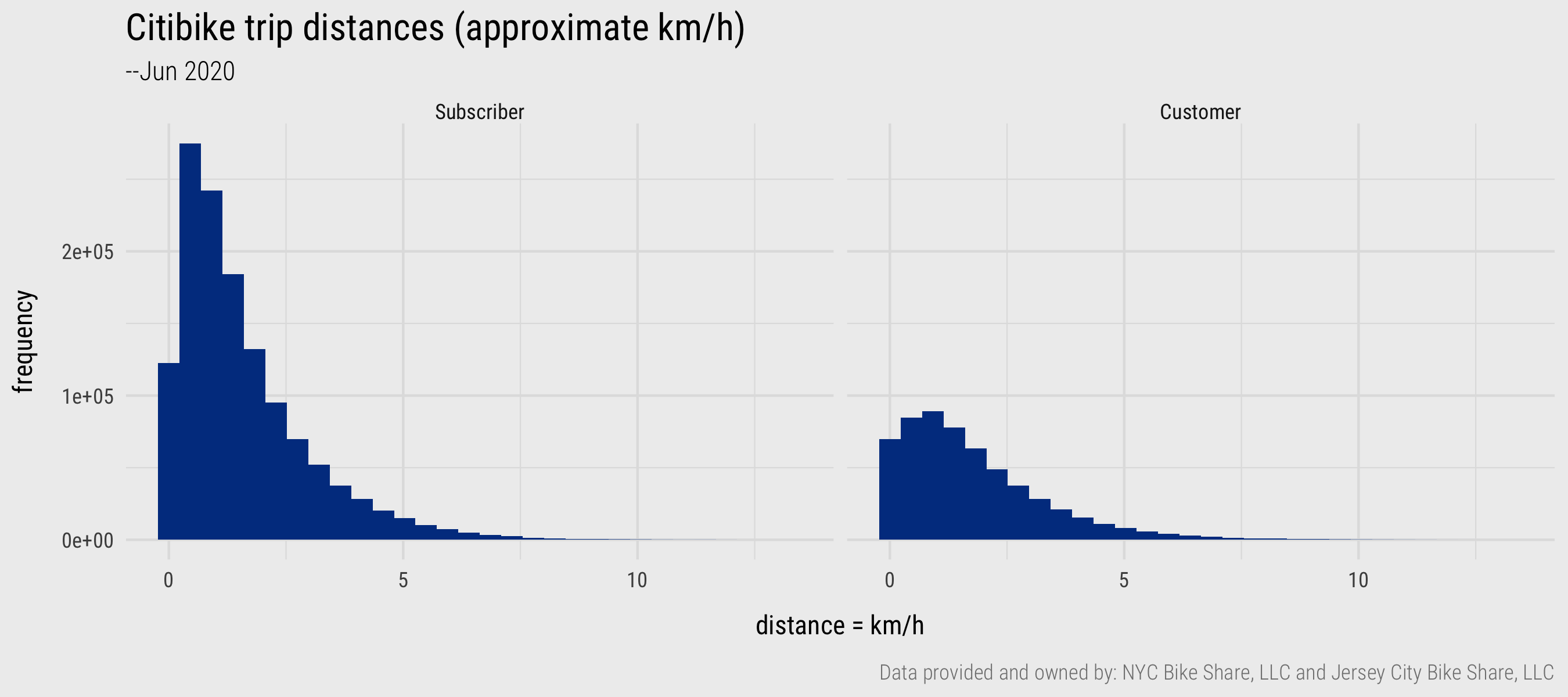
Figure 3: Histograms generated with ggplot2. Plot data computed using dplyr and lubridate
From the newly created distance variable, we can calculate the average (mean) trip distance for the 1.9m trips – 1.6km. This might seem very short, but remember that the distance calculation is problematic in that these are straight-line distances between pairs of docking stations. Really we should be calculating network distances derived from the cycle network in New York. A separate reason – discovered when generating a histogram on the dist variable – is that there are a large number of trips (124,403) that start and end at the same docking station. Initially these might seem to be unsuccessful hires – people failing to undock a bike for example. We could investigate this further by paying attention to the docking stations at which same origin-destination trips occur, as in the code block below.
ny_trips %>%
  filter(start_station_id==end_station_id) %>%
  group_by(start_station_id) %>% summarise(count=n()) %>%
  left_join(ny_stations %>%  select(stn_id, name), by=c("start_station_id"="stn_id")) %>%
  arrange(desc(count))

## # A tibble: 958 x 3
##    start_station_id count name
##    <chr>            <int> <chr>
##  1 ny3423            2017 West Drive & Prospect Park West
##  2 ny3881            1263 12 Ave & W 125 St
##  3 ny514             1024 12 Ave & W 40 St
##  4 ny3349             978 Grand Army Plaza & Plaza St West
##  5 ny3992             964 W 169 St & Fort Washington Ave
##  6 ny3374             860 Central Park North & Adam Clayton Powell Blvd
##  7 ny3782             837 Brooklyn Bridge Park - Pier 2
##  8 ny3599             829 Franklin Ave & Empire Blvd
##  9 ny3521             793 Lenox Ave & W 111 St
## 10 ny2006             782 Central Park S & 6 Ave
## # … with 948 more rows
All of the top 10 docking stations are either in parks, near parks or located along river promenades. This coupled with the fact that these trips occur in much greater relative number for casual than regular users (Customer vs Subscriber) is further evidence that these are valid trips.
Write functions of your own
Through most of the course we will be making use of functions written by others – mainly those developed for packages that form the tidyverse and therefore that follow a consistent syntax. However, there may be times where you need to abstract over some of your code to make functions of your own. Chapter 19 of Wickham and Grolemund (2017) presents some helpful guidelines around the circumstances under which the data scientist typically tends to write functions. Most often this is when you find yourself copy-pasting the same chunks of code with minimal adaptation.
Functions have three key characteristics:
- They are (usually) named – the name should be expressive and communicate what the function does (we talk about
dplyrverbs). - They have brackets
<function()>usually containing arguments – inputs which determine what the function does and returns. - Immediately followed by
<function()>are{}used to contain the body – in this is code that performs a distinct task, described by the function’s name.
Effective functions are short, perform single discrete operations and are intuitive.
You will recall that in the ny_trips table there is a variable called birth_year. From this we can derive cyclists’ approximate age. Below I have written a function get_age() for doing this. The function expects two arguments: yob – a year of birth as type chr; yref – a reference year. In the body, lubridate’s as.period function is used to calculate the time in years that elapsed, the value that the function returns. Once defined, and loaded into the session by being executed, it can be used (as below).
# Function for calculating time elapsed between two dates in years (age).
get_age <- function(yob, yref) {
    period <- lubridate::as.period(lubridate::interval(yob, yref),unit = "year")
    return(period$year)
}

ny_trips <- ny_trips %>% # Take the ny_trips data frame.
  mutate(
    age=get_age(as.POSIXct(birth_year, format="%Y"), as.POSIXct("2020", format="%Y")) # Calculate age from birth_date.
    )
We can use the two new derived variables – distance travelled and age – in our analysis. In Figure 4, we explore how approximate travel speeds vary by age, gender and trip distance. The code used to generate the summary data and plot is in the template file. Again the average “speed” calculation should be treated very cautiously as it is based on straight line distances and it is very difficult to select out “utility” from “leisure” trips. I have tried to do the latter by selecting trips that occur only on weekdays and that are made by Subscriber cyclists. Additionally, due to the heavy subsetting data become a little volatile for certain age groups and so I’ve aggregated the age variable into 5-year bands. Collecting more data is probably a good idea.
There are nevertheless some interesting patterns. Men tend to cycle at faster speeds than do women, although this gap narrows with the older age groups. The effect of age on speed cycled is more apparent for the longer trips. This trend is reasonably strong, although the volatility in the older age groups for trips >4.5km suggests we probably need more data and a more involved analysis to establish this. For example, it may be that the comparatively rare occurrence of trips in the 65-70 age group is made by only a small subset of cyclists. A larger dataset would result in a regression to the mean effect and negate any noise caused by outlier individuals. Certainly Figure 1 is an interesting data graphic – and the type of exploratory analysis demonstrated here, using dplyr functions, is most definitely consistent with that identified in the previous session when introducing Social Data Science.
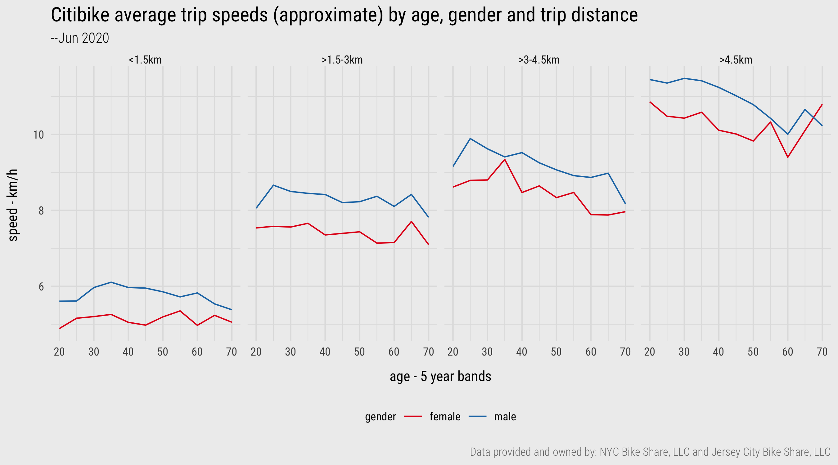
Figure 4: Line charts generated with ggplot2. Plot data computed using dplyr and lubridate
Tidy
The ny_trips and ny_stations data already comply with the rules for tidy data (Wickham 2014). Each row in ny_trips is a distinct trip and each row in ny_stations a distinct station. However throughout the course we will undoubtedly encounter datasets that need to be reshaped. There are two key functions to learn here, made available via the tidyr package: pivot_longer() and pivot_wider(). pivot_longer() is used to tidy data in which observations are spread across columns, as in Table 6 (the gapminder dataset). pivot_wider() is used to tidy data in which observations are spread across rows, as in Table 7 (the gapminder dataset). You will find yourself using these functions, particularly pivot_longer(), not only for fixing messy data, but for flexibly reshaping data for use in ggplot2 specifications (more on this in sessions 3 and 4) or joining tables.
A quick breakdown of pivot_longer:
pivot_longer(
  data,
  cols, # Columns to pivot longer (across rows).
  names_to="name", # Name of the column to create from values held in spread *column names*.
  values_to="name" # Name of column to create form values stored in spread *cells*
  )
A quick breakdown of pivot_wider:
pivot_wider(
  data,
  names_from, # Column in the long format which contains what will be column names in the wide format.
  values_from # Column in the long format which contains what will be values in the new wide format.
  )
In the homework you will be tidying some messy derived tables based on the bikeshare data using both of these functions, but we can demonstrate their purpose in tidying the messy gapminder data in Table 7. Remember that these data were messy as the observations by gender were spread across the columns:
untidy_wide
##   country     year  f_cases m_cases f_population m_population
##   <chr>       <chr> <chr>   <chr>   <chr>        <chr>
## 1 Afghanistan 1999  447     298     9993400      9993671
## 2 Afghanistan 2000  1599    1067    10296280     10299080
## 3 Brazil      1999  16982   20755   86001181     86005181
## 4 Brazil      2000  39440   41048   87251329     87253569
## 5 China       1999  104007  108252  636451250    636464022
## 6 China       2000  104746  109759  640212600    640215983
First we need to gather the problematic columns with pivot_longer().
untidy_wide %>%
  pivot_longer(cols=c(f_cases: m_population), names_to=c("gender_count_type"), values_to=c("counts"))

##   country     year  gender_count_type       counts
##   <chr>       <chr> <chr>                   <chr>
##  1 Afghanistan 1999  f_cases                447
##  2 Afghanistan 1999  m_cases                298
##  3 Afghanistan 1999  f_population           9993400
##  4 Afghanistan 1999  m_population           9993671
##  5 Afghanistan 2000  f_cases                1599
##  6 Afghanistan 2000  m_cases                1067
##  7 Afghanistan 2000  f_population           10296280
##  8 Afghanistan 2000  m_population           10299080
##  9 Brazil      1999  f_cases                16982
## 10 Brazil      1999  m_cases                20755
## # … with 14 more rows
So this has usefully collapsed the dataset by gender, we now have a problem similar to that in Table 6 where observations are spread across the rows – in this instance cases and population are better treated as separate variables. This can be fixed by separating the gender_count_type variables and then spreading the values of the new count_type (cases, population) across the columns. Hopefully you can see how this gets us to the tidy gapminder data structure in Table 5
untidy_wide %>%
  pivot_longer(cols=c(f_cases: m_population), names_to=c("gender_count_type"), values_to=c("counts")) %>%
  separate(col=gender_count_type, into=c("gender", "count_type"), sep="_")

##    country     year  gender count_type counts
##    <chr>       <chr> <chr>  <chr>      <chr>
##  1 Afghanistan 1999  f      cases      447
##  2 Afghanistan 1999  m      cases      298
##  3 Afghanistan 1999  f      population 9993400
##  4 Afghanistan 1999  m      population 9993671
##  5 Afghanistan 2000  f      cases      1599
##  6 Afghanistan 2000  m      cases      1067
##  7 Afghanistan 2000  f      population 10296280
##  8 Afghanistan 2000  m      population 10299080
##  9 Brazil      1999  f      cases      16982
## 10 Brazil      1999  m      cases      20755
## # … with 14 more rows

untidy_wide %>%
  pivot_longer(cols=c(f_cases: m_population), names_to=c("gender_count_type"), values_to=c("counts")) %>%
  separate(col=gender_count_type, into=c("gender", "count_type"), sep="_") %>%
  pivot_wider(names_from=count_type, values_from=counts)

##    country     year  gender cases  population
##    <chr>       <chr> <chr>  <chr>  <chr>
##  1 Afghanistan 1999  f      447    9993400
##  2 Afghanistan 1999  m      298    9993671
##  3 Afghanistan 2000  f      1599   10296280
##  4 Afghanistan 2000  m      1067   10299080
##  5 Brazil      1999  f      16982  86001181
##  6 Brazil      1999  m      20755  86005181
##  7 Brazil      2000  f      39440  87251329
##  8 Brazil      2000  m      41048  87253569
##  9 China       1999  f      104007 636451250
## 10 China       1999  m      108252 636464022
## 11 China       2000  f      104746 640212600
## 12 China       2000  m      109759 640215983
Conclusions
Developing the vocabulary and technical skills to systematically describe and organise data is crucial to modern data analysis. This session has covered the fundamentals here: that data consist of observations and variables of different types (Stevens 1946) and that in order to work effectively with datasets, especially in a functional way in R, these data must be organised according to the rules of tidy data (Wickham 2014). Most of the session content was dedicated to the techniques that enable these concepts to be operationalised. We covered how to download, transform and reshape a reasonably large set of data from New York’s Citibike scheme. In doing so, we generated insights that might inform further data collection and analysis activity. In the next session we will apply and extend this conceptual and technical knowledge as we introduce the fundamentals of visual data analysis and ggplot2’s grammar of graphics.
References
Note that the version of the trips data downloaded from my external repo contains a sample of just 500k records – this is not ideal, but was due to data storage limits on my external repo.↩︎