Communication and storytelling
Contents
By the end of this session you should gain the following knowledge:
- Appreciate the main characteristics of data-driven stories.
- Identify how visual and rhetorical devices are used to communicate with data.
By the end of this session you should gain the following practical skills:
- Create
ggplot2graphics with non-standard annotations.
Introduction
It is now taken-for-granted that we live in an evidence-based society in which data are deeply embedded in most domains and in how we approach most of the world’s problems. This recognition has coincided with, amongst other things, the open source movement which has freed up access to, and technologies for working with, data. The response to Covid-19 is an excellent example. Enter Covid19 github into a search and you’ll be confronted with hundreds of repositories demonstrating how data related to the pandemic can be collected, processed and analysed.
This is exciting and feels very democratic. But there is responsibility amongst those constructing and sharing evidence-based arguments to do so with integrity; navigating the difficult tension between communicating a clear message – necessarily reducing some of the complexity – at the same time as acknowledging uncertainty. Those of you with an interest in these matters might follow David Spiegelhalter, who’s job was created to support public communication of claims made from data, also Tim Harford’s excellent More or Less series. In academia there has been a realisation within Information Visualization and Data Journalism of the role of narratives and storytelling in communicating with data (e.g. Henry-Riche et al. 2018). Different from the approach to visual data analysis taken in most of this course, this work recognises that there is not a single, optimum solution to any visualization problem that exposes the true picture/story – no such formulation exists. But that careful design decisions must be made in light of data, audience and intended purpose.
In this session we will review some of this literature with a special focus on approaches to communicating Covid-19 case numbers.
Watch John Burn-Murdoch’s talk at IEEE VIS 2020 on lessons learnt from generating (visual) data stories around the Covid-19 pandemic. Skip to 15:15 – 45:00 to catch John’s talk.
Concepts
Data-driven storytelling
In sessions 2, 3 and 4, I made the case that visual data analysis is concerned with encoding data to visuals in a way that follows established guidelines known to work well for particular tasks. Watching John’s talk, you hopefully got a sense that designing graphics for communication requires slightly deeper thinking, with no obviously “optimal” way to proceed.
This is not to suggest that visual data stories are devoid of underlying theories or frameworks. There are of course entire academic disciplines devoted to communication and storytelling. Roth (2020)’s recent survey paper on visual storytelling in Cartography considers these to usefully identify some of the characteristics of effective visual data stories. Roth (2020) enumerates 10 characteristics, but particularly important are that visual design stories are:
- Designed: The analyst makes very deliberate decisions in light of audience and purpose. The goal of visual storytelling is not just to show but also to explain.
- Partial: Essential information is prioritised and made salient, with abstraction and brevity preferred over complexity and completeness.
- Intuitive: Visual narratives take advantage of our natural tendency to communicate via metaphor and story, with a clear “entry point” and clear progression.
- Compelling: Visual stories often capture attention through an array of graphical devices – sequence, animation and interaction. They generate an aesthetic response.
- Relatable and situated: Visual stories promote empathy, using devices that place the audience in the story setting. They are usually constructed from somewhere – according to a particular position.
- Political: Visual data stories often promote with clarity particular voices, interpretations or positions.
In the sections that follow, we will review some key Covid-19 visualizations and reflect on how these storytelling devices have been variously deployed.
Designed and partial
's international comparison of deaths, as it appeared on [twitter](https://twitter.com/jburnmurdoch/status/1241820210455285760).](../../class/09-class_files/jbm-logchart.jpeg)
Figure 1: John Burn-Murdoch’s international comparison of deaths, as it appeared on twitter.
A version of John Burn Murdoch’s international comparison chart is in Figure 1. We can evaluate the graphic using some of the principles introduced in session 3 and session 4. In mapping the two quantitive variables to position on an aligned scale and colour hue to distinguish countries, the graphic uses an encoding that exploits our cognitive abilities. By superimposing lines representing countries on the same coordinate space, it also nicely uses layout to support comparison (Gleicher and Roberts 2011).
Other important design decisions were mentioned in John’s talk. You might have noticed that these were justified with respect to two goals or tasks that he wished the reader to perform. Thinking about Roth (2020)’s characteristics of visual storytelling, the graphic is designed with a very deliberate purpose:
- Between country comparison:
- “Are countries on the same course?”
- Comparison against milestone:
- “How many days does it take a certain county to reach a given number of cases/deaths?”
It is possible to see each of these goals informing the configuration of the graphic and in the careful design decisions made to prioritise essential information – the graphic is partial. Comparison between countries is most obviously supported by the use of a log-scale. This removes the dominant salient pattern in standard scales due to the exponential doubling and instead allows slopes (growth rates) to be compared directly. In his talk John makes the point that log scales are, though, not so familiar to the average reader. In other versions of the graphic, useful annotations are provided identifying slope gradients that correspond to different growth rates, again narrowing on the essential goal of the graphic – between country comparison of growth rates. In the talk John mentioned approaches to dealing with daily volatility in the data and that a decision was made to use a smoothing function based on splines rather than the more widely understood 7-day rolling average. This was not a comfortable decision as it introduced complexity, and so was incorporated discreetly (partial/designed).
ggplot2. A presentation in which John makes the case for ggplot2 for Data Journalism from this link.
An interesting design alternative that supports between country comparison is Aatish Bhatia’s Covid Trends chart (Figure 2). A double log scale is used and growth rate in new cases is presented on the y-axis with total case numbers, rather than time elapsed, plotted along the x-axis. Whilst the introduction of a double log scale might be judged to increase visual complexity, actually this design narrows or simplifies the reader’s visual judgement to looking at the thing that we are most interested in: comparison of country growth rates against the two day doubling (annotated with the diagonal). The chart is also accompanied with an excellent explanatory video, in which many of the characteristics of visual data stories enumerated by Roth (2020) can be identified.
's [Covid Trends](https://aatishb.com/covidtrends/) chart. [Source](https://github.com/aatishb/covidtrends#credits).](../../class/09-class_files/covid-trends.png)
Figure 2: Aatish Bhatia’s Covid Trends chart. Source.
Intuitive and compelling
According to Roth (2020), visual data stories are often explanatory; they make compelling use of graphical and rhetorical devices to support understanding. This is especially important in data-driven storytelling as it often involves concepts that are initially quite challenging. In Figure 3 is a static image from a data story written by Flourish based on design work by Marteen Lambrechts. The data story is essentially a design exposition (Beecham et al. 2020; Wood, Kachkaev, and Dykes 2018), guiding readers from the familiar to the unfamiliar. First a standard time series chart of hospitalisations and deaths is presented. Deficiencies in this layout are explained before progressively introducing the transformations involved to generate the preferred graphic, a connected scatterplot. Ordering the story in this way explains design decisions and the trade-offs associated with visual design from a familiar starting point and helps justify new, sometimes unfamiliar encodings. Thinking about Roth (2020)’s characteristics of visual storytelling, formulating a design story in this way helps build intuition – there is a clear entry point and clear progression.
 demonstrating how connected scatterplots can be used to analyse changes in hospitalisations and deaths.](../../class/09-class_files/lambrechts-connected-flourish.png)
Figure 3: Static image from a data story written by Flourish demonstrating how connected scatterplots can be used to analyse changes in hospitalisations and deaths.
For a more involved design exposition of connected scatterplots, see Danny Dorling’s work on slowdown. Note that Danny also encodes time using line width. This is an important addition, along with colour as demonstrated with timecurves.
I have also tried to use this idea of guided design exposition for explaining complex designs in an analysis of Covid-19 cases data (Beecham et al. 2021) – exploring ways of showing simultaneously absolute and relative change in cases, with geographic context.
Figure 4, again by John Burn-Murdoch, is another stellar exposition of how animation can be used to build intuition. The main objective is to demonstrate how different 2020 is in terms of admissions to intensive care compared to a normal year. This was in response to claims that Covid-19 behaves much like seasonal flu; to this extent the graphic is also quite political. Each year from 2013-14 is added to the chart and the y-axis rescaled to reflect the new numbers. This helps build expectation around normal variablitity in a similar way to the hypothetical outcome plots covered in the previous session. The expectation is then roundly debunked by the introduction of the 2020-21 line in red, with animated rescaling of the y-axis used for further emphasis.
's animated rescaling [via twitter](https://twitter.com/jburnmurdoch/status/1347200811303055364) demonstrating how different in terms of intensive care admissions 2020/21 is to a standard flu season.](../../class/09-class_files/jbm-anim.gif)
Figure 4: John Burn-Murdoch’s animated rescaling via twitter demonstrating how different in terms of intensive care admissions 2020/21 is to a standard flu season.
Political
Figure 5 presents a final example of visual narrative from John Burn-Murdoch with an obviously political purpose. The graphic was created in response to claims from the UK’s Prime Minister that it is largely restrictions rather than vaccination that has reduced infection rates in the country. Interesting here is how annotation and visual saliency is used to direct how the graphic is perceived. If the graphic was only annotated with points in time when lockdown and vaccination was initiated, it would invite us to make judgements about the effects of these two events on infectious rates. That John makes highly salient annotations labelling the (unmeasurable) effect of lockdown and vaccine is an interesting addition. There is little room for ambiguity.
Initially I was a little surprised by this presentation – labelling the chart with an unmeasurable effect – and wondered if it had graphical integrity (see Tufte (1983)’s lie factor). Given the fact that John’s work is so carefully considered, communicated transparently and with authority, I think it probably does have integrity. I do wonder whether John’s reflections on his experiences of generating data stories earlier in the pandemic informed his thinking here – that the messages readers interpreted from his cases charts varied depending on the prior expectations and political beliefs of those consuming them.
's analysis [via twitter](https://twitter.com/jburnmurdoch/status/1382013080448724994) evaluating the role of lockdown and the vaccine.](../../class/09-class_files/jbm-vaccine.jpeg)
Figure 5: John Burn-Murdoch’s analysis via twitter evaluating the role of lockdown and the vaccine.
Techniques
The technical element demonstrates how to design plots deliberatively with annotations in ggplot2. We will recreate a glyphmap type graphic that originally appeared in The Washington Post to tell a story of growth in Covid-19 cases by US county.
.](../../class/09-class_files/wp.png)
Figure 6: Glyphmap design displaying growth in COVID-19 cases by US county, based on the design by Thebault and Hauslohner, original in The Washington Post.
In the graphic (Figure 6), each US county is represented as a line which is encoded with daily growth rates in new cases between 3rd May and 26th May. Lines are positioned at the geographic centre of each county. The graphic is data dense and without careful decisions on which aspects to emphasise, it would be quite unreadable. Line thickness is varied according to relative infection rates (cumulative cases/population size) and growth rate is double encoded with colour value – darker and steeper lines have higher growth rates. Even with these additions, it is challenging to discern complete trajectories, but instead a typical model or expectation of these trajectories can be learnt from visually scanning the graphic. That there is spatial autocorrelation in trajectories means an overall pattern of exposure can be inferred, before eyes are then drawn to exceptions. Initially these are towards the extreme end; tall, steep, dark and thick lines, suggesting large absolute numbers, rapid growth rates and high exposure. Secondarily, interesting subtle patterns can be discerned, for example a thick and mid-dark line surrounded by lines that are generally lighter and thinner; a county that appears locally exceptional in having a comparatively high growth and exposure rate.
The design is impressive, and there is an obvious benefit to showing growth rates in their spatial position. However, we are not looking at absolute numbers here. The counties that are most salient are not those with the largest case counts. Rather, they have experienced rapid growth since the number of cases reported on 3rd May. So the graphic is most certainly partial and designed to suit a particular purpose. A slight adjustment in my implementation in Figure 6 was to only show growth rates for counties that had non-negligible case counts on 3rd May (\(\geq20\) cases).
Without the careful integration of annotations and non-standard legends, the graphic would not be so successful. The aim of this technical session is to demonstrate an approach to generating heavily designed annotations – custom legends, which are often necessary when communicating with maps. For a more extensive demonstration of how charts can be annotated and refined, I highly recommend Chapter 8 of Healy (2018) and the BBC Visual and Data Journalism Cookbook.
Import
- Download the 09-template.Rmd file for this session and save it to the
reportsfolder of yourcomp-sdsproject. - Open your
comp-sdsproject in RStudio and load the template file by clickingFile>Open File ...>reports/09-template.Rmd.
The template file lists the required packages – tidyverse and sf. The data were collected using Kieran Healy’s covdata package, with attribution to the county-level cumulative cases dataset released and maintained by data journalists at the New York Times (this repo).
The template provides access to a version of this dataset that I have ‘staged’ for charting. For this I filtered cases data on the dates covered by the Washington Post graphic (3rd to 25th May); identified counties whose daily case counts were \(\geq20\) cases on 3rd May; calculated daily growth rates, anchored to the recorded case counts on 3rd May; calculated ‘end’ growth rates and daily counts for each county (those recorded on 25th May); and finally a binned growth rate variable identifying counties with daily case counts on 25rd May that were \(\leq2\times\), \(\geq2\times\), \(\geq4\times\), \(\geq7\times\) the daily case counts measured on 3rd May. Also there is a state_boundaries dataset to download, which contains geometry data for each US state, collected from US Census Bureau as well as coordinate variables describing the geographic centroid of each state. The Albers Equal Area projection is used.
Plot trajectories
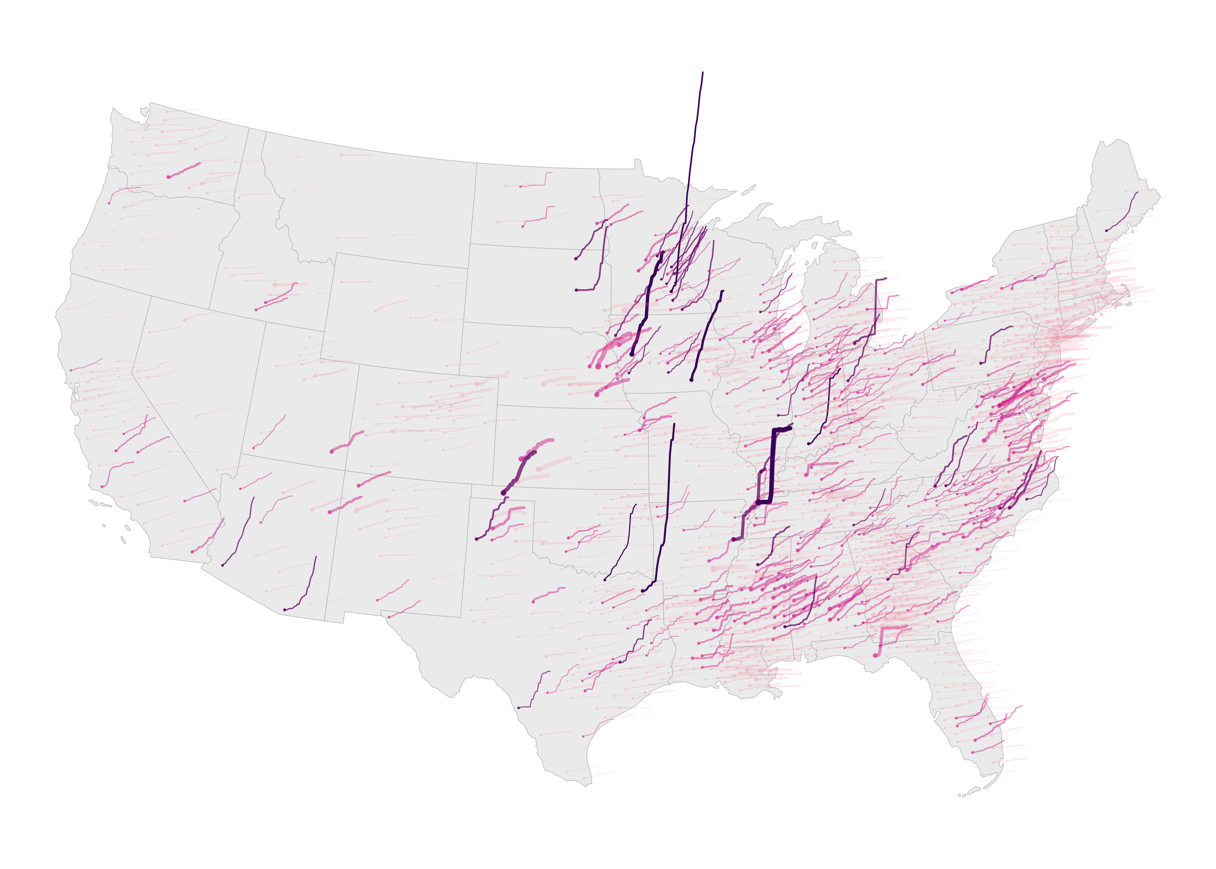
Figure 7: Glyphmap design displaying growth in COVID-19 cases by US county, without legend and annotations.
The main graphic is reasonably straightforward to construct.
The code:
county_data %>%
  ggplot()+
  geom_sf(data=state_boundaries, fill="#eeeeee", colour="#bcbcbc", size=0.2)+
  coord_sf(crs=5070, datum=NA, clip="off")+
  geom_point(
    data=.%>% filter(date=="2020-05-03"),
    aes(x=x, y=y, colour=binned_growth_rate, alpha=binned_growth_rate, size=case_rate)
    )+
  # Plot case data.
  geom_path(
    aes(
      x=x+(day_num*6000)-6000, y=y+(growth_rate*50000)-50000, group=fips,
      colour=binned_growth_rate, size=case_rate, alpha=binned_growth_rate
      ),
    lineend="round"
  ) +
  scale_colour_manual(values=c("#fa9fb5", "#dd3497", "#7a0177", "#49006a"))+
  scale_size(range=c(.1,2.5))+
  scale_alpha_ordinal(range=c(.2,1))+
  guides(colour=FALSE, size=FALSE, alpha=FALSE)+
  theme_void()
The plot specification:
- Data: The main dataset – the staged
county_datafile. Separately there is astate_boundariesfile, used to draw state boundaries and later label states. For the points drawn at the centroid of each US county (geom_point()), the data are filtered so that only a single day is represented (filter(date=="2020-05-03")). - Encoding: For
geom_point(), x-position and y-position is mapped to county centroid (x,yincounty_data), points are coloured according tobinned_growth_rate(bothcolourandalpha) and sized according to that county’scase_rate. The same colour and size encoding is used for the lines (geom_path()). County lines are again anchored at county centroids but offset inxaccording to time elapsed (day_num) and inyaccording togrowth_rate. The constants applied togrowth_rate(5000) andday_num(6000), which control the space occupied by the lines, was arrived at manually through trial and error. In order to draw separate lines for each county, we set thegroup=argument to the county identifier variablefips. - Marks:
geom_point()for the start points centred on county centroids andgeom_path()for the lines. - Scale:
scale_colour_manual()for the binned growth rate colours;scale_alpha()for an ordinal transparency range – the floor for this is 0.2 and not 0, otherwise counties with the smallest binned growth rates would not be visible;scale_size()for varying size continuously according to case rate, the range was arrived at through trial and error. - Setting: We don’t want the default legend to appear and so
guides()turns these off; additionallytheme_void()for removing default axes, gridlines etc.
Add labels and annotations
The two-letter state boundaries can be added in a geom_text() layer, positioned in x and y at state centroids. For obvious reasons this needs to appear after the first call to geom_sf(), which draws the filled state outlines:
county_data %>%
  ggplot()+
  geom_sf(data=state_boundaries, fill="#eeeeee", colour="#bcbcbc", size=0.2)+
  geom_text(data=state_boundaries, aes(x=x,y=y,label=STUSPS), alpha=.8)+
  ...
  ...
  ...
For the selected counties, we create a filtered data frame of those counties with just one row for each county. This is a little more tedious as we have to manually identify these in a filter(). Note that we filter on date first, so that only one row is returned for each county. Within the mutate() some manual abbreviations are made for state names and also end_rate variable is rounded to whole numbers for better labelling.
# Counties to annotate.
annotate <- county_data %>% filter(
    date=="2020-05-03",
    county==c("Huntingdon") & state=="Pennsylvania" |
    county==c("Lenawee") & state=="Michigan" |
    county==c("Crawford") & state=="Iowa" |
    county==c("Wapello") & state=="Iowa" |
    county==c("Lake") & state=="Tennessee" |
    county=="Texas" & state == c("Oklahoma") |
    county==c("Duplin") & state=="North Carolina" |
    county==c("Santa Cruz") & state=="Arizona"|
    county==c("Titus") & state=="Texas"|
    county==c("Yakima") & state=="Washington"
    ) %>%
  mutate(
    state_abbr=case_when(
      state=="Pennsylvania" ~ "Penn.",
      state=="Iowa" ~ "Iowa",
      state=="Tennessee" ~ "Tenn.",
      state=="Oklahoma" ~ "Okla.",
      state=="Texas" ~ "Texas",
      state=="North Carolina" ~ "N.C.",
      state=="Washington" ~ "Wash.",
      state=="Michigan" ~ "Mich.",
      state=="Arizona" ~ "Arizona",
      TRUE ~ ""
    ),
    end_rate_round = round(end_rate,0)
  )
Plotting these is again quite straightforward with geom_text(). The paste0() function is used to build labels that display county and then state_abbr. These appear below each county and y-position is offset accordingly. Additionally the counties are given a bold font by passing an argument to family= (not in the code below as I have used a font not native to all machines). The same approach is used for the rate labels, but with an incremented y-position offset so that they don’t overlap the county name labels.
county_data %>%
  ggplot()+
  geom_sf(data=state_boundaries, fill="#eeeeee", colour="#bcbcbc", size=0.2)+
  ...
  geom_text(data=annotate, aes(x=x,y=y-20000,label=paste0(county,", ",state_abbr)), alpha=1, size=3)+
  geom_text(data=annotate, aes(x=x,y=y-65000,label=paste0(end_rate_round,"X more cases")), alpha=1, size=2.5)+
  ...
  ...
  ...
Build legend
To generate the legend, we need to know the spatial extent of US mainland so that we can draw outside of this. This can be arrived at using st_bbox() and also width and height dimensions for US expressed in spatial units.
# Bounding box for mainland US.
bbox <- st_bbox(state_boundaries)
width <- bbox$xmax-bbox$xmin
height <- bbox$ymax-bbox$ymin
We then create a dataset for the top right legend displaying the different categories of growth rate (Figure 8). Counties filtered by their different growth rates (in the filter() below) were identified manually. In the mutate() we set x-position to start at the right quarter of the graphic (bbox$xmax-.25*width) and y-position to start slightly above the top of the graphic bbox$ymax+.05*height. case_rate is set to a constant as we don’t want line width to vary and also a manually created label variable.
# Legend : growth
legend_growth <- county_data %>%
  filter(
    county=="Dubois" & state=="Indiana" |
    county=="Androscoggin" & state=="Maine" |
    county=="Fairfax" & state=="Virginia" |
    county=="Bledsoe" & state=="Tennessee"
  ) %>%
  mutate(
    x=bbox$xmax-.25*width,y=bbox$ymax+.05*height,
    case_rate=.01,
    label=case_when(
      county == "Dubois" ~ "7x more cases than on May 3",
      county == "Androscoggin" ~ "4x",
      county == "Fairfax" ~ "2x",
      county == "Bledsoe" ~ "About the same as on May 3"
    )
  )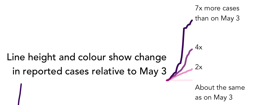
Figure 8: Legend demonstrating growth rates.
A separate dataset is also created for drawing the top left legend (Figure 9), showing different case rates relative to population size. In the mutate() we set x-position to start towards the left of the graphic (bbox$xmax-.88*width) and y-position to start slightly above the top of the graphic bbox$ymax+.05*height. We want to draw three lines corresponding to a low, medium and high growth rate and so pivot_longer() to duplicate the daily case data over rows. Each line needs to be drawn next to one another and this is achieved with the offset_day variable, a multiple applied to the geographic width of US in the eventual ggplot2 specification.
# Legend : case
legend_case <- county_data %>%
  filter(
    county == "Kings" & state=="California" ) %>%
  mutate(
    x=bbox$xmax-.88*width,y=bbox$ymax+.05*height,
    binned_growth_rate=factor(binned_growth_rate)
  ) %>%
  select(x, y, day_num, growth_rate, binned_growth_rate, fips) %>%
  mutate(
    low=.001, mid=.009, high=.015,
  ) %>%
  pivot_longer(cols=c(low, mid, high), names_to="offset", values_to="offset_rate") %>%
  mutate(
    offset_day= case_when(
      offset == "low" ~ 0,
      offset == "mid" ~ .04,
      offset == "high" ~ .08
    )
  )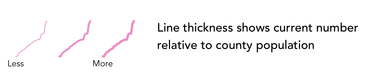
Figure 9: Legend demonstrating case rates.
Compose graphic
The code block below demonstrates how derived data for the legends are used in the ggplot2 specification. Exactly the same mappings is used in the legend as the main graphic, and so the call to geom_path() looks similar, except for the different use of x- and y- position. Labels for the legends are generated using annotate() and again positioned using location information contained in bbox.
county_data %>%
  ggplot()+
  geom_sf(data=state_boundaries, fill="#eeeeee", colour="#bcbcbc", size=0.2)+
  ...
  ...
  ...
  # Plot growth legend lines.
  geom_path(
    data=legend_growth,
    aes(
      x=x+(day_num*6000)-6000, y=y+(growth_rate*50000)-50000,
      group=fips, colour=binned_growth_rate, size=case_rate,
      alpha=binned_growth_rate
      ),
    lineend="round"
  ) +
  # Text label for growth legend lines.
  geom_text(
    # For appropriate positioning, we manually edit the growth_rate values of
    # Bledsoe, no growth county.
    data=legend_growth %>% filter(day_num == max(county_data$day_num)) %>%
    mutate(growth_rate=if_else(county=="Bledsoe", -1,growth_rate)),
    aes(
      x=x+(day_num*6000)+10000,y=y+(growth_rate*50000)-50000,
      label=str_wrap(label, 15)
      ),
      alpha=1, size=2.5, hjust=0, vjust=0
      )+
  annotate("text",
    x=bbox$xmax-.25*width, y=bbox$ymax+.08*height,
    label=str_wrap("Line height and colour show change in reported cases
    relative to May 3",35), alpha=1, size=3.5, hjust=1)+
  # Plot case legend lines.
  geom_path(
    data=legend_case,
    aes(
      x=x+(day_num*6000)-6000+offset_day*width, y=y+(growth_rate*50000)-50000,
      group=paste0(fips,offset), colour=binned_growth_rate, size=offset_rate,
      alpha=binned_growth_rate
    ),
    lineend="round"
    ) +
  # Text label for case legend lines.
  annotate("text", x=bbox$xmax-.88*width, y=bbox$ymax+.04*height, label="Less",
    alpha=1, size=2.5, hjust=0.5)+
  annotate("text", x=bbox$xmax-.8*width, y=bbox$ymax+.04*height, label="More",
    alpha=1, size=2.5, hjust=0.5)+
  annotate("text", x=bbox$xmax-.75*width, y=bbox$ymax+.08*height,
  label=str_wrap("Line thickness shows current number relative to county population",35),
  alpha=1, size=3.5, hjust=0)+
  # Title.
  annotate("text", x=bbox$xmax-.5*width, y=bbox$ymax+.15*height,
  label="Change in reported cases since May 3", alpha=1, size=5)+
  ...
  ...
  ...
Conclusions
Data are deeply embedded in most domains and in how we approach most of the world’s problems. Communicating with data is, however, not an easy undertaking. Difficult decisions must be made around how much important detail to sacrifice in favour of clarity and simplicity of message. Visual approaches can help here; giving cues that order and prioritise information and that build explanatory narratives using metaphor and other rhetorical devices. There are stellar examples of this from in-house Data Journalism teams, most obviously in recent evidence-based stories around the pandemic. We have considered some of these and the careful design decisions made when communicating data-driven stories in light of data, audience and intended purpose. Many leading data journalists use ggplot2 as their visulization toolkit of choice and in the technical session we demonstrated how more deliberatively designed graphics can be generated. This somewhat fiddly approach to creating graphics is different from the style of workflow envisaged for ggplot2 in the session on Exploratory Data Analysis. However, as demonstrated through John Burn-Murdoch’s excellent work and also the BBC graphics team, ggplot2
can be used for visualization design, making control over annotations, text labels, and embedded graphics important skills to develop.